
Overview
UI components turn structured tool results from your MCP server into a
human-friendly UI. Your components run inside an iframe in ChatGPT, talk to the
host via the MCP Apps bridge (JSON-RPC over postMessage), and render inline
with the conversation.
This is the UI architecture built for ChatGPT Apps and later standardized as MCP Apps, so you can build once and run your UI across MCP Apps-compatible hosts.
ChatGPT continues to support window.openai for Apps SDK compatibility and
optional ChatGPT extensions.
You can also check out the examples repository on GitHub.
Component library
Use the optional UI kit at apps-sdk-ui for ready-made buttons, cards, input controls, and layout primitives that match ChatGPT’s container. It saves time when you want consistent styling without rebuilding base components.
Use the MCP Apps bridge (recommended)
ChatGPT implements the open MCP Apps standard for app interfaces. For new apps, use the bridge by default:
- Transport: JSON-RPC 2.0 over
postMessage. - Tool I/O:
ui/notifications/tool-inputandui/notifications/tool-result. - Tool calls:
tools/call. - Messaging + context:
ui/messageandui/update-model-context.
For a high-level overview and a mapping guide from Apps SDK APIs, see MCP Apps compatibility in ChatGPT.
Receive tool inputs and results
ChatGPT sends tool inputs and results into your iframe as JSON-RPC
notifications. For example, tool results arrive as ui/notifications/tool-result:
{
  "jsonrpc": "2.0",
  "method": "ui/notifications/tool-result",
  "params": {
    "content": [],
    "structuredContent": { "tasks": [] }
  }
}
Listen for notifications and re-render from structuredContent:
window.addEventListener(
  "message",
  (event) => {
    if (event.source !== window.parent) return;
    const message = event.data;
    if (!message || message.jsonrpc !== "2.0") return;
    if (message.method !== "ui/notifications/tool-result") return;

    const toolResult = message.params;
    const data = toolResult?.structuredContent;
    // Update UI from `data`.
  },
  { passive: true }
);
If a tool requires user approval, don’t assume tool input is available on the
first render. ChatGPT may wait to populate window.openai.toolInput and send
ui/notifications/tool-input only after the user approves the call, so widgets
should subscribe to the lifecycle notification and treat missing initial input
as a normal state.
Call tools from the UI
To call a tool directly from the UI, send a JSON-RPC request for tools/call.
Ensure the tool is available to the UI (app) in its descriptor. By default,
tools are available to both the model and the UI; use _meta.ui.visibility to
restrict that when needed.
See the quickstart for a minimal request/response implementation using
postMessage: Quickstart.
Send a follow-up message
Use ui/message to ask the host to post a message:
window.parent.postMessage(
  {
    jsonrpc: "2.0",
    method: "ui/message",
    params: {
      role: "user",
      content: [
        { type: "text", text: "Draft a tasting itinerary for my picks." },
      ],
    },
  },
  "*"
);
Update model-visible context
When UI state changes in a way the model should see, call
ui/update-model-context:
// Requires a JSON-RPC request/response helper.
await rpcRequest("ui/update-model-context", {
  content: [{ type: "text", text: "User selected 3 items." }],
});
Separate data processing from UI rendering
Decoupled pattern
If you attach a widget template to every tool call, ChatGPT can re-render your iframe too often. A better pattern is to separate data-processing tools from render tools:
- Data tools fetch, compute, or mutate data and return only tool results.
- Render tools take final data and return the widget template.
This allows the model to apply its intelligence to data it fetched before choosing to render UI to the user, making it much more likely that it will accomplish the user’s specific expressed goal.
This is already supported by the current Apps SDK design.
In practice, many apps use this split:
- Search/fetch tools (data-first): Return IDs plus metadata with no widget template attached.
- Render tools (for example,
render_listings_widget): Take a prepared list of IDs and render the widget.
In ChatGPT, only the render tool should include
_meta["openai/outputTemplate"]. For broader MCP Apps compatibility, also set
_meta.ui.resourceUri on the render tool.
Decoupled call flow
Recommended call flow:
- The model calls the data tool (for example,
roll_dice). - The model receives
structuredContentfrom the data tool. - The model calls the render tool with that data.
- The widget renders once with final, model-checked context.
Example: real estate follow-up queries
Suppose your app shows listing cards and a map, but your backend search tool
only supports broad filters (city, price, beds, baths) and cannot filter by
school zone.
If a user asks, “Which of these are in the Richmond Primary School zone?”, decoupling helps:
searchruns broadly and returns candidate listing IDs plus metadata.- The model refines that candidate set for the follow-up question.
- The model calls
render_listings_widgetwith only the filtered IDs. - The widget renders the final filtered set.
Best practices:
- Keep data tools reusable. Return complete
structuredContentfor chaining. - Keep render tools focused on presentation. Don’t mix business logic into the render handler.
- State the dependency in the render tool description (for example, “Always
call
roll_dicefirst”). - Keep reruns intentional. Let the UI call data tools directly for local interactions like “Re-roll,” without remounting the widget.
Decoupled example
Example (decoupled dice tools):
import { McpServer } from "@modelcontextprotocol/sdk/server/mcp.js";
import { z } from "zod/v3";

const TEMPLATE_URI = "ui://widget/dice.html";

const server = new McpServer(
  { name: "Decoupled dice", version: "1.0.0" },
  { capabilities: { tools: {} } }
);

// The widget only renders toolOutput.
// Re-roll calls the data tool directly to avoid remounting the widget.
const widgetHtml = `
  <div style="font-family: system-ui; padding: 8px;">
    <div style="font-size: 20px; margin-bottom: 6px;">
      Result: <span id="out">—</span>
    </div>
    <button id="reroll">Re-roll</button>
  </div>

  <script>
    const outputEl = document.getElementById("out");
    const rerollButton = document.getElementById("reroll");

    function render(result) {
      outputEl.textContent = String(result?.value ?? "—");
    }

    render(window.openai?.toolOutput);

    rerollButton.onclick = async () => {
      const current = window.openai?.toolOutput;
      const sides = current?.sides ?? window.openai?.toolInput?.sides ?? 6;
      const next = await window.openai?.callTool?.("roll_dice", { sides });
      if (next?.structuredContent) {
        render(next.structuredContent);
      }
    };

    window.addEventListener(
      "openai:set_globals",
      (event) => {
        render(event.detail?.globals?.toolOutput ?? window.openai?.toolOutput);
      },
      { passive: true }
    );
  </script>
`.trim();

server.registerResource("dice-widget", TEMPLATE_URI, {}, async () => ({
  contents: [
    {
      uri: TEMPLATE_URI,
      mimeType: "text/html;profile=mcp-app",
      text: widgetHtml,
      _meta: { ui: { prefersBorder: true } },
    },
  ],
}));

// 1) Data tool: no output template, returns chainable structuredContent.
server.registerTool(
  "roll_dice",
  {
    title: "Roll dice",
    description: "Roll an N-sided die and return { sides, value }.",
    inputSchema: { sides: z.number().int().min(2) },
    outputSchema: {
      sides: z.number().int().min(2),
      value: z.number().int().min(1),
    },
    _meta: {
      "openai/toolInvocation/invoking": "Rolling…",
      "openai/toolInvocation/invoked": "Rolled.",
    },
  },
  async ({ sides }) => {
    const value = 1 + Math.floor(Math.random() * sides);
    return {
      structuredContent: { sides, value },
      content: [{ type: "text", text: `Rolled ${value} on ${sides} sides.` }],
    };
  }
);

// 2) Render tool: owns the template and requires data from roll_dice.
server.registerTool(
  "render_dice_widget",
  {
    title: "Render dice widget",
    description:
      "Render the dice widget from roll data. First call roll_dice, then pass its sides and value to this tool.",
    inputSchema: {
      sides: z.number().int().min(2),
      value: z.number().int().min(1),
    },
    outputSchema: {
      sides: z.number().int().min(2),
      value: z.number().int().min(1),
    },
    _meta: {
      ui: { resourceUri: TEMPLATE_URI },
      "openai/outputTemplate": TEMPLATE_URI,
      "openai/toolInvocation/invoking": "Rendering…",
      "openai/toolInvocation/invoked": "Rendered.",
    },
  },
  async ({ sides, value }) => ({
    structuredContent: { sides, value },
    content: [
      {
        type: "text",
        text: `Showing a ${sides}-sided roll: ${value}.`,
      },
    ],
  })
);

export default server;
Understand the window.openai API
ChatGPT provides window.openai as an Apps SDK compatibility layer and a few
ChatGPT-only capabilities. OpenAI extensions are optional—use them when they add
material value in ChatGPT, but don’t rely on them for baseline MCP Apps
compatibility.
For the full API reference, see Apps SDK Reference.
useOpenAiGlobal helper
Many Apps SDK projects wrap window.openai access in small helper functions so views remain testable. This example helper listens for host openai:set_globals events and lets React components subscribe to a single global value:
export function useOpenAiGlobal<K extends keyof WebplusGlobals>(
  key: K
): WebplusGlobals[K] {
  return useSyncExternalStore(
    (onChange) => {
      const handleSetGlobal = (event: SetGlobalsEvent) => {
        const value = event.detail.globals[key];
        if (value === undefined) {
          return;
        }

        onChange();
      };

      window.addEventListener(SET_GLOBALS_EVENT_TYPE, handleSetGlobal, {
        passive: true,
      });

      return () => {
        window.removeEventListener(SET_GLOBALS_EVENT_TYPE, handleSetGlobal);
      };
    },
    () => window.openai[key]
  );
}
Upload files from the widget (ChatGPT extension)
Use window.openai.uploadFile(file, { library?: boolean }) to upload a
user-selected file and receive a fileId. Pass { library: true } when the
upload should also be saved into the user’s ChatGPT file library, if that
library is available for the current user.
function FileUploadInput() {
  return (
    <input
      type="file"
      onChange={async (event) => {
        const file = event.currentTarget.files?.[0];
        if (!file || !window.openai?.uploadFile) {
          return;
        }

        const { fileId } = await window.openai.uploadFile(file, {
          library: true,
        });
        console.log("Uploaded fileId:", fileId);
      }}
    />
  );
}
Reuse files from the ChatGPT file library (ChatGPT extension)
Use window.openai.selectFiles() when the user should be able to pick files
they already uploaded to ChatGPT instead of uploading them again. The ChatGPT
file library is not available to every user or environment, so feature-detect
this helper before depending on it. The returned file IDs are already
authorized for the current app.
async function pickExistingFiles() {
  if (!window.openai?.selectFiles) {
    return [];
  }

  const files = await window.openai.selectFiles();
  console.log(files);
  // [{ fileId, fileName, mimeType }]
  return files;
}
Feature-detect window.openai.selectFiles and fall back to
window.openai.uploadFile when the current environment or user does not have
access to the library picker.
Download files in the widget (ChatGPT extension)
Use window.openai.getFileDownloadUrl({ fileId }) to retrieve a temporary URL
for files the widget uploaded, selected from the file library, received through
a tool input file param, or received from a tool result file reference.
const { downloadUrl } = await window.openai.getFileDownloadUrl({ fileId });
imageElement.src = downloadUrl;
Tool file references use snake case fields:
{
  "download_url": "https://...",
  "file_id": "file_...",
  "mime_type": "image/png",
  "file_name": "input.png"
}
Use file_id from that object as fileId when calling
window.openai.getFileDownloadUrl({ fileId }). download_url is temporary and
should only be used for the current operation.
Close the widget (ChatGPT extension)
You can close the widget two ways: from the UI by calling window.openai.requestClose(), or from the server by having your tool response set metadata.openai/closeWidget: true, which instructs the host to hide the widget when that response arrives:
{
  "role": "tool",
  "tool_call_id": "abc123",
  "content": "...",
  "metadata": {
    "_meta": {
      "ui": {
        "csp": {
          "connectDomains": ["https://api.myapp.example.com"],
          "resourceDomains": ["https://persistent.oaistatic.com"],
          "frameDomains": ["https://widgets.example.com"]
        }
      }
    },
    "openai/closeWidget": true,
    "openai/widgetCSP": {
      "redirect_domains": ["https://checkout.example.com"]
    },
    "openai/widgetDomain": "https://myapp.example.com"
  }
}
Note: By default, widgets can’t render subframes. Setting _meta.ui.csp.frameDomains relaxes this and allows your widget to embed iframes from those origins. Apps that use iframe embeds face stricter review and often fail review for broad distribution unless iframe content is core to the use case.
If you want window.openai.openExternal to send users to an external flow (like checkout) and enable a return link to the same conversation, add the destination origin to openai/widgetCSP under redirect_domains. ChatGPT will then skip the safe-link modal and append a redirectUrl query parameter to the destination so you can route the user back into ChatGPT.
Widget session ID
The host includes a per-widget identifier in tool response metadata as openai/widgetSessionId. Use it to correlate tool calls or logs for the same widget instance while it stays mounted.
Request alternate layouts (ChatGPT extension)
If the UI needs more space—like maps, tables, or embedded editors—ask the host to change the container. window.openai.requestDisplayMode negotiates inline, PiP, or fullscreen presentations.
await window.openai?.requestDisplayMode({ mode: "fullscreen" });
// Note: on mobile, PiP may be coerced to fullscreen
Open a modal (ChatGPT extension)
Use window.openai.requestModal to open a host-controlled modal. You can pass a different UI template from the same app by providing the template URI that you registered on your MCP server with registerResource, or omit template to open the current one.
await window.openai.requestModal({
  template: "ui://widget/checkout.html",
});
Use host-backed navigation
Skybridge (the sandbox runtime) mirrors the iframe’s history into ChatGPT’s UI. Use standard routing APIs—such as React Router—and the host will keep navigation controls in sync with your component.
Router setup (React Router’s BrowserRouter):
export default function PizzaListRouter() {
  return (
    <BrowserRouter>
      <Routes>
        <Route path="/" element={<PizzaListApp />}>
          <Route path="place/:placeId" element={<PizzaListApp />} />
        </Route>
      </Routes>
    </BrowserRouter>
  );
}
Programmatic navigation:
const navigate = useNavigate();

function openDetails(placeId: string) {
  navigate(`place/${placeId}`, { replace: false });
}

function closeDetails() {
  navigate("..", { replace: true });
}
Scaffold the component project
Now that you understand the MCP Apps bridge (and optional ChatGPT extensions), it’s time to scaffold your component project.
As best practice, keep the component code separate from your server logic. A common layout is:
app/
  server/            # MCP server (Python or Node)
  web/               # Component bundle source
    package.json
    tsconfig.json
    src/component.tsx
    dist/component.js   # Build output
Create the project and install dependencies (Node 18+ recommended):
cd app/web
npm init -y
npm install react@^18 react-dom@^18
npm install -D typescript esbuild
If your component requires drag-and-drop, charts, or other libraries, add them now. Keep the dependency set lean to reduce bundle size.
Author the React component
Your entry file should mount a component into a root element and render from
the latest tool result delivered over the MCP Apps bridge (for example,
ui/notifications/tool-result).
The examples page includes sample apps, such as the “Pizza list” app that lists pizza restaurants.
Explore the Pizzaz component gallery
The Apps SDK examples include example components. Treat them as blueprints when shaping your own UI:
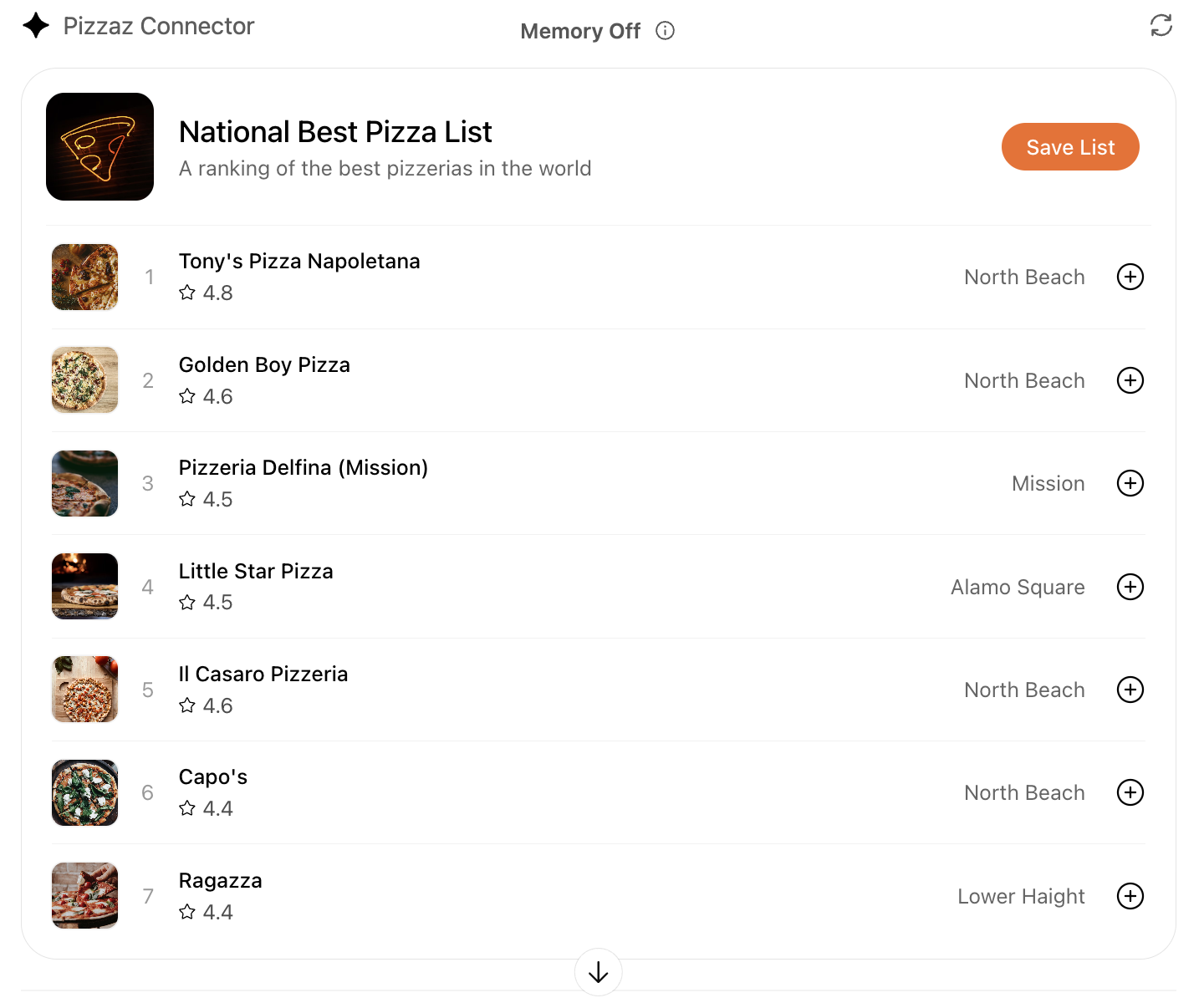
- Pizzaz List: Ranked card list with favorites and call-to-action buttons.
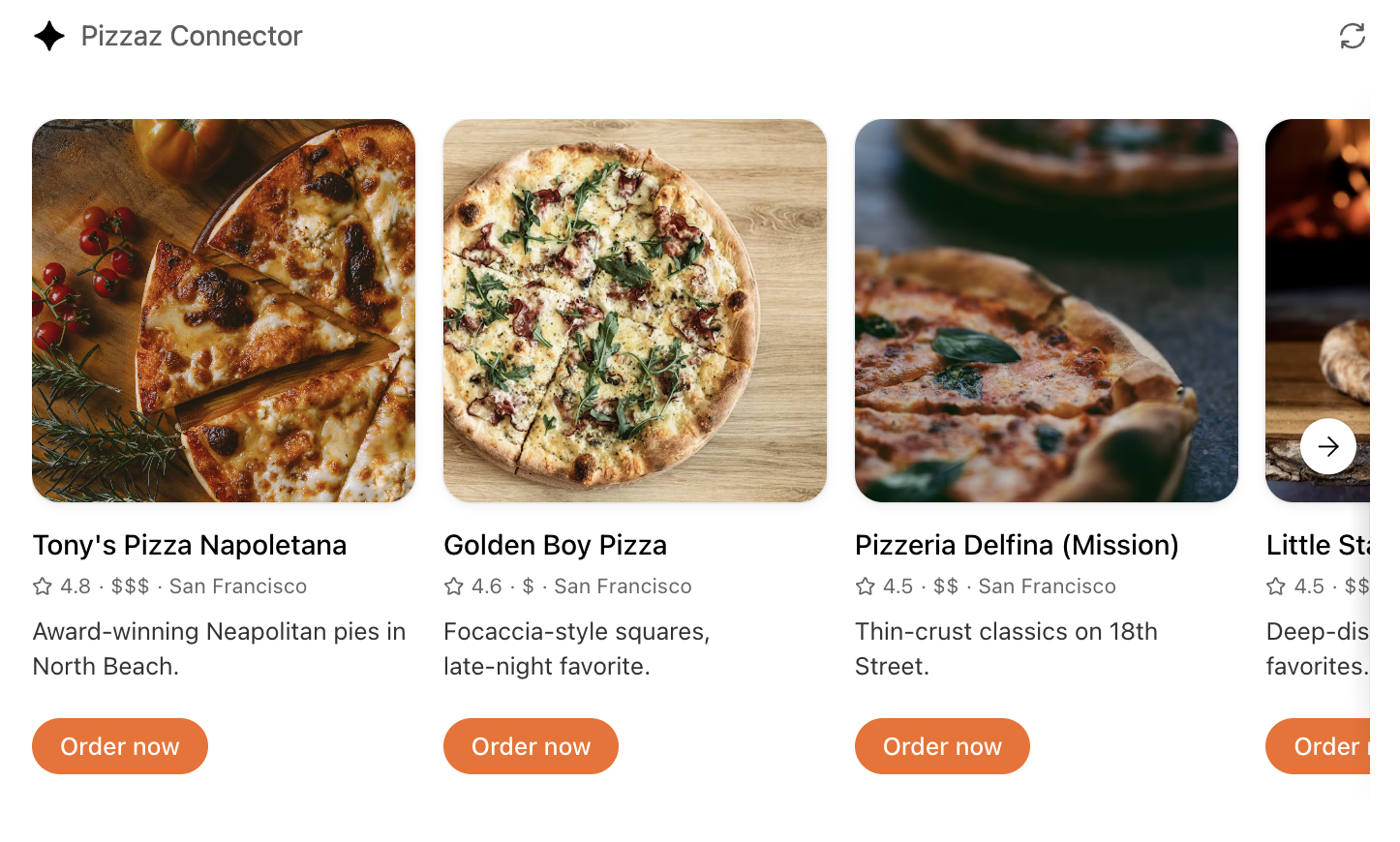
- Pizzaz Carousel: Embla-powered horizontal scroller that demonstrates media-heavy layouts.
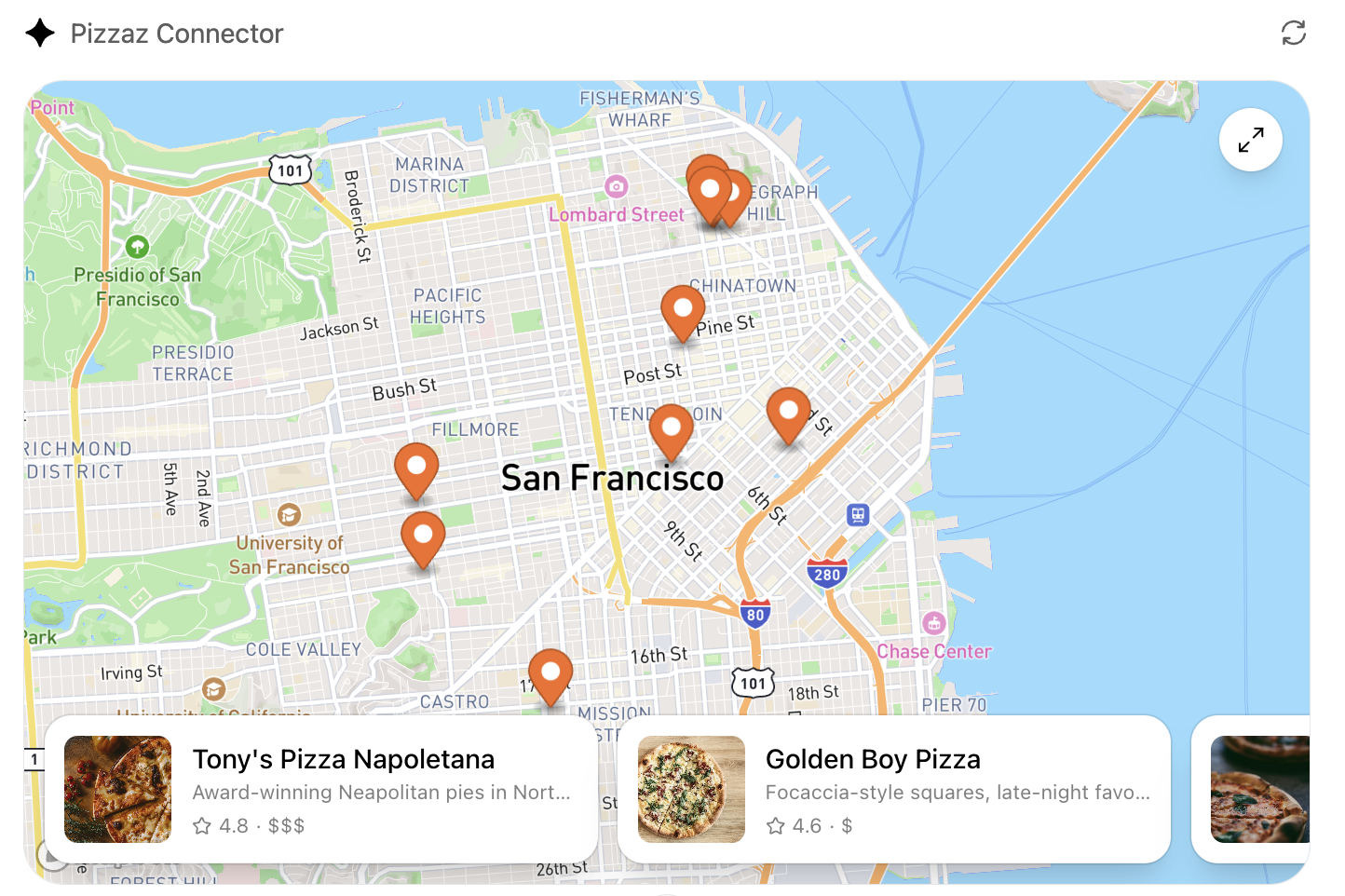
- Pizzaz Map: Mapbox integration with fullscreen inspector and host state sync.
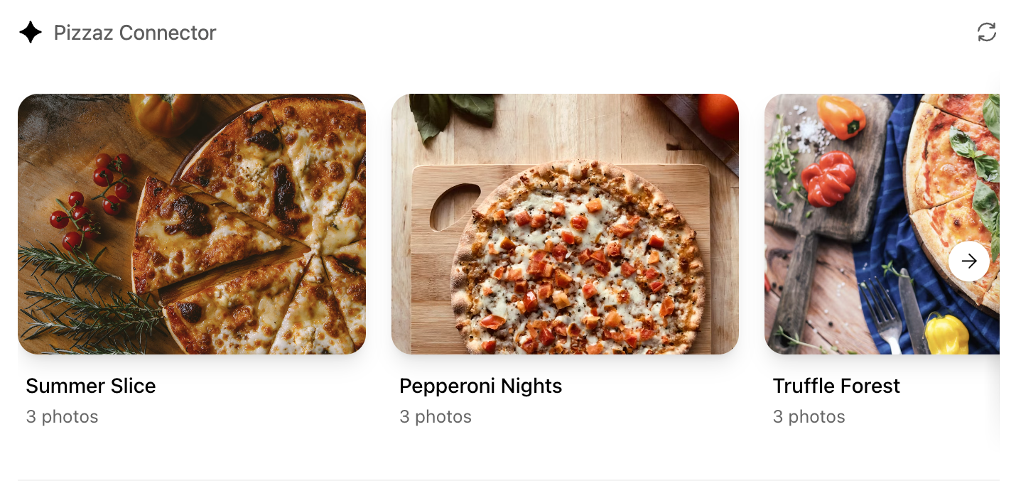
- Pizzaz Album: Stacked gallery view built for deep dives on a single place.
- Pizzaz Video: Scripted player with overlays and fullscreen controls.
Each example shows how to bundle assets, wire host APIs, and structure state for real conversations. Copy the one closest to your use case and adapt the data layer for your tool responses.
React helper hooks
A small helper to subscribe to ui/notifications/tool-result:
type ToolResult = { structuredContent?: unknown } | null;

export function useToolResult() {
  const [toolResult, setToolResult] = useState<ToolResult>(null);

  useEffect(() => {
    const onMessage = (event: MessageEvent) => {
      if (event.source !== window.parent) return;
      const message = event.data;
      if (!message || message.jsonrpc !== "2.0") return;
      if (message.method !== "ui/notifications/tool-result") return;
      setToolResult(message.params ?? null);
    };

    window.addEventListener("message", onMessage, { passive: true });
    return () => window.removeEventListener("message", onMessage);
  }, []);

  return toolResult;
}
Render from toolResult?.structuredContent, and treat it as untrusted input.
Widget localization
The host mirrors the locale to document.documentElement.lang. Use that locale
to load translations and format dates/numbers. A common pattern with
react-intl:
import { IntlProvider } from "react-intl";
import en from "./locales/en-US.json";
import es from "./locales/es-ES.json";

const messages: Record<string, Record<string, string>> = {
  "en-US": en,
  "es-ES": es,
};

export function App() {
  const locale = document.documentElement.lang || "en-US";
  return (
    <IntlProvider
      locale={locale}
      messages={messages[locale] ?? messages["en-US"]}
    >
      {/* Render UI with <FormattedMessage> or useIntl() */}
    </IntlProvider>
  );
}
Bundle for the iframe
Once you finish writing your React component, you can build it into a single JavaScript module that the server can inline:
// package.json
{
  "scripts": {
    "build": "esbuild src/component.tsx --bundle --format=esm --outfile=dist/component.js"
  }
}
Run npm run build to produce dist/component.js. If esbuild complains about missing dependencies, confirm you ran npm install in the web/ directory and that your imports match installed package names (for example, @react-dnd/html5-backend vs react-dnd-html5-backend).
Embed the component in the server response
See the Set up your server docs for how to embed the component in your MCP server response.
Component UI templates are the recommended path for production.
During development you can rebuild the component bundle whenever your React code changes and hot-reload the server.