
Overview
Apps are developer-built experiences that are available in ChatGPT. They extend what users can do without breaking the flow of conversation, appearing through lightweight cards, carousels, fullscreen views, and other display modes that integrate seamlessly into ChatGPT’s interface.
Before you start designing your app visually, make sure you have reviewed our recommended UX principles.
Design system
To help you design high quality apps that feel native to ChatGPT, you can use the Apps SDK UI design system.
It provides styling foundations with Tailwind, CSS variable design tokens, and a library of well-crafted, accessible components.
Using the Apps SDK UI is not a requirement to build your app, but it will make building an app for ChatGPT faster and easier, in a way that is consistent with the ChatGPT design system.
Before diving into code, start designing with our Figma component library
Display modes
Display modes are the surfaces developers use to create experiences for apps in ChatGPT. They allow partners to show content and actions that feel native to conversation. Each mode is designed for a specific type of interaction, from quick confirmations to immersive workflows.
Using these consistently helps experiences stay simple and predictable.
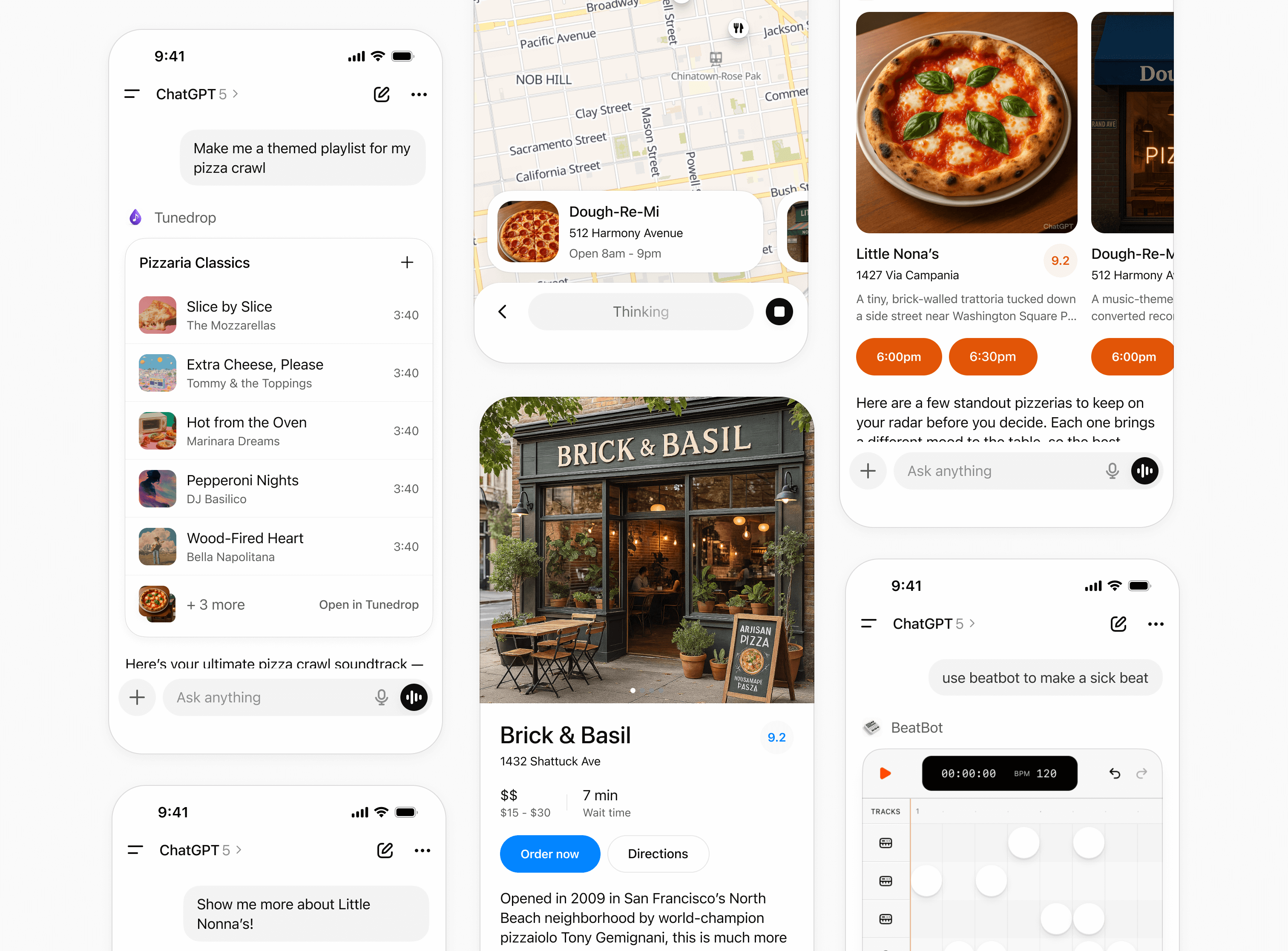
Inline
The inline display mode appears directly in the flow of the conversation. Inline surfaces currently always appear before the generated model response. Every app initially appears inline.
Layout
- Icon & tool call: A label with the app name and icon.
- Inline display: A lightweight display with app content embedded above the model response.
- Follow-up: A short, model-generated response shown after the widget to suggest edits, next steps, or related actions. Avoid content that is redundant with the card.
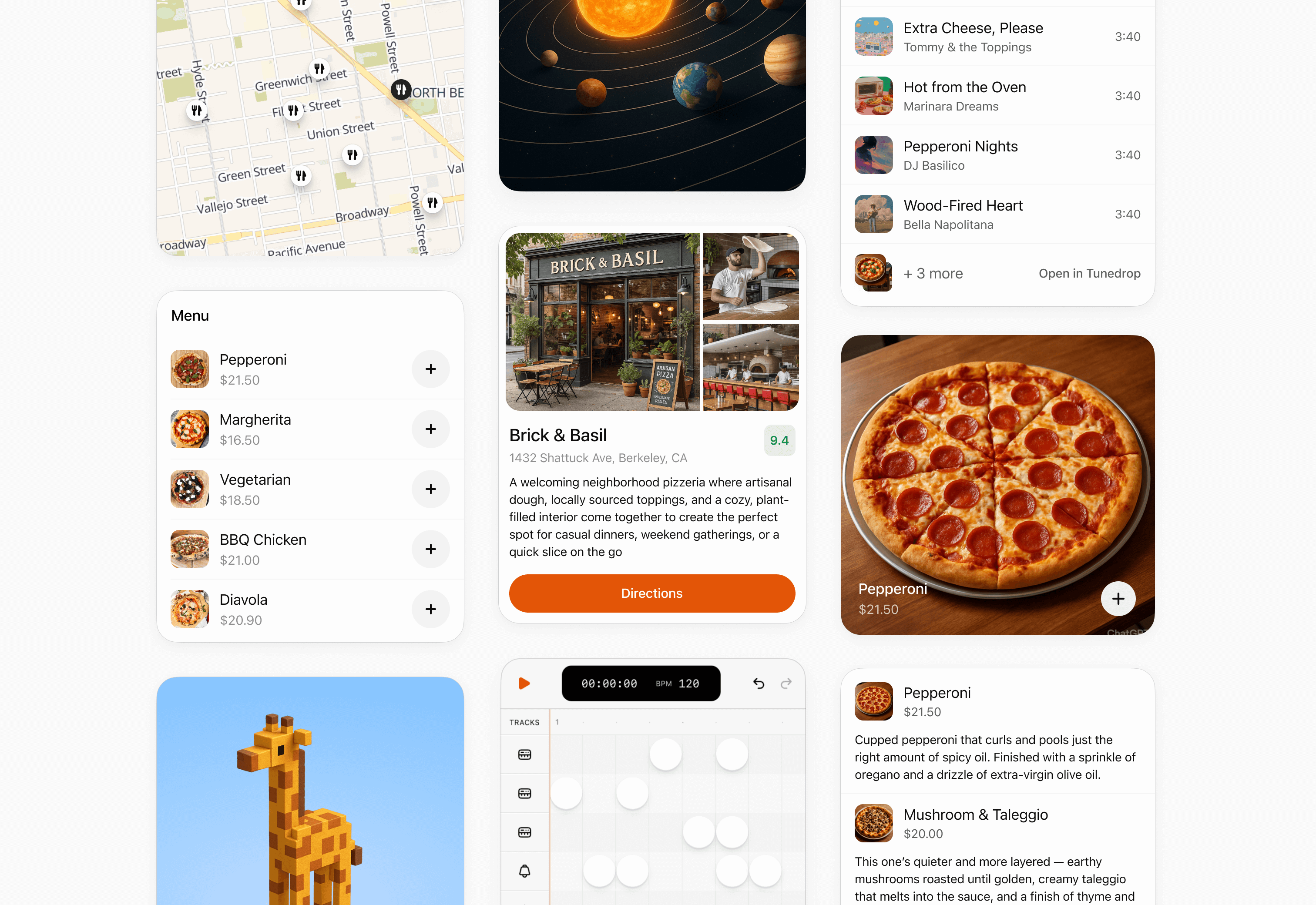
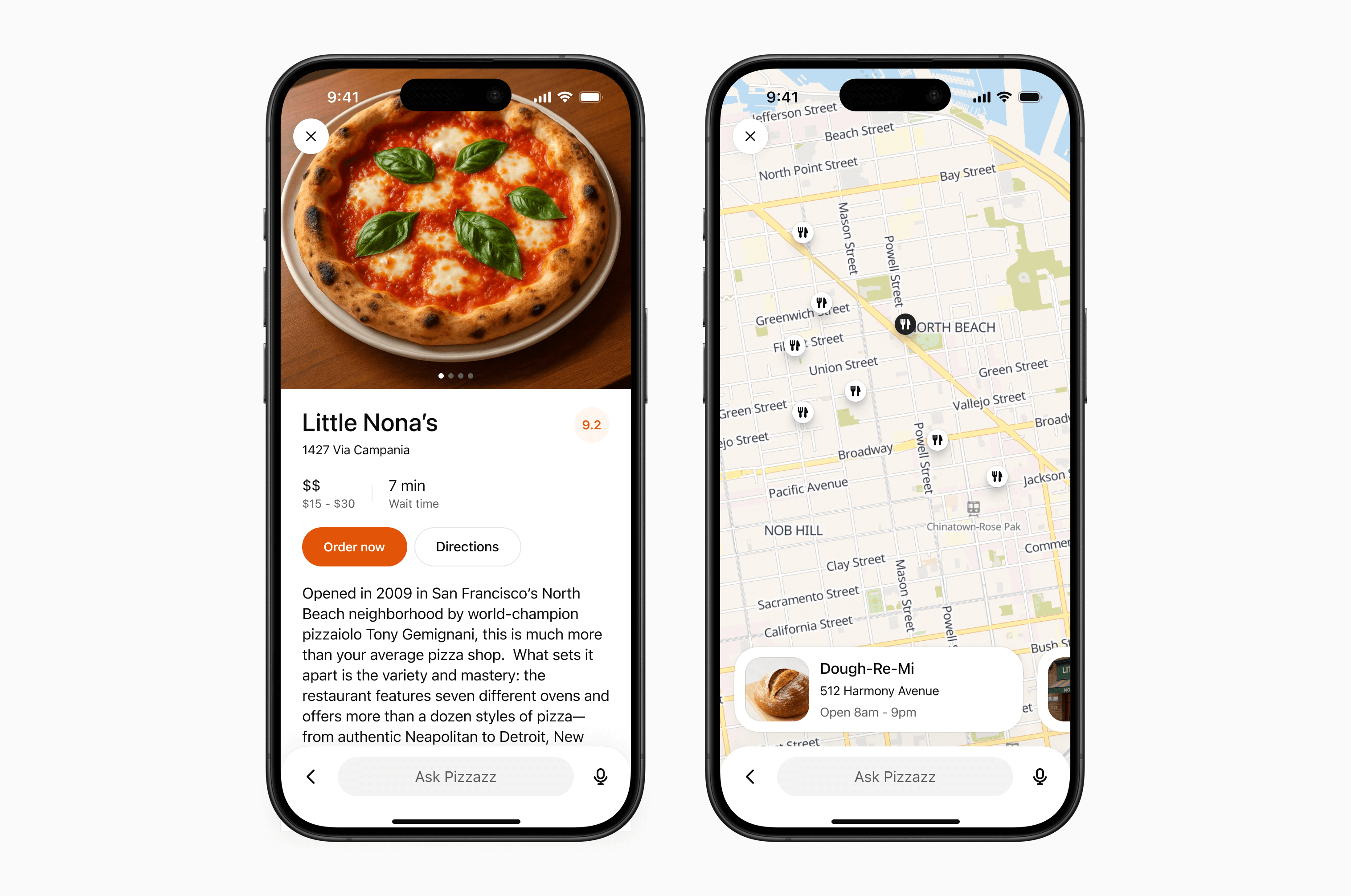
Inline card
Lightweight, single-purpose widgets embedded directly in conversation. They provide quick confirmations, simple actions, or visual aids.
When to use
- A single action or decision (for example, confirm a booking).
- Small amounts of structured data (for example, a map, order summary, or quick status).
- A fully self-contained widget or tool (e.g., an audio player or a score card).
Layout
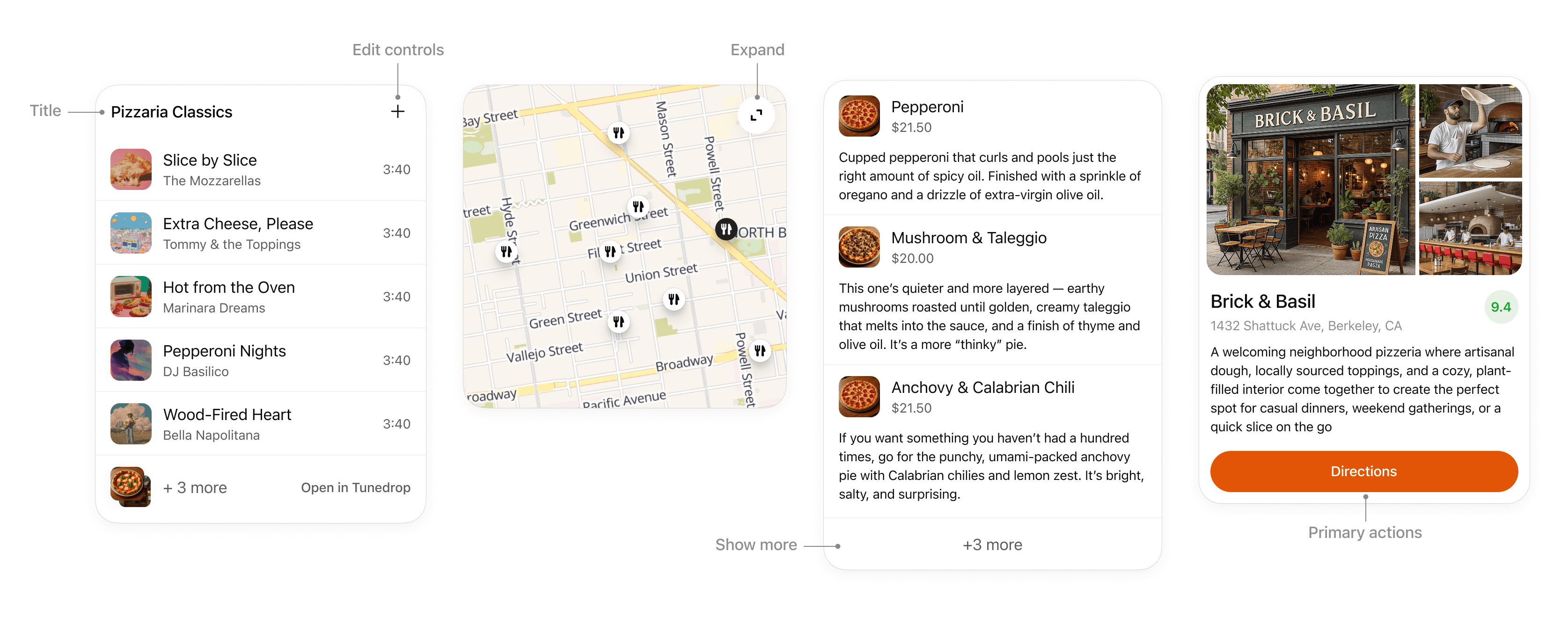
- Title: Include a title if your card is document-based or contains items with a parent element, like songs in a playlist.
- Expand: Use to open a fullscreen display mode if the card contains rich media or interactivity like a map or an interactive diagram.
- Show more: Use to disclose additional items if multiple results are presented in a list.
- Edit controls: Provide inline support for app responses without overwhelming the conversation.
- Primary actions: Limit to two actions, placed at bottom of card. Actions should perform either a conversation turn or a tool call.
Interaction
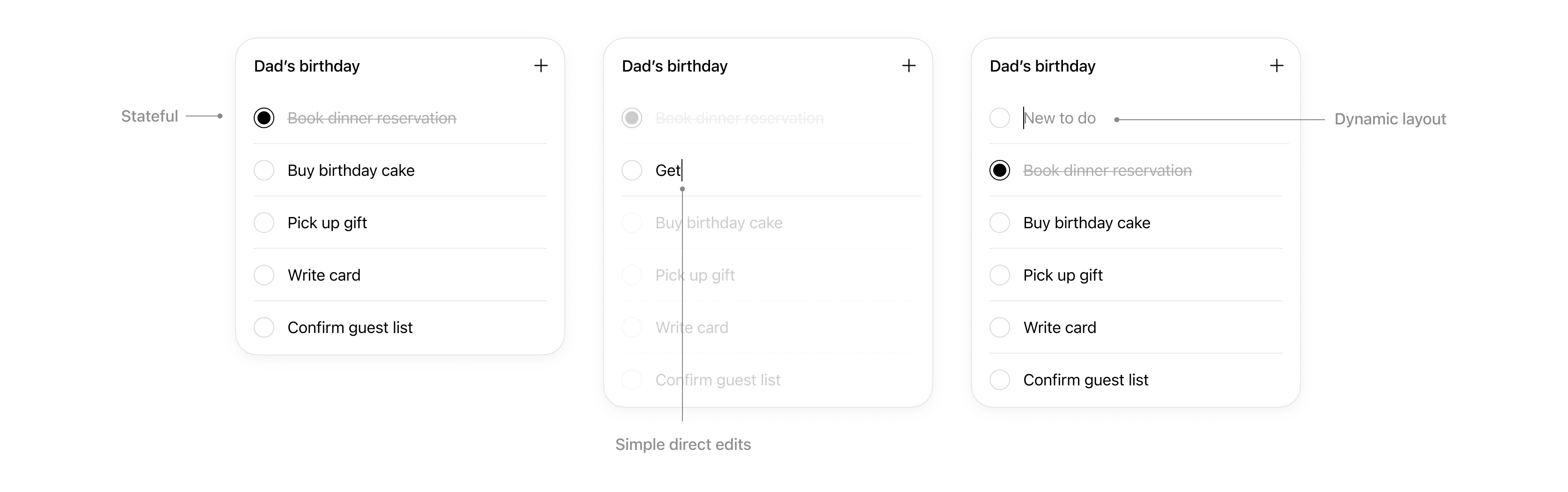
Cards support simple direct interaction.
- States: Edits made are persisted.
- Simple direct edits: If appropriate, inline editable text allows users to make quick edits without needing to prompt the model.
- Dynamic layout: Card layout can expand its height to match its contents up to the height of the mobile viewport.
Rules of thumb
- Limit primary actions per card: Support up to two actions maximum, with one primary CTA and one optional secondary CTA.
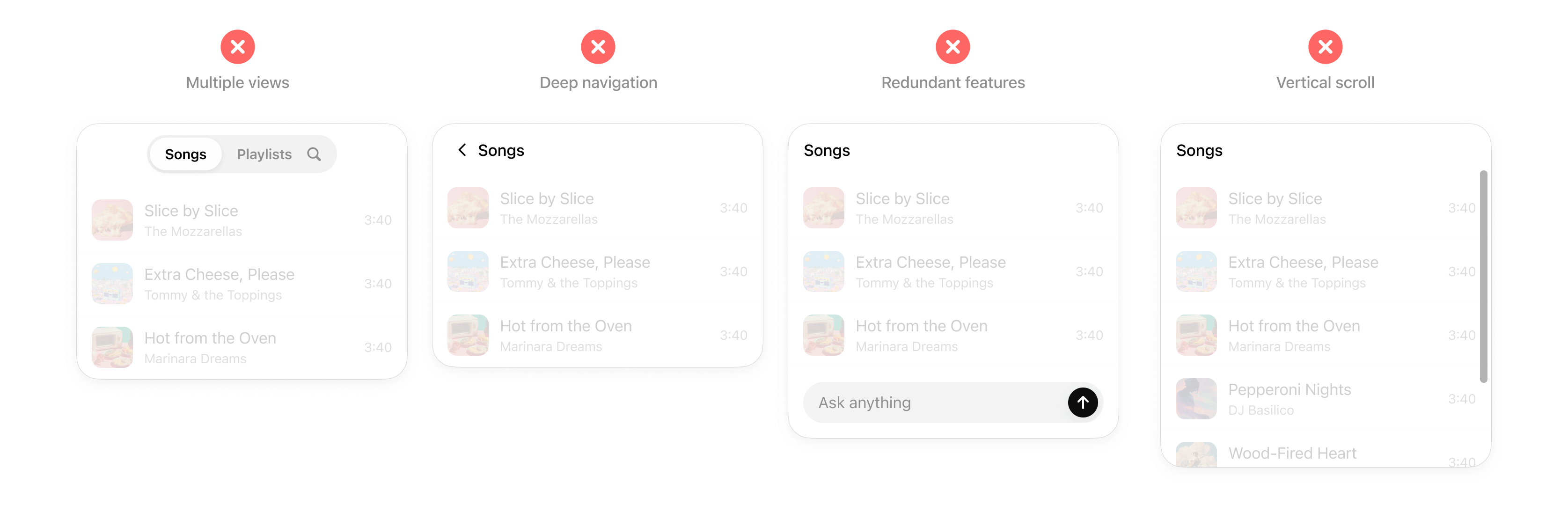
- No deep navigation or multiple views within a card. Cards should not contain multiple drill-ins, tabs, or deeper navigation. Consider splitting these into separate cards or tool actions.
- No nested scrolling. Cards should auto-fit their content and prevent internal scrolling.
- No duplicative inputs. Don’t replicate ChatGPT features in a card.
Inline carousel
A set of cards presented side-by-side, letting users quickly scan and choose from multiple options.
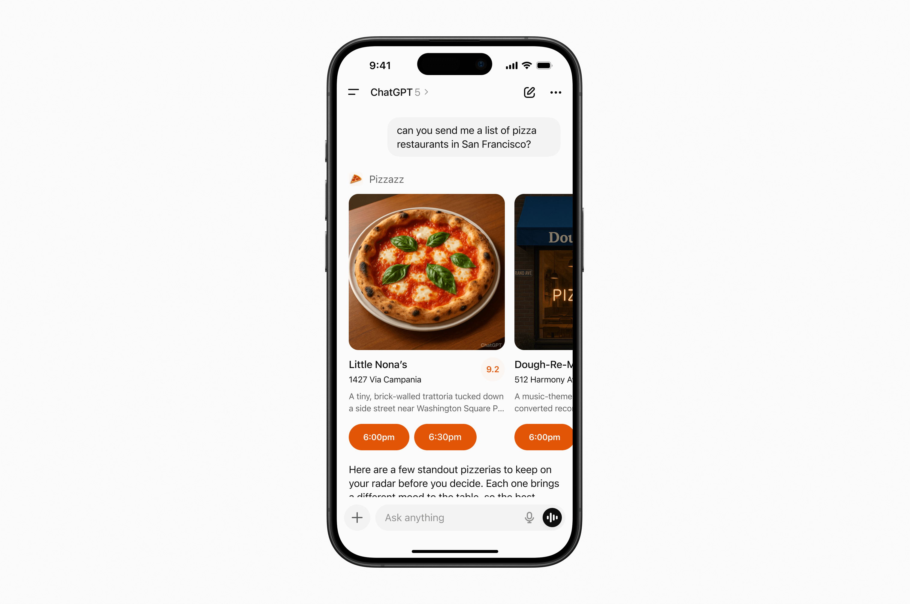
When to use
- Presenting a small list of similar items (for example, restaurants, playlists, events).
- Items have more visual content and metadata than will fit in simple rows.
Layout
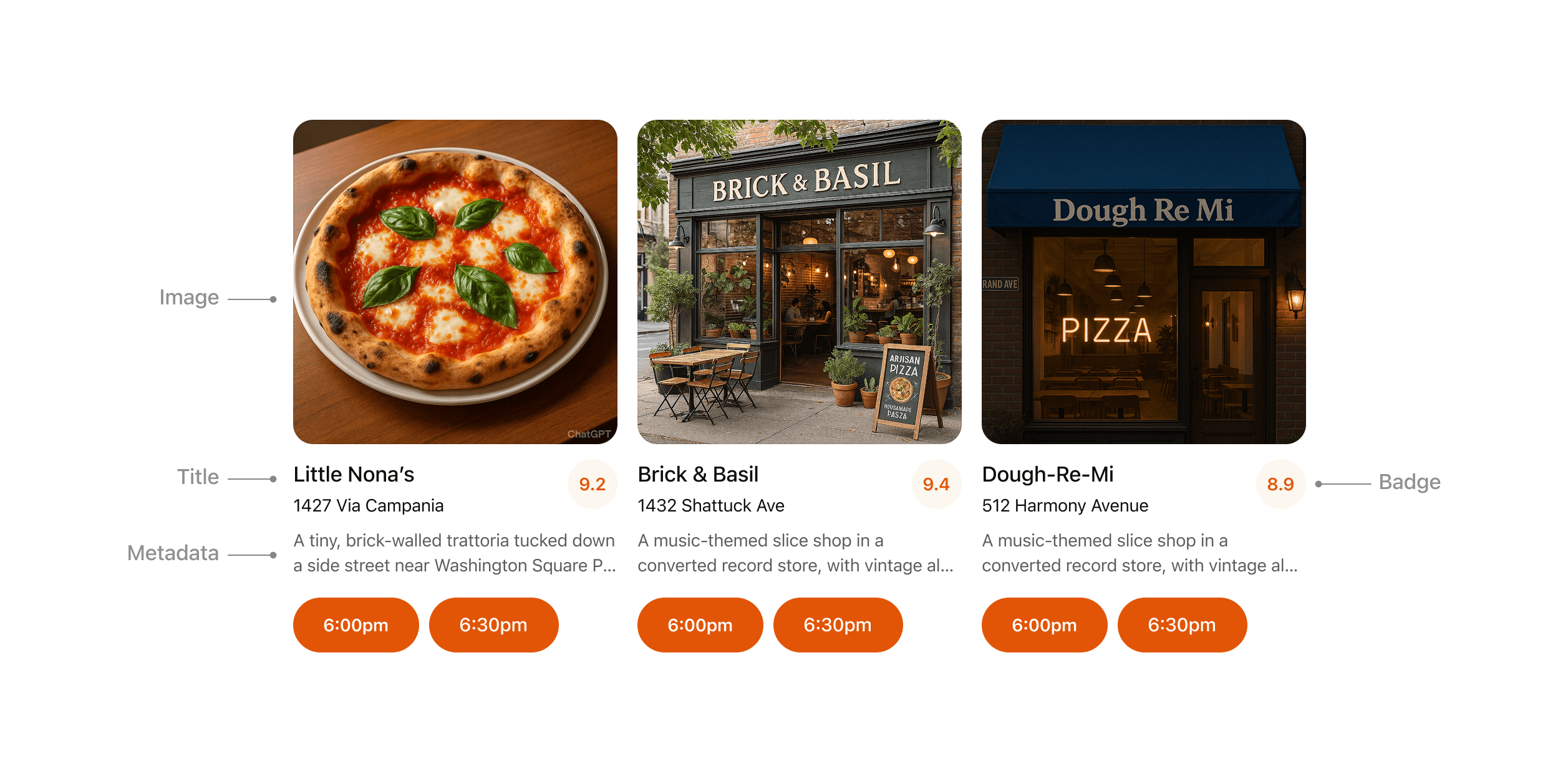
- Image: Items should always include an image or visual.
- Title: Carousel items should typically include a title to explain the content.
- Metadata: Use metadata to show the most important and relevant information about the item in the context of the response. Avoid showing more than two lines of text.
- Badge: Use the badge to show supporting context where appropriate.
- Actions: Provide a single clear CTA per item whenever possible.
Rules of thumb
- Keep to 3–8 items per carousel for scannability.
- Reduce metadata to the most relevant details, with three lines max.
- Each card may have a single, optional CTA (for example, “Book” or “Play”).
- Use consistent visual hierarchy across cards.
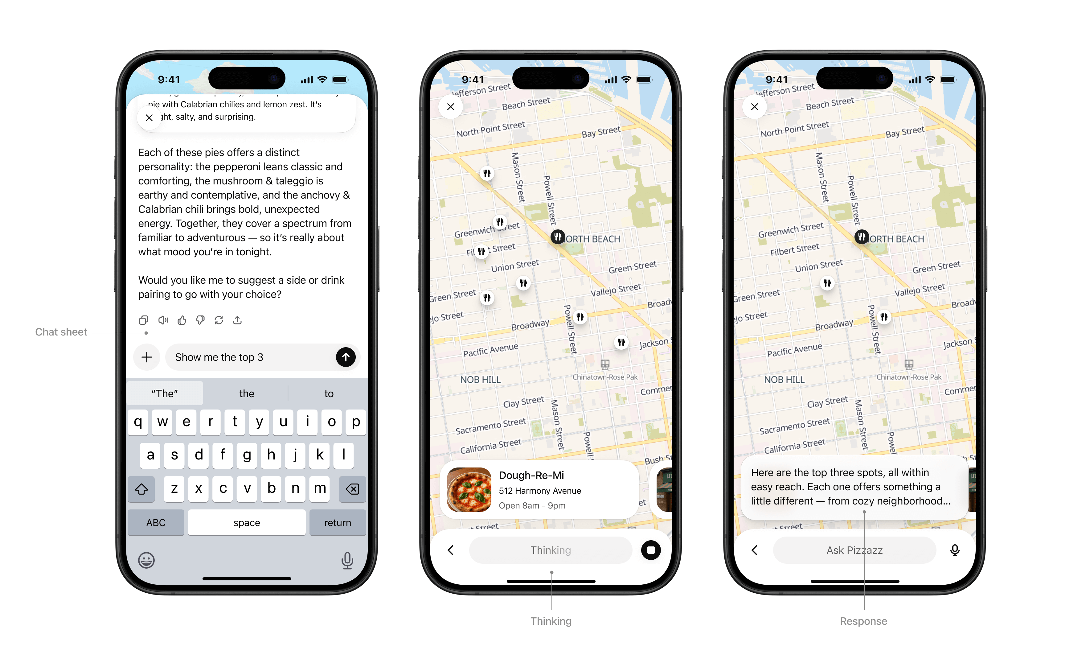
Fullscreen
Immersive experiences that expand beyond the inline card, giving users space for multi-step workflows or deeper exploration. The ChatGPT composer remains overlaid, allowing users to continue “talking to the app” through natural conversation in the context of the fullscreen view.
When to use
- Rich tasks that cannot be reduced to a single card (for example, an explorable map with pins, a rich editing canvas, or an interactive diagram).
- Browsing detailed content (for example, real estate listings, menus).
Layout
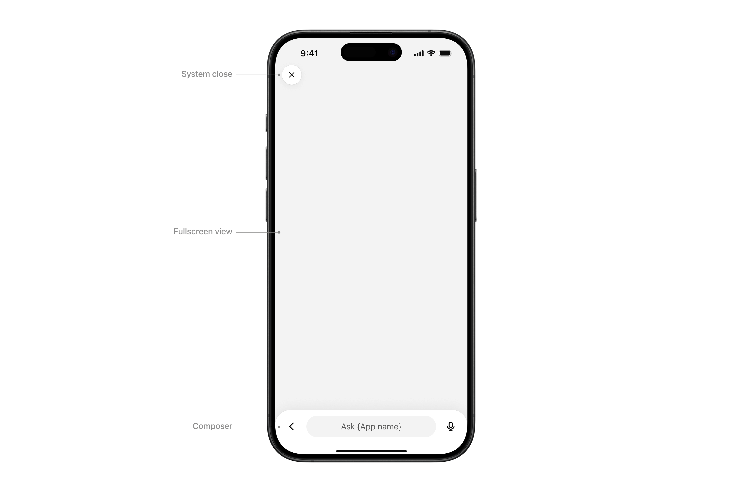
- System close: Closes the sheet or view.
- Fullscreen view: Content area.
- Composer: ChatGPT’s native composer, allowing the user to follow up in the context of the fullscreen view.
Interaction
- Chat sheet: Maintain conversational context alongside the fullscreen surface.
- Thinking: The composer input “shimmers” to show that a response is streaming.
- Response: When the model completes its response, an ephemeral, truncated snippet displays above the composer. Tapping it opens the chat sheet.
Rules of thumb
- Design your UX to work with the system composer. The composer is always present in fullscreen, so make sure your experience supports conversational prompts that can trigger tool calls and feel natural for users.
- Use fullscreen to deepen engagement, not to replicate your native app wholesale.
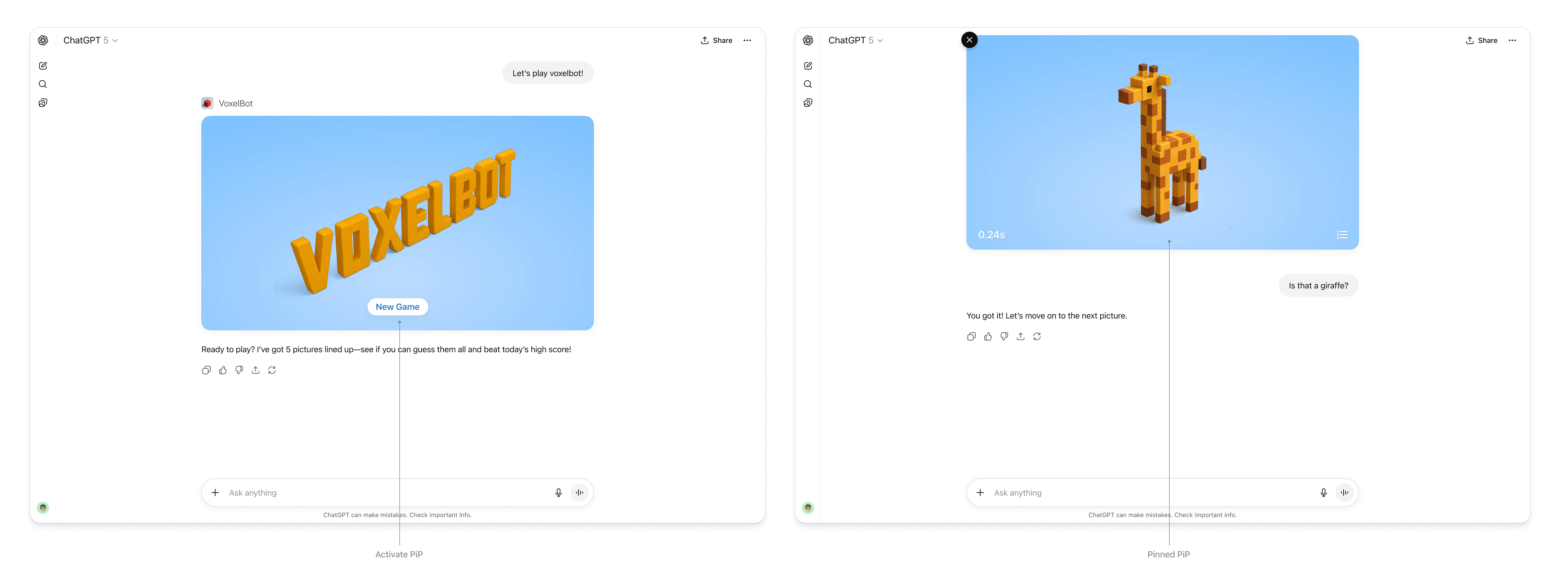
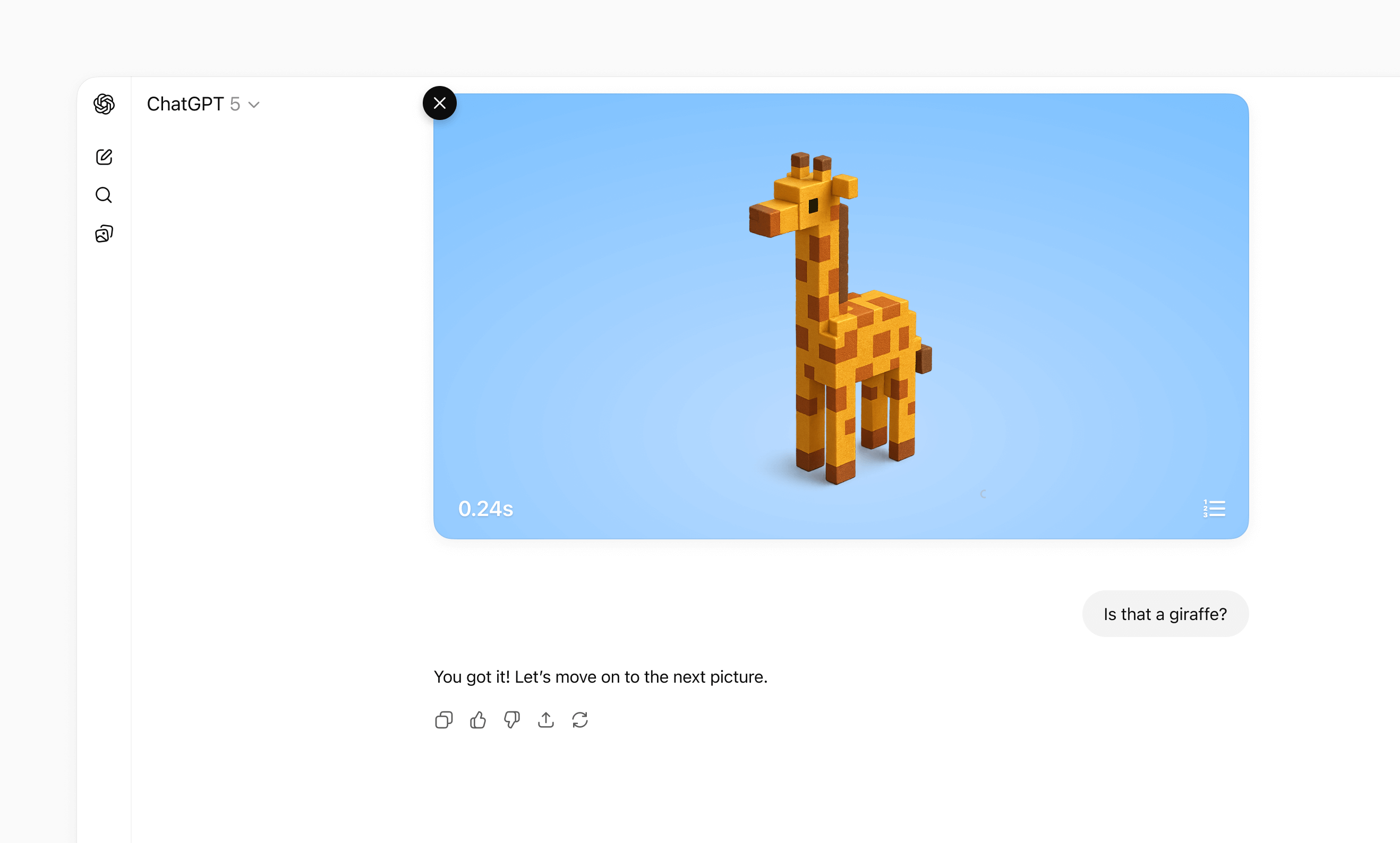
Picture-in-picture (PiP)
A persistent floating window inside ChatGPT optimized for ongoing or live sessions like games or videos. PiP remains visible while the conversation continues, and it can update dynamically in response to user prompts.
When to use
- Activities that run in parallel with conversation, such as a game, live collaboration, quiz, or learning session.
- Situations where the PiP widget can react to chat input, for example continuing a game round or refreshing live data based on a user request.
Interaction
- Activated: On scroll, the PiP window stays fixed to the top of the viewport
- Pinned: The PiP remains fixed until the user dismisses it or the session ends.
- Session ends: The PiP returns to an inline position and scrolls away.
Rules of thumb
- Ensure the PiP state can update or respond when users interact through the system composer.
- Close PiP automatically when the session ends.
- Do not overload PiP with controls or static content better suited for inline or fullscreen.
Visual design guidelines
A consistent look and feel helps partner-built tools feel like a natural part of the ChatGPT platform. Visual guidelines support clarity, usability, and accessibility, while still leaving room for brand expression in the right places.
These principles outline how to use color, type, spacing, and imagery in ways that preserve system clarity while giving partners space to differentiate their service.
Why this matters
Visual and UX consistency helps improve the overall user experience of using apps in ChatGPT. By following these guidelines, partners can present their tools in a way that feels consistent to users and delivers value without distraction.
Color
System-defined palettes help ensure actions and responses always feel consistent with the ChatGPT platform. Partners can add branding through accents, icons, or inline imagery, but should not redefine system colors.
Rules of thumb
- Use system colors for text, icons, and spatial elements like dividers.
- Partner brand accents such as logos or icons should not override backgrounds or text colors.
- Avoid custom gradients or patterns that break ChatGPT’s minimal look.
- Use brand accent colors on primary buttons inside app display modes.
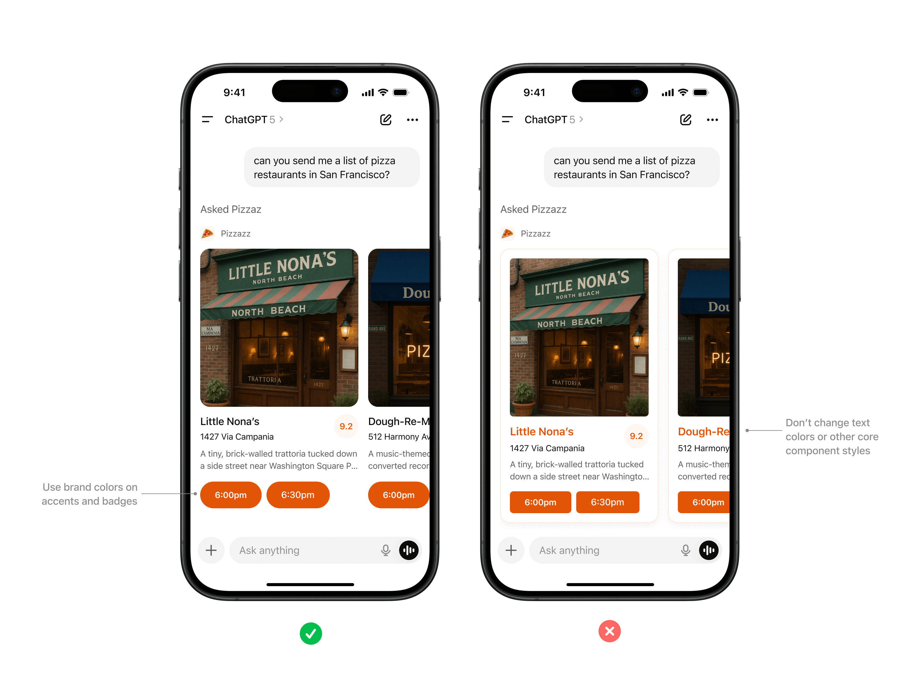
Use brand colors on accents and badges. Don’t change text colors or other core component styles.
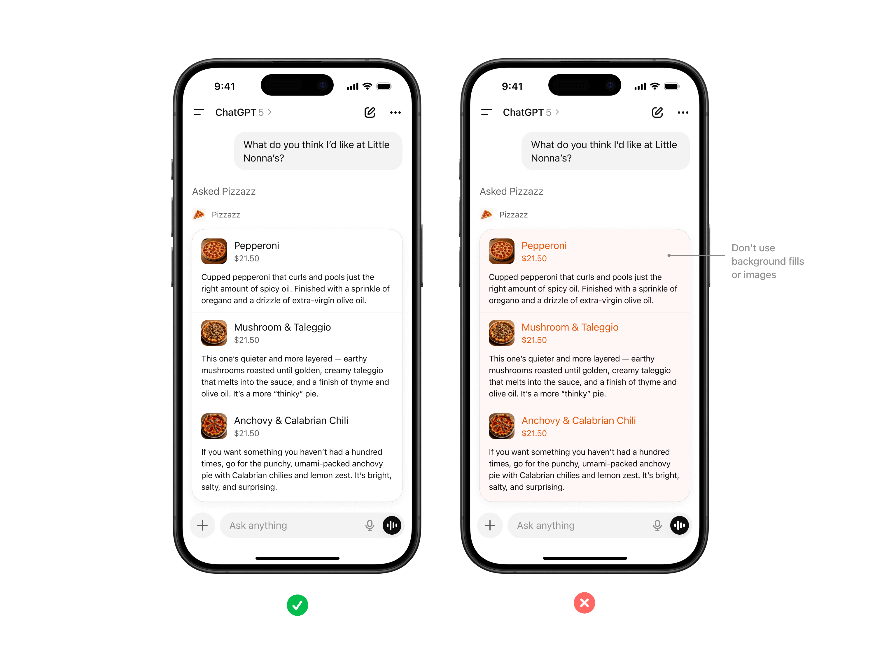
Don’t apply colors to backgrounds in text areas.
Typography
ChatGPT uses platform-native system fonts (SF Pro on iOS, Roboto on Android) to ensure readability and accessibility across devices.
Rules of thumb
- Always inherit the system font stack, respecting system sizing rules for headings, body text, and captions.
- Use partner styling such as bold, italic, or highlights only within content areas, not for structural UI.
- Limit variation in font size as much as possible, preferring body and body-small sizes.

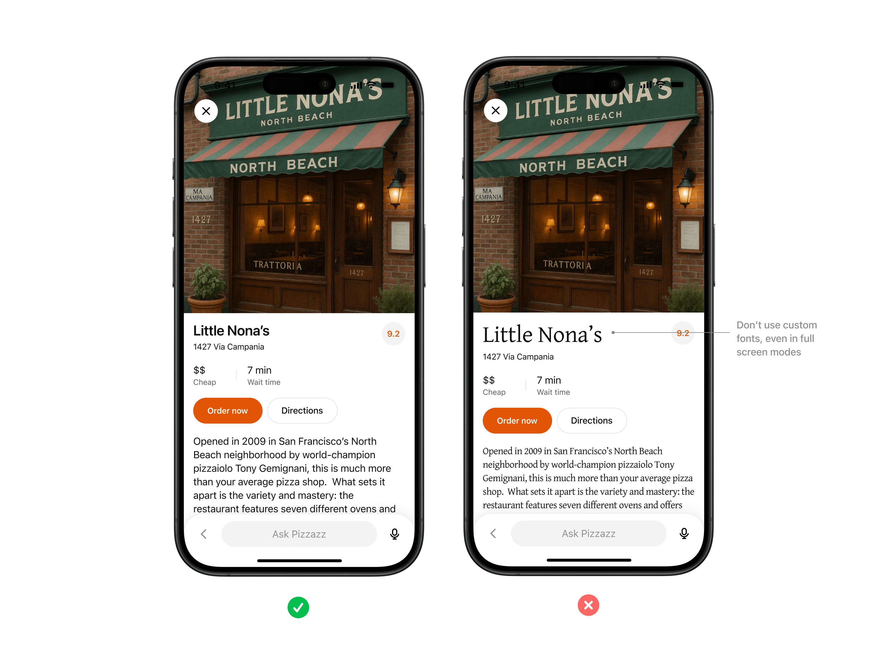
Don’t use custom fonts, even in full screen modes. Use system font variables wherever possible.
Spacing & layout
Consistent margins, padding, and alignment keep partner content scannable and predictable inside conversation.
Rules of thumb
- Use system grid spacing for cards, collections, and inspector panels.
- Keep padding consistent and avoid cramming or edge-to-edge text.
- Respect system specified corner rounds when possible to keep shapes consistent.
- Maintain visual hierarchy with headline, supporting text, and CTA in a clear order.
Icons & imagery
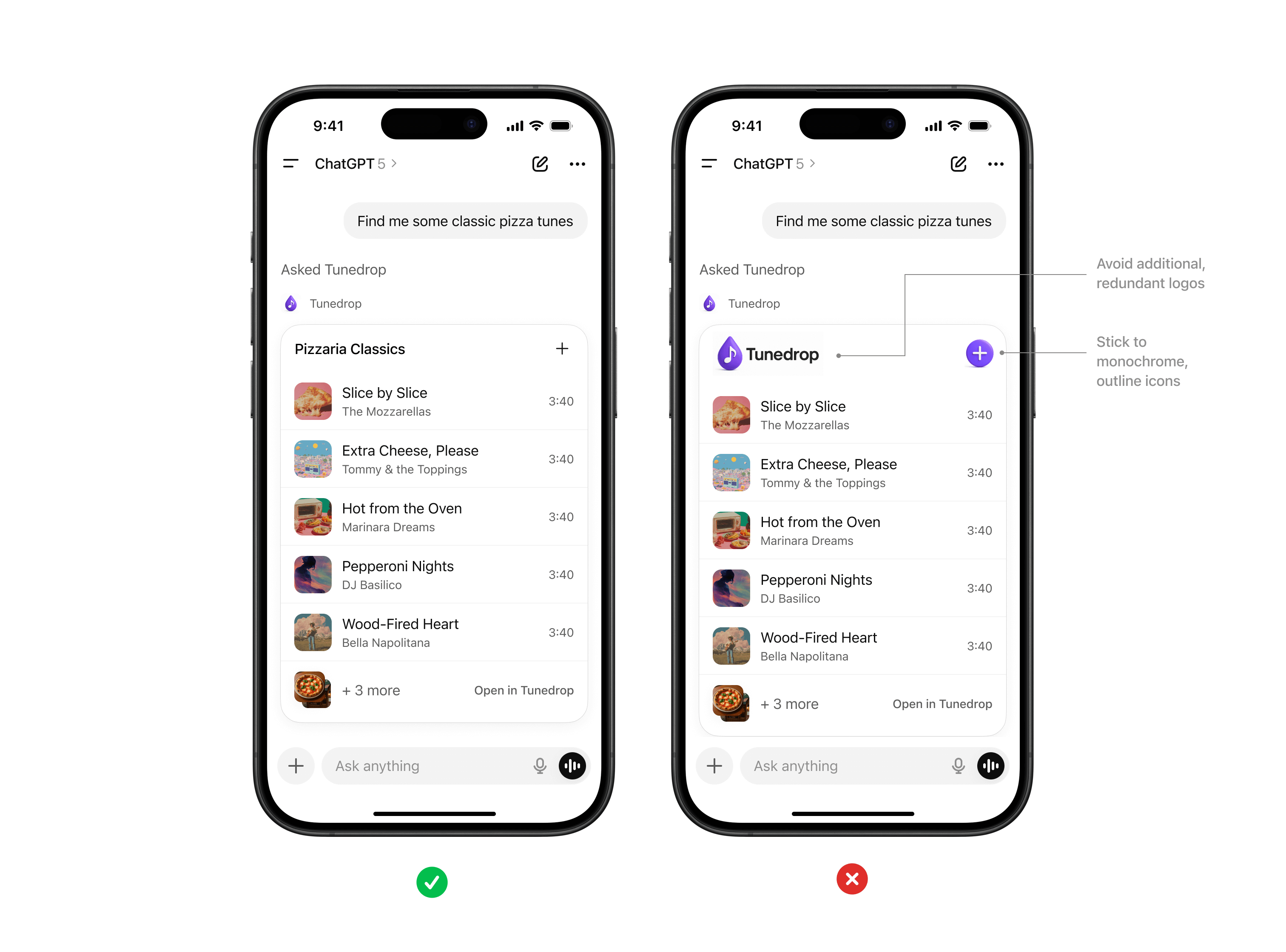
System iconography provides visual clarity, while partner logos and images help users recognize brand context.
Rules of thumb
- Use either system icons or custom iconography that fits within ChatGPT’s visual world — monochromatic and outlined.
- Do not include your logo as part of the response. ChatGPT will always append your logo and app name before the widget is rendered.
- All imagery must follow enforced aspect ratios to avoid distortion.
Accessibility
Every partner experience should be usable by the widest possible audience. Accessibility should be a core consideration when you are building apps for ChatGPT.
Rules of thumb
- Text and background must maintain a minimum contrast ratio (WCAG AA).
- Provide alt text for all images.
- Support text resizing without breaking layouts.