Build a complete, polished, interactive landing page. Use clear, natural copy and a restrained layout with purposeful controls. Keep native scrolling, support phone and desktop layouts, keyboard controls, and reduced motion. The main interaction should work without a runtime AI call or account.
Scenario: Type Field is a small online exhibition where visitors explore how variable typography works and make a poster from the same type system. This should demonstrate excellent typographic hierarchy, responsive composition and direct manipulation without depending on photography.
Art direction: vivid orange, warm white and black, very large letterforms, precise rules, asymmetrical Swiss-inspired composition. Use a distinctive grid that changes convincingly across breakpoints. Font specimens are the visual material. The page must still read clearly.
Page and signature interaction:
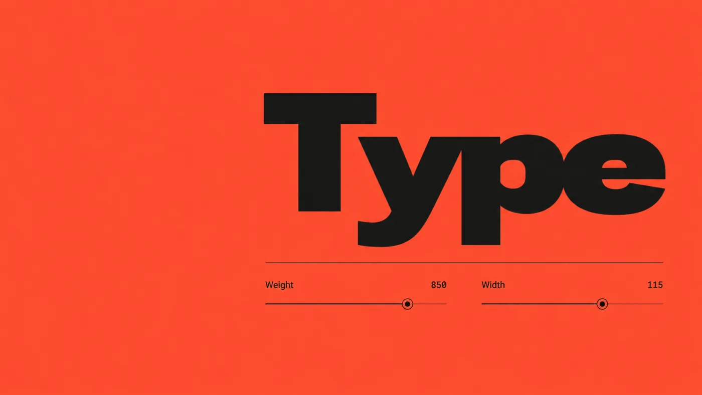
- Hero: “An exhibition of variable type.” A large, editable specimen occupies the page; drag a clear weight/width control to see its real letterforms change, with the current font-axis values visible only where useful.
- Use an actually licensed open-source variable font with verified supported axes. Credit the font accurately and retain its license. Do not claim to have designed an existing font, fabricate unsupported variable axes, or simulate width by merely stretching every glyph.
- Scrolling transforms the same specimen through three useful compositions: a compact headline, an editorial paragraph, and a large poster. Preserve readable text and show actual optical/spacing changes when supported.
- A “Make a poster” section lets visitors edit a short title, choose among three authored grid layouts, adjust supported axes, and switch between a small set of carefully selected palettes. The result should always remain composed, including long words and punctuation.
- Include an optional clear overlay for the baseline/grid so users can inspect alignment and switch it off. Explain type controls in short practical sentences.
- “Download poster” must produce a real, high-quality SVG or PNG with fonts handled correctly; also offer reset. Keep poster creation in the page rather than opening a complex design app.
Make the interactions tactile through timing and layout, not random flying letters. Avoid audio and unnecessary 3D. Use semantic HTML for the exhibition, with canvas/SVG only where needed for the export or specimen. Check long/empty inputs, glyph coverage, font loading, export fidelity, keyboard controls, reduced motion and mobile composition. This should be a complete, confident typography site that would be compelling even as a still image.