
Why components matter
UI components are the human-visible half of your connector. They let users view or edit data inline, switch to fullscreen when needed, and keep context synchronized between typed prompts and UI actions. Planning them early ensures your MCP server returns the right structured data and component metadata from day one.
Because ChatGPT implements the MCP Apps UI standard, a well-designed component and data contract can be portable across MCP Apps-compatible hosts.
Explore sample components
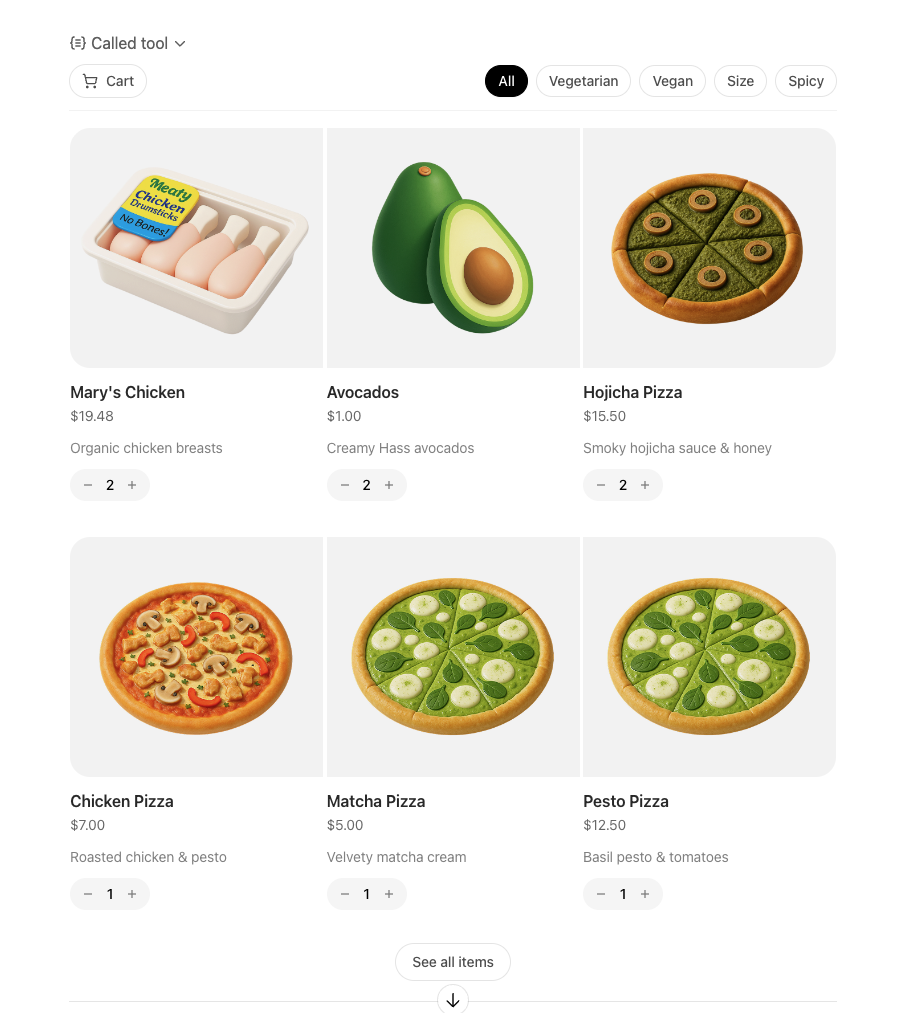
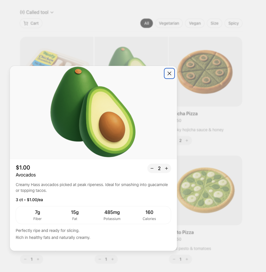
We publish reusable examples in openai-apps-sdk-examples so you can see common patterns before you build your own. The pizzaz gallery covers every default surface we provide today:
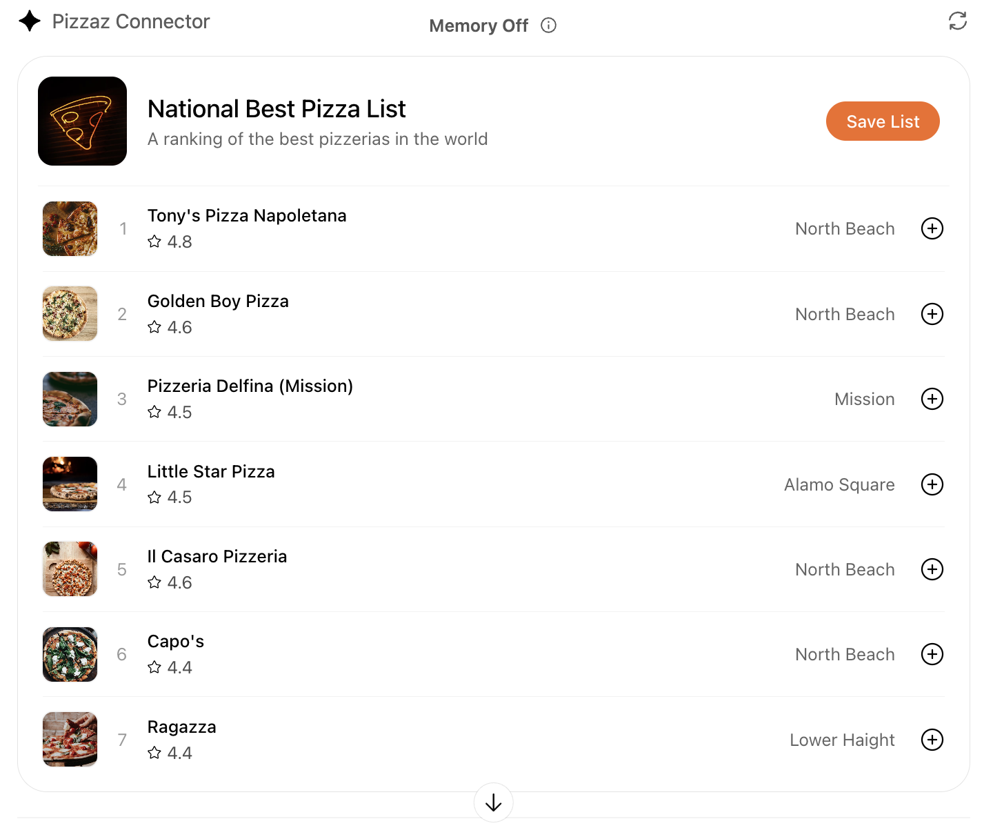
List
Renders dynamic collections with empty-state handling. View the code.
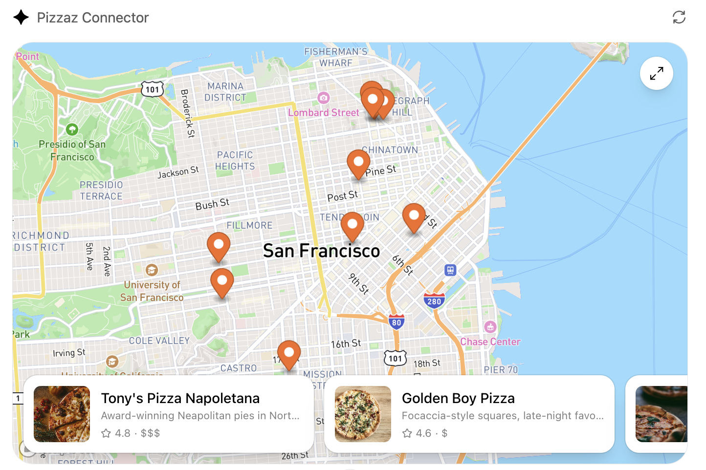
Map
Plots geo data with marker clustering and detail panes. View the code.
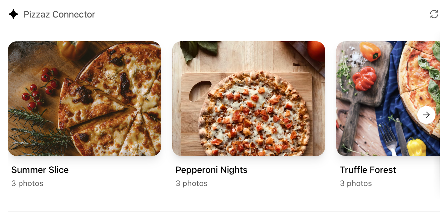
Album
Showcases media grids with fullscreen transitions. View the code.
Carousel
Highlights featured content with swipe gestures. View the code.
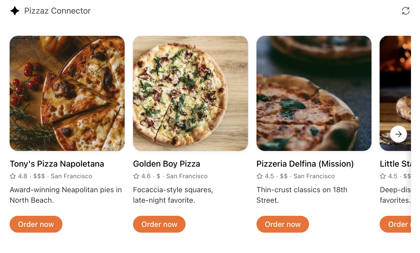
Shop
Demonstrates product browsing with checkout affordances. View the code.
Clarify the user interaction
For each use case, decide what the user needs to see and manipulate:
- Viewer vs. editor – is the component read-only (a chart, a dashboard) or should it support editing and writebacks (forms, kanban boards)?
- Single-shot vs. multiturn – will the user accomplish the task in one invocation, or should state persist across turns as they iterate?
- Inline vs. fullscreen – some tasks are comfortable in the default inline card, while others benefit from fullscreen or picture-in-picture modes. Sketch these states before you implement.
Write down the fields, affordances, and empty states you need so you can validate them with design partners and reviewers.
Map data requirements
Components should receive everything they need in the tool response. When planning:
- Structured content – define the JSON payload that the component will parse.
- Initial component state – render from the latest
structuredContentdelivered over the MCP Apps bridge (for example,ui/notifications/tool-result). On UI-initiated tool calls (tools/call), render from the returned tool result. To keep the model in sync with UI state, useui/update-model-context. - Auth context – note whether the component should display linked-account information, or whether the model must prompt the user to connect first.
Feeding this data through the MCP response is simpler than adding ad-hoc APIs later.
Design for responsive layouts
Components run inside an iframe on both desktop and mobile. Plan for:
- Adaptive breakpoints – set a max width and design layouts that collapse gracefully on small screens.
- Accessible color and motion – respect system dark mode (match color-scheme) and provide focus states for keyboard navigation.
- Launcher transitions – if the user opens your component from the launcher or expands to fullscreen, make sure navigation elements stay visible.
Document CSS variables, font stacks, and iconography up front so they are consistent across components.
Define the state contract
Because components and the chat surface share conversation state, be explicit about what is stored where:
- Component state – use
ui/update-model-contextfor model-visible UI state. If you want ChatGPT to persist UI-only state across widget re-renders (optional), you can also usewindow.openai.setWidgetState(selected record, scroll position, staged form data). - Server state – store authoritative data in your backend or the built-in storage layer. Decide how to merge server changes back into component state after follow-up tool calls.
- Model messages – think about what human-readable updates the component should send back via
ui/messageso the transcript stays meaningful.
Capturing this state diagram early prevents hard-to-debug sync issues later.
Plan telemetry and debugging hooks
Inline experiences are hardest to debug without instrumentation. Decide in advance how you will:
- Emit analytics events for component loads, button clicks, and validation errors.
- Log tool-call IDs alongside component telemetry so you can trace issues end to end.
- Provide fallbacks when the component fails to load (e.g., show the structured JSON and prompt the user to retry).
Once these plans are in place you are ready to move on to the implementation details in Build a ChatGPT UI.