
위젯은 ChatKit에서 제공하는 컨테이너와 컴포넌트입니다. 미리 만들어진 위젯을 사용하거나, 템플릿을 수정하거나, 위젯을 직접 디자인해 제품에 맞게 ChatKit을 자유롭게 구성할 수 있습니다.
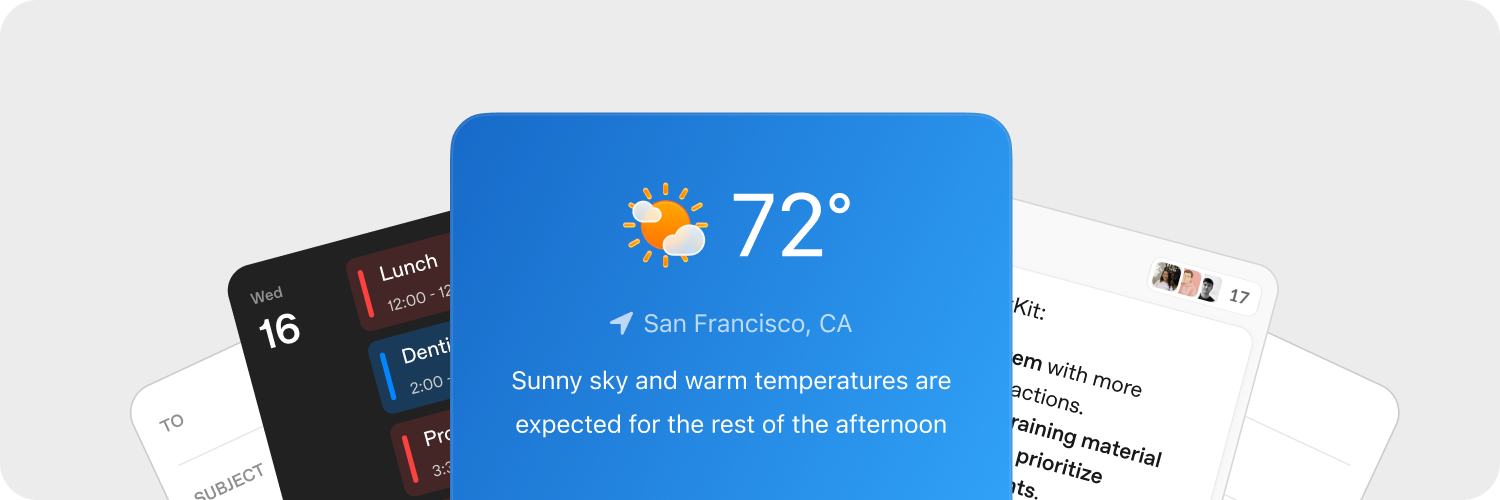
위젯 빠르게 디자인하기
ChatKit Studio의 Widget Builder에서 카드 레이아웃과 목록 행을 다양하게 구성하고 컴포넌트를 미리 보세요. 원하는 디자인이 완성되면 생성된 JSON을 연동 코드에 복사하고 백엔드에서 제공하세요.
에셋 업로드하기
에셋을 업로드해 제품에 맞게 ChatKit 위젯을 꾸미세요. ChatKit 메시지에서 업로드한 파일이나 이미지를 참조하려면 먼저 해당 파일이나 이미지를 애플리케이션의 백엔드에서 호스팅해야 합니다. 구현 예시는 Python SDK 업로드 가이드를 참고하세요.
ChatKit 위젯을 사용하면 대화 안에 컨텍스트, 바로가기, 대화형 카드를 바로 표시할 수 있습니다. 사용자가 위젯 버튼을 클릭하면 애플리케이션이 사용자 정의 액션 페이로드를 수신하므로 백엔드에서 응답할 수 있습니다.
서버에서 액션 처리하기
위젯 액션을 사용하면 사용자가 UI에서 로직을 실행할 수 있습니다. 여러 위젯 노드의 다양한 이벤트(예: 버튼 클릭)에 액션을 연결하고 서버 또는 클라이언트의 연동 코드에서 처리할 수 있습니다.
위젯 이벤트를 수신하려면 onAction 콜백을 사용하세요. 이 콜백은 WidgetsOption 또는 이에 해당하는 React 훅에서 제공됩니다. 액션을 처리하려면 액션 페이로드를 백엔드로 전달하세요.
chatkit.setOptions({
widgets: {
async onAction(action, item) {
await fetch("/api/widget-action", {
method: "POST",
headers: { "Content-Type": "application/json" },
body: JSON.stringify({ action, itemId: item.id }),
});
},
},
});ChatKit Python SDK 문서에서 전체 서버 예시를 따라 구현 과정을 단계별로 살펴보세요.
자세한 내용은 액션 문서를 참고하세요.
레퍼런스
먼저 위에서 소개한 시각적 빌더와 도구를 사용해 보세요. 아래에서 위젯의 작동 방식과 사용 가능한 모든 옵션을 확인할 수 있습니다.
위젯은 하나의 컨테이너(WidgetRoot) 안에 여러 컴포넌트(WidgetNode)를 배치해 구성합니다.
컨테이너(WidgetRoot)
컨테이너 유형에 따라 상태를 텍스트로 표시하거나 주요 액션을 제공할 수 있습니다.
-
Card - 위젯을 구획된 영역에 담는 컨테이너입니다.
status,confirm,cancel필드를 사용해 위젯 아래에 상태 표시기와 액션 버튼을 표시할 수 있습니다.children: list[WidgetNode]size: “sm” | “md” | “lg” | “full” (기본값: “md”)padding: float | str | dict[str, float | str] | None (키:top,right,bottom,left,x,y)background: str |{ dark: str, light: str }| Nonestatus:{ text: str, favicon?: str }|{ text: str, icon?: str }| Nonecollapsed: bool | NoneasForm: bool | Noneconfirm:{ label: str, action: ActionConfig }| Nonecancel:{ label: str, action: ActionConfig }| Nonetheme: “light” | “dark” | Nonekey: str | None
-
ListView – 항목을 세로 목록으로 표시합니다. 각 항목은
ListViewItem입니다.children: list[ListViewItem]limit: int | “auto” | Nonestatus:{ text: str, favicon?: str }|{ text: str, icon?: str }| Nonetheme: “light” | “dark” | Nonekey: str | None
컴포넌트(WidgetNode)
지원되는 위젯 유형은 다음과 같습니다. Widget Builder의 컴포넌트 섹션에서도 컴포넌트를 살펴보고 대화형 편집기를 사용할 수 있습니다.
-
Badge – 상태나 메타데이터를 표시하는 작은 레이블입니다.
label: strcolor: “secondary” | “success” | “danger” | “warning” | “info” | “discovery” | Nonevariant: “solid” | “soft” | “outline” | Nonepill: bool | Nonesize: “sm” | “md” | “lg” | Nonekey: str | None
-
Box – 배치 방향, 간격, 스타일을 지정할 수 있는 유연한 레이아웃 컨테이너입니다.
children: list[WidgetNode] | Nonedirection: “row” | “column” | Nonealign: “start” | “center” | “end” | “baseline” | “stretch” | Nonejustify: “start” | “center” | “end” | “stretch” | “between” | “around” | “evenly” | Nonewrap: “nowrap” | “wrap” | “wrap-reverse” | Noneflex: int | str | Noneheight: float | str | Nonewidth: float | str | NoneminHeight: int | str | NoneminWidth: int | str | NonemaxHeight: int | str | NonemaxWidth: int | str | Nonesize: float | str | NoneminSize: int | str | NonemaxSize: int | str | Nonegap: int | str | Nonepadding: float | str | dict[str, float | str] | None (키:top,right,bottom,left,x,y)margin: float | str | dict[str, float | str] | None (키:top,right,bottom,left,x,y)border: int |dict[str, Any]| None (테두리 전체:{ size: int, color?: str|{ dark: str, light: str }, style?: “solid” | “dashed” | “dotted” | “double” | “groove” | “ridge” | “inset” | “outset” }per-side:{ top?: int|dict, right?: int|dict, bottom?: int|dict, left?: int|dict, x?: int|dict, y?: int|dict })radius: “2xs” | “xs” | “sm” | “md” | “lg” | “xl” | “2xl” | “3xl” | “4xl” | “full” | “100%” | “none” | Nonebackground: str |{ dark: str, light: str }| NoneaspectRatio: float | str | Nonekey: str | None
-
Row – 자식 요소를 가로로 배치합니다.
children: list[WidgetNode] | Nonegap: int | str | Nonepadding: float | str | dict[str, float | str] | None (키:top,right,bottom,left,x,y)align: “start” | “center” | “end” | “baseline” | “stretch” | Nonejustify: “start” | “center” | “end” | “stretch” | “between” | “around” | “evenly” | Noneflex: int | str | Noneheight: float | str | Nonewidth: float | str | NoneminHeight: int | str | NoneminWidth: int | str | NonemaxHeight: int | str | NonemaxWidth: int | str | Nonesize: float | str | NoneminSize: int | str | NonemaxSize: int | str | Nonemargin: float | str | dict[str, float | str] | None (키:top,right,bottom,left,x,y)border: int | dict[str, Any] | None (테두리 전체:{ size: int, color?: str | { dark: str, light: str }, style?: "solid" | "dashed" | "dotted" | "double" | "groove" | "ridge" | "inset" | "outset" }각 변:{ top?: int|dict, right?: int|dict, bottom?: int|dict, left?: int|dict, x?: int|dict, y?: int|dict })radius: “2xs” | “xs” | “sm” | “md” | “lg” | “xl” | “2xl” | “3xl” | “4xl” | “full” | “100%” | “none” | Nonebackground: str |{ dark: str, light: str }| NoneaspectRatio: float | str | Nonekey: str | None
-
Col – 자식 요소를 세로로 배치합니다.
children: list[WidgetNode] | Nonegap: int | str | Nonepadding: float | str | dict[str, float | str] | None (키:top,right,bottom,left,x,y)align: “start” | “center” | “end” | “baseline” | “stretch” | Nonejustify: “start” | “center” | “end” | “stretch” | “between” | “around” | “evenly” | Nonewrap: “nowrap” | “wrap” | “wrap-reverse” | Noneflex: int | str | Noneheight: float | str | Nonewidth: float | str | NoneminHeight: int | str | NoneminWidth: int | str | NonemaxHeight: int | str | NonemaxWidth: int | str | Nonesize: float | str | NoneminSize: int | str | NonemaxSize: int | str | Nonemargin: float | str | dict[str, float | str] | None (키:top,right,bottom,left,x,y)border: int | dict[str, Any] | None (테두리 전체:{ size: int, color?: str | { dark: str, light: str }, style?: "solid" | "dashed" | "dotted" | "double" | "groove" | "ridge" | "inset" | "outset" }각 변:{ top?: int|dict, right?: int|dict, bottom?: int|dict, left?: int|dict, x?: int|dict, y?: int|dict })radius: “2xs” | “xs” | “sm” | “md” | “lg” | “xl” | “2xl” | “3xl” | “4xl” | “full” | “100%” | “none” | Nonebackground: str |{ dark: str, light: str }| NoneaspectRatio: float | str | Nonekey: str | None
-
Button – 용도에 맞게 구성할 수 있는 액션 버튼입니다.
submit: bool | Nonestyle: “primary” | “secondary” | Nonelabel: stronClickAction: ActionConfigiconStart: str | NoneiconEnd: str | Nonecolor: “primary” | “secondary” | “info” | “discovery” | “success” | “caution” | “warning” | “danger” | Nonevariant: “solid” | “soft” | “outline” | “ghost” | Nonesize: “3xs” | “2xs” | “xs” | “sm” | “md” | “lg” | “xl” | “2xl” | “3xl” | Nonepill: bool | Noneblock: bool | Noneuniform: bool | NoneiconSize: “sm” | “md” | “lg” | “xl” | “2xl” | Nonekey: str | None
-
Caption – 작은 글자로 부가 설명을 표시합니다.
value: strsize: “sm” | “md” | “lg” | Noneweight: “normal” | “medium” | “semibold” | “bold” | NonetextAlign: “start” | “center” | “end” | Nonecolor: str |{ dark: str, light: str }| Nonetruncate: bool | NonemaxLines: int | Nonekey: str | None
-
DatePicker – 드롭다운 달력으로 날짜를 입력하는 필드입니다.
onChangeAction: ActionConfig | Nonename: strmin: datetime | Nonemax: datetime | Noneside: “top” | “bottom” | “left” | “right” | Nonealign: “start” | “center” | “end” | Noneplaceholder: str | NonedefaultValue: datetime | Nonevariant: “solid” | “soft” | “outline” | “ghost” | Nonesize: “3xs” | “2xs” | “xs” | “sm” | “md” | “lg” | “xl” | “2xl” | “3xl” | Nonepill: bool | Noneblock: bool | Noneclearable: bool | Nonedisabled: bool | Nonekey: str | None
-
Divider – 가로 또는 세로 구분선입니다.
spacing: int | str | Nonecolor: str |{ dark: str, light: str }| Nonesize: int | str | Noneflush: bool | Nonekey: str | None
-
Icon – 지정한 이름에 해당하는 아이콘을 표시합니다.
name: strcolor: str |{ dark: str, light: str }| Nonesize: “xs” | “sm” | “md” | “lg” | “xl” | Nonekey: str | None
-
Image – 이미지를 표시합니다. 스타일, 맞춤 방식, 위치를 지정할 수 있습니다.
size: int | str | Noneheight: int | str | Nonewidth: int | str | NoneminHeight: int | str | NoneminWidth: int | str | NonemaxHeight: int | str | NonemaxWidth: int | str | NoneminSize: int | str | NonemaxSize: int | str | Noneradius: “2xs” | “xs” | “sm” | “md” | “lg” | “xl” | “2xl” | “3xl” | “4xl” | “full” | “100%” | “none” | Nonebackground: str |{ dark: str, light: str }| Nonemargin: int | str | dict[str, int | str] | None (키:top,right,bottom,left,x,y)aspectRatio: float | str | Noneflex: int | str | Nonesrc: stralt: str | Nonefit: “none” | “cover” | “contain” | “fill” | “scale-down” | Noneposition: “center” | “top” | “bottom” | “left” | “right” | “top left” | “top right” | “bottom left” | “bottom right” | Noneframe: bool | Noneflush: bool | Nonekey: str | None
-
ListView – 항목을 세로 목록으로 표시합니다.
children: list[ListViewItem] | Nonelimit: int | “auto” | Nonestatus: dict[str, Any] | None (구조:{ text: str, favicon?: str })theme: “light” | “dark” | Nonekey: str | None
-
ListViewItem –
ListView의 개별 항목으로, 필요에 따라 액션을 연결할 수 있습니다.children: list[WidgetNode] | NoneonClickAction: ActionConfig | Nonegap: int | str | Nonealign: “start” | “center” | “end” | “baseline” | “stretch” | Nonekey: str | None
-
Markdown – 마크다운 형식의 텍스트를 렌더링하며 스트리밍 업데이트를 지원합니다.
value: strstreaming: bool | Nonekey: str | None
-
Select – 드롭다운 목록에서 항목 하나를 선택하는 입력 필드입니다.
options: list[dict[str, str]] (각 옵션:{ label: str, value: str })onChangeAction: ActionConfig | Nonename: strplaceholder: str | NonedefaultValue: str | Nonevariant: “solid” | “soft” | “outline” | “ghost” | Nonesize: “3xs” | “2xs” | “xs” | “sm” | “md” | “lg” | “xl” | “2xl” | “3xl” | Nonepill: bool | Noneblock: bool | Noneclearable: bool | Nonedisabled: bool | Nonekey: str | None
-
Spacer – 레이아웃에 크기를 조절할 수 있는 빈 공간을 둡니다.
minSize: int | str | Nonekey: str | None
-
Text – 일반 텍스트를 표시합니다(마크다운을 렌더링하려면
Markdown을 사용하세요). 스트리밍 업데이트를 지원합니다.value: strcolor: str |{ dark: str, light: str }| Nonewidth: float | str | Nonesize: “xs” | “sm” | “md” | “lg” | “xl” | Noneweight: “normal” | “medium” | “semibold” | “bold” | NonetextAlign: “start” | “center” | “end” | Noneitalic: bool | NonelineThrough: bool | Nonetruncate: bool | NoneminLines: int | NonemaxLines: int | Nonestreaming: bool | Noneeditable: bool | dict[str, Any] | None (dict인 경우:{ name: str, autoComplete?: str, autoFocus?: bool, autoSelect?: bool, allowAutofillExtensions?: bool, required?: bool, placeholder?: str, pattern?: str })key: str | None
-
Title – 제목 텍스트를 눈에 띄게 표시합니다.
value: strsize: “xs” | “sm” | “md” | “lg” | “xl” | “2xl” | “3xl” | “4xl” | “5xl” | Noneweight: “normal” | “medium” | “semibold” | “bold” | NonetextAlign: “start” | “center” | “end” | Nonecolor: str |{ dark: str, light: str }| Nonetruncate: bool | NonemaxLines: int | Nonekey: str | None
-
Form – 액션을 제출할 수 있는 레이아웃 컨테이너입니다.
onSubmitAction: ActionConfigchildren: list[WidgetNode] | Nonealign: “start” | “center” | “end” | “baseline” | “stretch” | Nonejustify: “start” | “center” | “end” | “stretch” | “between” | “around” | “evenly” | Noneflex: int | str | Nonegap: int | str | Noneheight: float | str | Nonewidth: float | str | NoneminHeight: int | str | NoneminWidth: int | str | NonemaxHeight: int | str | NonemaxWidth: int | str | Nonesize: float | str | NoneminSize: int | str | NonemaxSize: int | str | Nonepadding: float | str | dict[str, float | str] | None (키:top,right,bottom,left,x,y)margin: float | str | dict[str, float | str] | None (키:top,right,bottom,left,x,y)border: int | dict[str, Any] | None (테두리 전체:{ size: int, color?: str | { dark: str, light: str }, style?: "solid" | "dashed" | "dotted" | "double" | "groove" | "ridge" | "inset" | "outset" }각 변:{ top?: int|dict, right?: int|dict, bottom?: int|dict, left?: int|dict, x?: int|dict, y?: int|dict })radius: “2xs” | “xs” | “sm” | “md” | “lg” | “xl” | “2xl” | “3xl” | “4xl” | “full” | “100%” | “none” | Nonebackground: str |{ dark: str, light: str }| Nonekey: str | None
-
Transition – 애니메이션이 적용될 수 있는 콘텐츠를 감쌉니다.
children: WidgetNode | Nonekey: str | None