
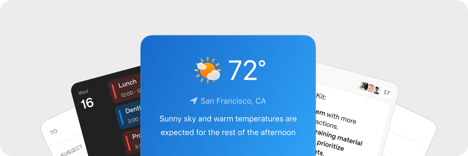
Widgets are the containers and components that come with ChatKit. You can use prebuilt widgets, modify templates, or design your own to fully customize ChatKit in your product.
Design widgets quickly
Use the Widget Builder in ChatKit Studio to experiment with card layouts, list rows, and preview components. When you have a design you like, copy the generated JSON into your integration and serve it from your backend.
Upload assets
Upload assets to customize ChatKit widgets to match your product. ChatKit expects uploads (files and images) to be hosted by your backend before they are referenced in a message. Follow the upload guide in the Python SDK for a reference implementation.
ChatKit widgets can surface context, shortcuts, and interactive cards directly in the conversation. When a user clicks a widget button, your application receives a custom action payload so you can respond from your backend.
Handle actions on your server
Widget actions allow users to trigger logic from the UI. Actions can be bound to different events on various widget nodes (e.g., button clicks) and then handled by your server or client integration.
Capture widget events with the onAction callback from WidgetsOption or equivalent React hook. Forward the action payload to your backend to handle actions.
1
2
3
4
5
6
7
8
9
10
11
chatkit.setOptions({
  widgets: {
    async onAction(action, item) {
      await fetch("/api/widget-action", {
        method: "POST",
        headers: { "Content-Type": "application/json" },
        body: JSON.stringify({ action, itemId: item.id }),
      });
    },
  },
});
Looking for a full server example? See the ChatKit Python SDK docs for an end-to-end walkthrough.
Learn more in the actions docs.
Reference
We recommend getting started with the visual builders and tools above. Use the rest of this documentation to learn how widgets work and see all options.
Widgets are constructed with a single container (WidgetRoot), which contains many components (WidgetNode).
Containers (WidgetRoot)
Containers have specific characteristics, like display status indicator text and primary actions.
-
Card - A bounded container for widgets. Supports
status,confirmandcancelfields for presenting status indicators and action buttons below the widget.children: list[WidgetNode]size: “sm” | “md” | “lg” | “full” (default: “md”)padding: float | str | dict[str, float | str] | None (keys:top,right,bottom,left,x,y)background: str |{ dark: str, light: str }| Nonestatus:{ text: str, favicon?: str }|{ text: str, icon?: str }| Nonecollapsed: bool | NoneasForm: bool | Noneconfirm:{ label: str, action: ActionConfig }| Nonecancel:{ label: str, action: ActionConfig }| Nonetheme: “light” | “dark” | Nonekey: str | None
-
ListView – Displays a vertical list of items, each as a
ListViewItem.children: list[ListViewItem]limit: int | “auto” | Nonestatus:{ text: str, favicon?: str }|{ text: str, icon?: str }| Nonetheme: “light” | “dark” | Nonekey: str | None
Components (WidgetNode)
The following widget types are supported. You can also browse components and use an interactive editor in the components section of the Widget Builder.
-
Badge – A small label for status or metadata.
label: strcolor: “secondary” | “success” | “danger” | “warning” | “info” | “discovery” | Nonevariant: “solid” | “soft” | “outline” | Nonepill: bool | Nonesize: “sm” | “md” | “lg” | Nonekey: str | None
-
Box – A flexible container for layout, supports direction, spacing, and styling.
children: list[WidgetNode] | Nonedirection: “row” | “column” | Nonealign: “start” | “center” | “end” | “baseline” | “stretch” | Nonejustify: “start” | “center” | “end” | “stretch” | “between” | “around” | “evenly” | Nonewrap: “nowrap” | “wrap” | “wrap-reverse” | Noneflex: int | str | Noneheight: float | str | Nonewidth: float | str | NoneminHeight: int | str | NoneminWidth: int | str | NonemaxHeight: int | str | NonemaxWidth: int | str | Nonesize: float | str | NoneminSize: int | str | NonemaxSize: int | str | Nonegap: int | str | Nonepadding: float | str | dict[str, float | str] | None (keys:top,right,bottom,left,x,y)margin: float | str | dict[str, float | str] | None (keys:top,right,bottom,left,x,y)border: int |dict[str, Any]| None (single border:{ size: int, color?: str|{ dark: str, light: str }, style?: “solid” | “dashed” | “dotted” | “double” | “groove” | “ridge” | “inset” | “outset” }per-side:{ top?: int|dict, right?: int|dict, bottom?: int|dict, left?: int|dict, x?: int|dict, y?: int|dict })radius: “2xs” | “xs” | “sm” | “md” | “lg” | “xl” | “2xl” | “3xl” | “4xl” | “full” | “100%” | “none” | Nonebackground: str |{ dark: str, light: str }| NoneaspectRatio: float | str | Nonekey: str | None
-
Row – Arranges children horizontally.
children: list[WidgetNode] | Nonegap: int | str | Nonepadding: float | str | dict[str, float | str] | None (keys:top,right,bottom,left,x,y)align: “start” | “center” | “end” | “baseline” | “stretch” | Nonejustify: “start” | “center” | “end” | “stretch” | “between” | “around” | “evenly” | Noneflex: int | str | Noneheight: float | str | Nonewidth: float | str | NoneminHeight: int | str | NoneminWidth: int | str | NonemaxHeight: int | str | NonemaxWidth: int | str | Nonesize: float | str | NoneminSize: int | str | NonemaxSize: int | str | Nonemargin: float | str | dict[str, float | str] | None (keys:top,right,bottom,left,x,y)border: int | dict[str, Any] | None (single border:{ size: int, color?: str | { dark: str, light: str }, style?: "solid" | "dashed" | "dotted" | "double" | "groove" | "ridge" | "inset" | "outset" }per-side:{ top?: int|dict, right?: int|dict, bottom?: int|dict, left?: int|dict, x?: int|dict, y?: int|dict })radius: “2xs” | “xs” | “sm” | “md” | “lg” | “xl” | “2xl” | “3xl” | “4xl” | “full” | “100%” | “none” | Nonebackground: str |{ dark: str, light: str }| NoneaspectRatio: float | str | Nonekey: str | None
-
Col – Arranges children vertically.
children: list[WidgetNode] | Nonegap: int | str | Nonepadding: float | str | dict[str, float | str] | None (keys:top,right,bottom,left,x,y)align: “start” | “center” | “end” | “baseline” | “stretch” | Nonejustify: “start” | “center” | “end” | “stretch” | “between” | “around” | “evenly” | Nonewrap: “nowrap” | “wrap” | “wrap-reverse” | Noneflex: int | str | Noneheight: float | str | Nonewidth: float | str | NoneminHeight: int | str | NoneminWidth: int | str | NonemaxHeight: int | str | NonemaxWidth: int | str | Nonesize: float | str | NoneminSize: int | str | NonemaxSize: int | str | Nonemargin: float | str | dict[str, float | str] | None (keys:top,right,bottom,left,x,y)border: int | dict[str, Any] | None (single border:{ size: int, color?: str | { dark: str, light: str }, style?: "solid" | "dashed" | "dotted" | "double" | "groove" | "ridge" | "inset" | "outset" }per-side:{ top?: int|dict, right?: int|dict, bottom?: int|dict, left?: int|dict, x?: int|dict, y?: int|dict })radius: “2xs” | “xs” | “sm” | “md” | “lg” | “xl” | “2xl” | “3xl” | “4xl” | “full” | “100%” | “none” | Nonebackground: str |{ dark: str, light: str }| NoneaspectRatio: float | str | Nonekey: str | None
-
Button – A flexible action button.
submit: bool | Nonestyle: “primary” | “secondary” | Nonelabel: stronClickAction: ActionConfigiconStart: str | NoneiconEnd: str | Nonecolor: “primary” | “secondary” | “info” | “discovery” | “success” | “caution” | “warning” | “danger” | Nonevariant: “solid” | “soft” | “outline” | “ghost” | Nonesize: “3xs” | “2xs” | “xs” | “sm” | “md” | “lg” | “xl” | “2xl” | “3xl” | Nonepill: bool | Noneblock: bool | Noneuniform: bool | NoneiconSize: “sm” | “md” | “lg” | “xl” | “2xl” | Nonekey: str | None
-
Caption – Smaller, supporting text.
value: strsize: “sm” | “md” | “lg” | Noneweight: “normal” | “medium” | “semibold” | “bold” | NonetextAlign: “start” | “center” | “end” | Nonecolor: str |{ dark: str, light: str }| Nonetruncate: bool | NonemaxLines: int | Nonekey: str | None
-
DatePicker – A date input with a dropdown calendar.
onChangeAction: ActionConfig | Nonename: strmin: datetime | Nonemax: datetime | Noneside: “top” | “bottom” | “left” | “right” | Nonealign: “start” | “center” | “end” | Noneplaceholder: str | NonedefaultValue: datetime | Nonevariant: “solid” | “soft” | “outline” | “ghost” | Nonesize: “3xs” | “2xs” | “xs” | “sm” | “md” | “lg” | “xl” | “2xl” | “3xl” | Nonepill: bool | Noneblock: bool | Noneclearable: bool | Nonedisabled: bool | Nonekey: str | None
-
Divider – A horizontal or vertical separator.
spacing: int | str | Nonecolor: str |{ dark: str, light: str }| Nonesize: int | str | Noneflush: bool | Nonekey: str | None
-
Icon – Displays an icon by name.
name: strcolor: str |{ dark: str, light: str }| Nonesize: “xs” | “sm” | “md” | “lg” | “xl” | Nonekey: str | None
-
Image – Displays an image with optional styling, fit, and position.
size: int | str | Noneheight: int | str | Nonewidth: int | str | NoneminHeight: int | str | NoneminWidth: int | str | NonemaxHeight: int | str | NonemaxWidth: int | str | NoneminSize: int | str | NonemaxSize: int | str | Noneradius: “2xs” | “xs” | “sm” | “md” | “lg” | “xl” | “2xl” | “3xl” | “4xl” | “full” | “100%” | “none” | Nonebackground: str |{ dark: str, light: str }| Nonemargin: int | str | dict[str, int | str] | None (keys:top,right,bottom,left,x,y)aspectRatio: float | str | Noneflex: int | str | Nonesrc: stralt: str | Nonefit: “none” | “cover” | “contain” | “fill” | “scale-down” | Noneposition: “center” | “top” | “bottom” | “left” | “right” | “top left” | “top right” | “bottom left” | “bottom right” | Noneframe: bool | Noneflush: bool | Nonekey: str | None
-
ListView – Displays a vertical list of items.
children: list[ListViewItem] | Nonelimit: int | “auto” | Nonestatus: dict[str, Any] | None (shape:{ text: str, favicon?: str })theme: “light” | “dark” | Nonekey: str | None
-
ListViewItem – An item in a
ListViewwith optional action.children: list[WidgetNode] | NoneonClickAction: ActionConfig | Nonegap: int | str | Nonealign: “start” | “center” | “end” | “baseline” | “stretch” | Nonekey: str | None
-
Markdown – Renders markdown-formatted text, supports streaming updates.
value: strstreaming: bool | Nonekey: str | None
-
Select – A dropdown single-select input.
options: list[dict[str, str]] (each option:{ label: str, value: str })onChangeAction: ActionConfig | Nonename: strplaceholder: str | NonedefaultValue: str | Nonevariant: “solid” | “soft” | “outline” | “ghost” | Nonesize: “3xs” | “2xs” | “xs” | “sm” | “md” | “lg” | “xl” | “2xl” | “3xl” | Nonepill: bool | Noneblock: bool | Noneclearable: bool | Nonedisabled: bool | Nonekey: str | None
-
Spacer – Flexible empty space used in layouts.
minSize: int | str | Nonekey: str | None
-
Text – Displays plain text (use
Markdownfor markdown rendering). Supports streaming updates.value: strcolor: str |{ dark: str, light: str }| Nonewidth: float | str | Nonesize: “xs” | “sm” | “md” | “lg” | “xl” | Noneweight: “normal” | “medium” | “semibold” | “bold” | NonetextAlign: “start” | “center” | “end” | Noneitalic: bool | NonelineThrough: bool | Nonetruncate: bool | NoneminLines: int | NonemaxLines: int | Nonestreaming: bool | Noneeditable: bool | dict[str, Any] | None (when dict:{ name: str, autoComplete?: str, autoFocus?: bool, autoSelect?: bool, allowAutofillExtensions?: bool, required?: bool, placeholder?: str, pattern?: str })key: str | None
-
Title – Prominent heading text.
value: strsize: “xs” | “sm” | “md” | “lg” | “xl” | “2xl” | “3xl” | “4xl” | “5xl” | Noneweight: “normal” | “medium” | “semibold” | “bold” | NonetextAlign: “start” | “center” | “end” | Nonecolor: str |{ dark: str, light: str }| Nonetruncate: bool | NonemaxLines: int | Nonekey: str | None
-
Form – A layout container that can submit an action.
onSubmitAction: ActionConfigchildren: list[WidgetNode] | Nonealign: “start” | “center” | “end” | “baseline” | “stretch” | Nonejustify: “start” | “center” | “end” | “stretch” | “between” | “around” | “evenly” | Noneflex: int | str | Nonegap: int | str | Noneheight: float | str | Nonewidth: float | str | NoneminHeight: int | str | NoneminWidth: int | str | NonemaxHeight: int | str | NonemaxWidth: int | str | Nonesize: float | str | NoneminSize: int | str | NonemaxSize: int | str | Nonepadding: float | str | dict[str, float | str] | None (keys:top,right,bottom,left,x,y)margin: float | str | dict[str, float | str] | None (keys:top,right,bottom,left,x,y)border: int | dict[str, Any] | None (single border:{ size: int, color?: str | { dark: str, light: str }, style?: "solid" | "dashed" | "dotted" | "double" | "groove" | "ridge" | "inset" | "outset" }per-side:{ top?: int|dict, right?: int|dict, bottom?: int|dict, left?: int|dict, x?: int|dict, y?: int|dict })radius: “2xs” | “xs” | “sm” | “md” | “lg” | “xl” | “2xl” | “3xl” | “4xl” | “full” | “100%” | “none” | Nonebackground: str |{ dark: str, light: str }| Nonekey: str | None
-
Transition – Wraps content that may animate.
children: WidgetNode | Nonekey: str | None