
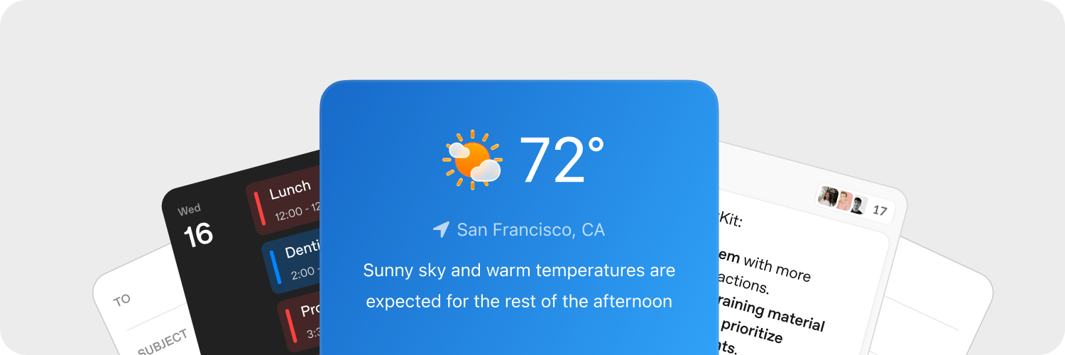
Widgets sind die Container und Komponenten, die ChatKit mitliefert. Du kannst fertige Widgets verwenden, Vorlagen anpassen oder eigene Widgets entwerfen. So kannst du ChatKit ganz auf dein Produkt abstimmen.
Widgets schnell entwerfen
Mit dem Widget Builder in ChatKit Studio kannst du Kartenlayouts und Listenzeilen ausprobieren und dir Komponenten in der Vorschau ansehen. Wenn dir ein Entwurf gefällt, kopiere das generierte JSON in deine Integration und stelle es über dein Backend bereit.
Dateien und Bilder hochladen
Lade Dateien und Bilder hoch, um ChatKit-Widgets an dein Produkt anzupassen. Für ChatKit muss dein Backend die hochgeladenen Dateien und Bilder bereitstellen, bevor du in einer Nachricht auf sie verweist. Eine Referenzimplementierung findest du in der Upload-Anleitung für das Python SDK.
ChatKit-Widgets können Kontext, Schnellzugriffe und interaktive Karten direkt im Chat anzeigen. Klickt jemand auf eine Schaltfläche im Widget, erhält deine Anwendung eine benutzerdefinierte Aktions-Payload. Darauf kannst du in deinem Backend reagieren.
Aktionen auf deinem Server verarbeiten
Über Widget-Aktionen können Personen direkt in der Benutzeroberfläche Anwendungslogik auslösen. Du kannst Aktionen an verschiedene Ereignisse auf unterschiedlichen Widget-Nodes binden, etwa an Klicks auf eine Schaltfläche. Die Aktionen kannst du anschließend auf deinem Server oder in deiner Client-Integration verarbeiten.
Erfasse Widget-Ereignisse mit dem onAction-Callback von WidgetsOption oder einem entsprechenden React-Hook. Leite die Aktions-Payload zur Verarbeitung an dein Backend weiter.
chatkit.setOptions({
widgets: {
async onAction(action, item) {
await fetch("/api/widget-action", {
method: "POST",
headers: { "Content-Type": "application/json" },
body: JSON.stringify({ action, itemId: item.id }),
});
},
},
});Suchst du ein vollständiges Serverbeispiel? Die Dokumentation zum ChatKit Python SDK führt dich Schritt für Schritt durch die gesamte Implementierung.
Mehr dazu findest du in der Dokumentation zu Aktionen.
Referenz
Für den Einstieg empfehlen wir die oben vorgestellten visuellen Editoren und Werkzeuge. Im Folgenden erfährst du, wie Widgets funktionieren und welche Optionen dir zur Verfügung stehen.
Jedes Widget hat genau einen Container (WidgetRoot), der mehrere Komponenten (WidgetNode) enthält.
Container (WidgetRoot)
Container haben eigene Eigenschaften. Sie können beispielsweise Statustext anzeigen und primäre Aktionen anbieten.
-
Card bildet einen abgegrenzten Bereich für Widgets. Mit den Feldern
status,confirmundcancelkannst du Statusanzeigen und Aktionsschaltflächen unter dem Widget anzeigen.children: list[WidgetNode]size: “sm” | “md” | “lg” | “full” (Standard: “md”)padding: float | str | dict[str, float | str] | None (Schlüssel:top,right,bottom,left,x,y)background: str |{ dark: str, light: str }| Nonestatus:{ text: str, favicon?: str }|{ text: str, icon?: str }| Nonecollapsed: bool | NoneasForm: bool | Noneconfirm:{ label: str, action: ActionConfig }| Nonecancel:{ label: str, action: ActionConfig }| Nonetheme: “light” | “dark” | Nonekey: str | None
-
ListView zeigt eine vertikale Liste an, in der jeder Eintrag ein
ListViewItemist.children: list[ListViewItem]limit: int | “auto” | Nonestatus:{ text: str, favicon?: str }|{ text: str, icon?: str }| Nonetheme: “light” | “dark” | Nonekey: str | None
Komponenten (WidgetNode)
ChatKit unterstützt die folgenden Widget-Typen. In der Komponentenübersicht des Widget Builders kannst du die Komponenten auch durchsehen und in einem interaktiven Editor ausprobieren.
-
Badge zeigt eine kleine Beschriftung für Statusangaben oder Metadaten an.
label: strcolor: “secondary” | “success” | “danger” | “warning” | “info” | “discovery” | Nonevariant: “solid” | “soft” | “outline” | Nonepill: bool | Nonesize: “sm” | “md” | “lg” | Nonekey: str | None
-
Box ist ein flexibler Layout-Container, bei dem du Richtung, Abstände und Darstellung festlegen kannst.
children: list[WidgetNode] | Nonedirection: “row” | “column” | Nonealign: “start” | “center” | “end” | “baseline” | “stretch” | Nonejustify: “start” | “center” | “end” | “stretch” | “between” | “around” | “evenly” | Nonewrap: “nowrap” | “wrap” | “wrap-reverse” | Noneflex: int | str | Noneheight: float | str | Nonewidth: float | str | NoneminHeight: int | str | NoneminWidth: int | str | NonemaxHeight: int | str | NonemaxWidth: int | str | Nonesize: float | str | NoneminSize: int | str | NonemaxSize: int | str | Nonegap: int | str | Nonepadding: float | str | dict[str, float | str] | None (Schlüssel:top,right,bottom,left,x,y)margin: float | str | dict[str, float | str] | None (Schlüssel:top,right,bottom,left,x,y)border: int |dict[str, Any]| None (einheitlicher Rahmen:{ size: int, color?: str|{ dark: str, light: str }, style?: “solid” | “dashed” | “dotted” | “double” | “groove” | “ridge” | “inset” | “outset” }per-side:{ top?: int|dict, right?: int|dict, bottom?: int|dict, left?: int|dict, x?: int|dict, y?: int|dict })radius: “2xs” | “xs” | “sm” | “md” | “lg” | “xl” | “2xl” | “3xl” | “4xl” | “full” | “100%” | “none” | Nonebackground: str |{ dark: str, light: str }| NoneaspectRatio: float | str | Nonekey: str | None
-
Row ordnet untergeordnete Elemente horizontal an.
children: list[WidgetNode] | Nonegap: int | str | Nonepadding: float | str | dict[str, float | str] | None (Schlüssel:top,right,bottom,left,x,y)align: “start” | “center” | “end” | “baseline” | “stretch” | Nonejustify: “start” | “center” | “end” | “stretch” | “between” | “around” | “evenly” | Noneflex: int | str | Noneheight: float | str | Nonewidth: float | str | NoneminHeight: int | str | NoneminWidth: int | str | NonemaxHeight: int | str | NonemaxWidth: int | str | Nonesize: float | str | NoneminSize: int | str | NonemaxSize: int | str | Nonemargin: float | str | dict[str, float | str] | None (Schlüssel:top,right,bottom,left,x,y)border: int | dict[str, Any] | None (einheitlicher Rahmen:{ size: int, color?: str | { dark: str, light: str }, style?: "solid" | "dashed" | "dotted" | "double" | "groove" | "ridge" | "inset" | "outset" }je Seite:{ top?: int|dict, right?: int|dict, bottom?: int|dict, left?: int|dict, x?: int|dict, y?: int|dict })radius: “2xs” | “xs” | “sm” | “md” | “lg” | “xl” | “2xl” | “3xl” | “4xl” | “full” | “100%” | “none” | Nonebackground: str |{ dark: str, light: str }| NoneaspectRatio: float | str | Nonekey: str | None
-
Col ordnet untergeordnete Elemente vertikal an.
children: list[WidgetNode] | Nonegap: int | str | Nonepadding: float | str | dict[str, float | str] | None (Schlüssel:top,right,bottom,left,x,y)align: “start” | “center” | “end” | “baseline” | “stretch” | Nonejustify: “start” | “center” | “end” | “stretch” | “between” | “around” | “evenly” | Nonewrap: “nowrap” | “wrap” | “wrap-reverse” | Noneflex: int | str | Noneheight: float | str | Nonewidth: float | str | NoneminHeight: int | str | NoneminWidth: int | str | NonemaxHeight: int | str | NonemaxWidth: int | str | Nonesize: float | str | NoneminSize: int | str | NonemaxSize: int | str | Nonemargin: float | str | dict[str, float | str] | None (Schlüssel:top,right,bottom,left,x,y)border: int | dict[str, Any] | None (einheitlicher Rahmen:{ size: int, color?: str | { dark: str, light: str }, style?: "solid" | "dashed" | "dotted" | "double" | "groove" | "ridge" | "inset" | "outset" }je Seite:{ top?: int|dict, right?: int|dict, bottom?: int|dict, left?: int|dict, x?: int|dict, y?: int|dict })radius: “2xs” | “xs” | “sm” | “md” | “lg” | “xl” | “2xl” | “3xl” | “4xl” | “full” | “100%” | “none” | Nonebackground: str |{ dark: str, light: str }| NoneaspectRatio: float | str | Nonekey: str | None
-
Button ist eine flexibel konfigurierbare Aktionsschaltfläche.
submit: bool | Nonestyle: “primary” | “secondary” | Nonelabel: stronClickAction: ActionConfigiconStart: str | NoneiconEnd: str | Nonecolor: “primary” | “secondary” | “info” | “discovery” | “success” | “caution” | “warning” | “danger” | Nonevariant: “solid” | “soft” | “outline” | “ghost” | Nonesize: “3xs” | “2xs” | “xs” | “sm” | “md” | “lg” | “xl” | “2xl” | “3xl” | Nonepill: bool | Noneblock: bool | Noneuniform: bool | NoneiconSize: “sm” | “md” | “lg” | “xl” | “2xl” | Nonekey: str | None
-
Caption zeigt ergänzenden Text in kleinerer Schrift an.
value: strsize: “sm” | “md” | “lg” | Noneweight: “normal” | “medium” | “semibold” | “bold” | NonetextAlign: “start” | “center” | “end” | Nonecolor: str |{ dark: str, light: str }| Nonetruncate: bool | NonemaxLines: int | Nonekey: str | None
-
DatePicker ist ein Eingabefeld für Datumsangaben mit ausklappbarem Kalender.
onChangeAction: ActionConfig | Nonename: strmin: datetime | Nonemax: datetime | Noneside: “top” | “bottom” | “left” | “right” | Nonealign: “start” | “center” | “end” | Noneplaceholder: str | NonedefaultValue: datetime | Nonevariant: “solid” | “soft” | “outline” | “ghost” | Nonesize: “3xs” | “2xs” | “xs” | “sm” | “md” | “lg” | “xl” | “2xl” | “3xl” | Nonepill: bool | Noneblock: bool | Noneclearable: bool | Nonedisabled: bool | Nonekey: str | None
-
Divider zeigt eine horizontale oder vertikale Trennlinie an.
spacing: int | str | Nonecolor: str |{ dark: str, light: str }| Nonesize: int | str | Noneflush: bool | Nonekey: str | None
-
Icon zeigt das Symbol mit dem angegebenen Namen an.
name: strcolor: str |{ dark: str, light: str }| Nonesize: “xs” | “sm” | “md” | “lg” | “xl” | Nonekey: str | None
-
Image zeigt ein Bild an. Optional kannst du festlegen, wie es aussieht, wie es in den verfügbaren Platz eingepasst wird und wo es erscheint.
size: int | str | Noneheight: int | str | Nonewidth: int | str | NoneminHeight: int | str | NoneminWidth: int | str | NonemaxHeight: int | str | NonemaxWidth: int | str | NoneminSize: int | str | NonemaxSize: int | str | Noneradius: “2xs” | “xs” | “sm” | “md” | “lg” | “xl” | “2xl” | “3xl” | “4xl” | “full” | “100%” | “none” | Nonebackground: str |{ dark: str, light: str }| Nonemargin: int | str | dict[str, int | str] | None (Schlüssel:top,right,bottom,left,x,y)aspectRatio: float | str | Noneflex: int | str | Nonesrc: stralt: str | Nonefit: “none” | “cover” | “contain” | “fill” | “scale-down” | Noneposition: “center” | “top” | “bottom” | “left” | “right” | “top left” | “top right” | “bottom left” | “bottom right” | Noneframe: bool | Noneflush: bool | Nonekey: str | None
-
ListView zeigt Einträge als vertikale Liste an.
children: list[ListViewItem] | Nonelimit: int | “auto” | Nonestatus: dict[str, Any] | None (Struktur:{ text: str, favicon?: str })theme: “light” | “dark” | Nonekey: str | None
-
ListViewItem ist ein Eintrag in einer
ListView, dem du optional eine Aktion zuweisen kannst.children: list[WidgetNode] | NoneonClickAction: ActionConfig | Nonegap: int | str | Nonealign: “start” | “center” | “end” | “baseline” | “stretch” | Nonekey: str | None
-
Markdown stellt Text mit Markdown-Formatierung dar und unterstützt Aktualisierungen per Streaming.
value: strstreaming: bool | Nonekey: str | None
-
Select ist eine Dropdown-Liste zur Auswahl einer einzelnen Option.
options: list[dict[str, str]] (je Option:{ label: str, value: str })onChangeAction: ActionConfig | Nonename: strplaceholder: str | NonedefaultValue: str | Nonevariant: “solid” | “soft” | “outline” | “ghost” | Nonesize: “3xs” | “2xs” | “xs” | “sm” | “md” | “lg” | “xl” | “2xl” | “3xl” | Nonepill: bool | Noneblock: bool | Noneclearable: bool | Nonedisabled: bool | Nonekey: str | None
-
Spacer fügt einen flexiblen Zwischenraum in ein Layout ein.
minSize: int | str | Nonekey: str | None
-
Text zeigt unformatierten Text an (verwende
Markdownfür die Darstellung von Markdown). Die Komponente unterstützt Aktualisierungen per Streaming.value: strcolor: str |{ dark: str, light: str }| Nonewidth: float | str | Nonesize: “xs” | “sm” | “md” | “lg” | “xl” | Noneweight: “normal” | “medium” | “semibold” | “bold” | NonetextAlign: “start” | “center” | “end” | Noneitalic: bool | NonelineThrough: bool | Nonetruncate: bool | NoneminLines: int | NonemaxLines: int | Nonestreaming: bool | Noneeditable: bool | dict[str, Any] | None (bei Verwendung eines dict:{ name: str, autoComplete?: str, autoFocus?: bool, autoSelect?: bool, allowAutofillExtensions?: bool, required?: bool, placeholder?: str, pattern?: str })key: str | None
-
Title zeigt eine hervorgehobene Überschrift an.
value: strsize: “xs” | “sm” | “md” | “lg” | “xl” | “2xl” | “3xl” | “4xl” | “5xl” | Noneweight: “normal” | “medium” | “semibold” | “bold” | NonetextAlign: “start” | “center” | “end” | Nonecolor: str |{ dark: str, light: str }| Nonetruncate: bool | NonemaxLines: int | Nonekey: str | None
-
Form ist ein Layout-Container, der beim Absenden eine Aktion auslösen kann.
onSubmitAction: ActionConfigchildren: list[WidgetNode] | Nonealign: “start” | “center” | “end” | “baseline” | “stretch” | Nonejustify: “start” | “center” | “end” | “stretch” | “between” | “around” | “evenly” | Noneflex: int | str | Nonegap: int | str | Noneheight: float | str | Nonewidth: float | str | NoneminHeight: int | str | NoneminWidth: int | str | NonemaxHeight: int | str | NonemaxWidth: int | str | Nonesize: float | str | NoneminSize: int | str | NonemaxSize: int | str | Nonepadding: float | str | dict[str, float | str] | None (Schlüssel:top,right,bottom,left,x,y)margin: float | str | dict[str, float | str] | None (Schlüssel:top,right,bottom,left,x,y)border: int | dict[str, Any] | None (einheitlicher Rahmen:{ size: int, color?: str | { dark: str, light: str }, style?: "solid" | "dashed" | "dotted" | "double" | "groove" | "ridge" | "inset" | "outset" }je Seite:{ top?: int|dict, right?: int|dict, bottom?: int|dict, left?: int|dict, x?: int|dict, y?: int|dict })radius: “2xs” | “xs” | “sm” | “md” | “lg” | “xl” | “2xl” | “3xl” | “4xl” | “full” | “100%” | “none” | Nonebackground: str |{ dark: str, light: str }| Nonekey: str | None
-
Transition umschließt Inhalte, die animiert werden können.
children: WidgetNode | Nonekey: str | None