
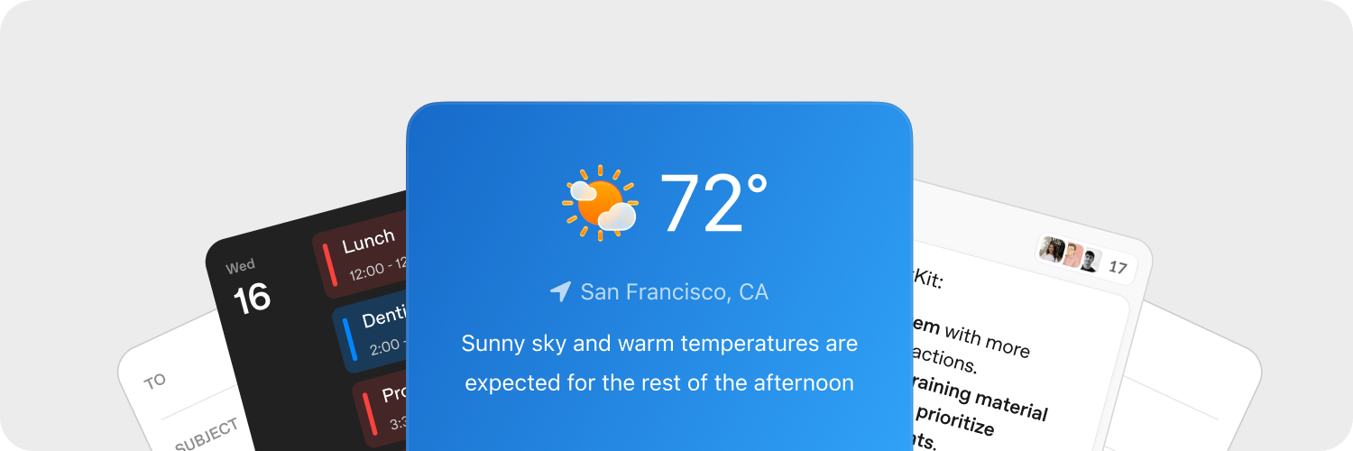
ChatKit 提供的小工具包含容器和元件。你可以使用現成的小工具、修改範本,或自行設計小工具,依產品需求完整自訂 ChatKit。
快速設計小工具
使用 ChatKit Studio 的小工具建構器嘗試不同的卡片版面和清單列配置,並預覽元件。選定設計後,將產生的 JSON 複製到整合程式碼中,再由後端提供這份 JSON。
上傳素材
你可以上傳素材,自訂 ChatKit 小工具的外觀,使其與產品風格一致。使用 ChatKit 時,上傳的檔案和圖片必須先由你的後端託管,才能在訊息中引用。實作方式可參考 Python SDK 上傳指南。
ChatKit 小工具可以直接在對話中顯示上下文、捷徑和互動式卡片。使用者點擊小工具中的按鈕時,應用程式會收到自訂動作的酬載,你就能從後端回應。
在伺服器上處理動作
使用者可以透過介面觸發小工具動作,執行應用程式邏輯。你可以將動作繫結至各個小工具節點上的不同事件(例如點擊按鈕),再由伺服器或用戶端的整合程式碼處理。
使用 onAction 回呼來接收小工具事件。你可以透過 WidgetsOption 或對應的 React Hook 設定這個回呼。將動作酬載轉送至後端,由後端處理動作。
chatkit.setOptions({
widgets: {
async onAction(action, item) {
await fetch("/api/widget-action", {
method: "POST",
headers: { "Content-Type": "application/json" },
body: JSON.stringify({ action, itemId: item.id }),
});
},
},
});需要完整的伺服器範例嗎?請參閱 ChatKit Python SDK 文件,逐步瞭解完整的實作流程。
如需更多資訊,請參閱動作文件。
參考資料
建議先從上述視覺化建構器和工具著手。以下說明小工具的運作方式,並列出所有可用選項。
每個小工具都由單一容器(WidgetRoot)構成,容器中可包含多個元件(WidgetNode)。
容器(WidgetRoot)
各種容器提供不同功能,例如顯示狀態指示文字和主要動作。
-
Card – 具有明確邊界的小工具容器。支援
status、confirm和cancel欄位,可在小工具下方顯示狀態指示和動作按鈕。children: list[WidgetNode]size: “sm” | “md” | “lg” | “full”(預設值為 “md”)padding: float | str | dict[str, float | str] | None (鍵:top、right、bottom、left、x、y)background: str |{ dark: str, light: str }| Nonestatus:{ text: str, favicon?: str }|{ text: str, icon?: str }| Nonecollapsed: bool | NoneasForm: bool | Noneconfirm:{ label: str, action: ActionConfig }| Nonecancel:{ label: str, action: ActionConfig }| Nonetheme: “light” | “dark” | Nonekey: str | None
-
ListView – 垂直顯示清單,每個項目都是一個
ListViewItem。children: list[ListViewItem]limit: int | “auto” | Nonestatus:{ text: str, favicon?: str }|{ text: str, icon?: str }| Nonetheme: “light” | “dark” | Nonekey: str | None
元件(WidgetNode)
ChatKit 支援以下小工具類型。你也可以在小工具建構器的元件區瀏覽元件,並使用互動式編輯器。
-
Badge – 用來顯示狀態或中繼資料的小標籤。
label: strcolor: “secondary” | “success” | “danger” | “warning” | “info” | “discovery” | Nonevariant: “solid” | “soft” | “outline” | Nonepill: bool | Nonesize: “sm” | “md” | “lg” | Nonekey: str | None
-
Box – 可彈性配置版面的容器,支援設定排列方向、間距和樣式。
children: list[WidgetNode] | Nonedirection: “row” | “column” | Nonealign: “start” | “center” | “end” | “baseline” | “stretch” | Nonejustify: “start” | “center” | “end” | “stretch” | “between” | “around” | “evenly” | Nonewrap: “nowrap” | “wrap” | “wrap-reverse” | Noneflex: int | str | Noneheight: float | str | Nonewidth: float | str | NoneminHeight: int | str | NoneminWidth: int | str | NonemaxHeight: int | str | NonemaxWidth: int | str | Nonesize: float | str | NoneminSize: int | str | NonemaxSize: int | str | Nonegap: int | str | Nonepadding: float | str | dict[str, float | str] | None (鍵:top、right、bottom、left、x、y)margin: float | str | dict[str, float | str] | None (鍵:top、right、bottom、left、x、y)border: int |dict[str, Any]| None (統一設定邊框:{ size: int, color?: str|{ dark: str, light: str }, style?: “solid” | “dashed” | “dotted” | “double” | “groove” | “ridge” | “inset” | “outset” }per-side:{ top?: int|dict, right?: int|dict, bottom?: int|dict, left?: int|dict, x?: int|dict, y?: int|dict })radius: “2xs” | “xs” | “sm” | “md” | “lg” | “xl” | “2xl” | “3xl” | “4xl” | “full” | “100%” | “none” | Nonebackground: str |{ dark: str, light: str }| NoneaspectRatio: float | str | Nonekey: str | None
-
Row – 水平排列子元件。
children: list[WidgetNode] | Nonegap: int | str | Nonepadding: float | str | dict[str, float | str] | None (鍵:top、right、bottom、left、x、y)align: “start” | “center” | “end” | “baseline” | “stretch” | Nonejustify: “start” | “center” | “end” | “stretch” | “between” | “around” | “evenly” | Noneflex: int | str | Noneheight: float | str | Nonewidth: float | str | NoneminHeight: int | str | NoneminWidth: int | str | NonemaxHeight: int | str | NonemaxWidth: int | str | Nonesize: float | str | NoneminSize: int | str | NonemaxSize: int | str | Nonemargin: float | str | dict[str, float | str] | None (鍵:top、right、bottom、left、x、y)border: int | dict[str, Any] | None (統一設定邊框:{ size: int, color?: str | { dark: str, light: str }, style?: "solid" | "dashed" | "dotted" | "double" | "groove" | "ridge" | "inset" | "outset" }分別設定各邊:{ top?: int|dict, right?: int|dict, bottom?: int|dict, left?: int|dict, x?: int|dict, y?: int|dict })radius: “2xs” | “xs” | “sm” | “md” | “lg” | “xl” | “2xl” | “3xl” | “4xl” | “full” | “100%” | “none” | Nonebackground: str |{ dark: str, light: str }| NoneaspectRatio: float | str | Nonekey: str | None
-
Col – 垂直排列子元件。
children: list[WidgetNode] | Nonegap: int | str | Nonepadding: float | str | dict[str, float | str] | None (鍵:top、right、bottom、left、x、y)align: “start” | “center” | “end” | “baseline” | “stretch” | Nonejustify: “start” | “center” | “end” | “stretch” | “between” | “around” | “evenly” | Nonewrap: “nowrap” | “wrap” | “wrap-reverse” | Noneflex: int | str | Noneheight: float | str | Nonewidth: float | str | NoneminHeight: int | str | NoneminWidth: int | str | NonemaxHeight: int | str | NonemaxWidth: int | str | Nonesize: float | str | NoneminSize: int | str | NonemaxSize: int | str | Nonemargin: float | str | dict[str, float | str] | None (鍵:top、right、bottom、left、x、y)border: int | dict[str, Any] | None (統一設定邊框:{ size: int, color?: str | { dark: str, light: str }, style?: "solid" | "dashed" | "dotted" | "double" | "groove" | "ridge" | "inset" | "outset" }分別設定各邊:{ top?: int|dict, right?: int|dict, bottom?: int|dict, left?: int|dict, x?: int|dict, y?: int|dict })radius: “2xs” | “xs” | “sm” | “md” | “lg” | “xl” | “2xl” | “3xl” | “4xl” | “full” | “100%” | “none” | Nonebackground: str |{ dark: str, light: str }| NoneaspectRatio: float | str | Nonekey: str | None
-
Button – 可彈性設定的動作按鈕。
submit: bool | Nonestyle: “primary” | “secondary” | Nonelabel: stronClickAction: ActionConfigiconStart: str | NoneiconEnd: str | Nonecolor: “primary” | “secondary” | “info” | “discovery” | “success” | “caution” | “warning” | “danger” | Nonevariant: “solid” | “soft” | “outline” | “ghost” | Nonesize: “3xs” | “2xs” | “xs” | “sm” | “md” | “lg” | “xl” | “2xl” | “3xl” | Nonepill: bool | Noneblock: bool | Noneuniform: bool | NoneiconSize: “sm” | “md” | “lg” | “xl” | “2xl” | Nonekey: str | None
-
Caption – 以較小字級顯示輔助說明。
value: strsize: “sm” | “md” | “lg” | Noneweight: “normal” | “medium” | “semibold” | “bold” | NonetextAlign: “start” | “center” | “end” | Nonecolor: str |{ dark: str, light: str }| Nonetruncate: bool | NonemaxLines: int | Nonekey: str | None
-
DatePicker – 附有下拉式日曆的日期輸入欄位。
onChangeAction: ActionConfig | Nonename: strmin: datetime | Nonemax: datetime | Noneside: “top” | “bottom” | “left” | “right” | Nonealign: “start” | “center” | “end” | Noneplaceholder: str | NonedefaultValue: datetime | Nonevariant: “solid” | “soft” | “outline” | “ghost” | Nonesize: “3xs” | “2xs” | “xs” | “sm” | “md” | “lg” | “xl” | “2xl” | “3xl” | Nonepill: bool | Noneblock: bool | Noneclearable: bool | Nonedisabled: bool | Nonekey: str | None
-
Divider – 水平或垂直分隔線。
spacing: int | str | Nonecolor: str |{ dark: str, light: str }| Nonesize: int | str | Noneflush: bool | Nonekey: str | None
-
Icon – 依名稱顯示圖示。
name: strcolor: str |{ dark: str, light: str }| Nonesize: “xs” | “sm” | “md” | “lg” | “xl” | Nonekey: str | None
-
Image – 顯示圖片,可設定樣式、縮放方式和位置。
size: int | str | Noneheight: int | str | Nonewidth: int | str | NoneminHeight: int | str | NoneminWidth: int | str | NonemaxHeight: int | str | NonemaxWidth: int | str | NoneminSize: int | str | NonemaxSize: int | str | Noneradius: “2xs” | “xs” | “sm” | “md” | “lg” | “xl” | “2xl” | “3xl” | “4xl” | “full” | “100%” | “none” | Nonebackground: str |{ dark: str, light: str }| Nonemargin: int | str | dict[str, int | str] | None (鍵:top、right、bottom、left、x、y)aspectRatio: float | str | Noneflex: int | str | Nonesrc: stralt: str | Nonefit: “none” | “cover” | “contain” | “fill” | “scale-down” | Noneposition: “center” | “top” | “bottom” | “left” | “right” | “top left” | “top right” | “bottom left” | “bottom right” | Noneframe: bool | Noneflush: bool | Nonekey: str | None
-
ListView – 以垂直清單顯示項目。
children: list[ListViewItem] | Nonelimit: int | “auto” | Nonestatus: dict[str, Any] | None (結構:{ text: str, favicon?: str })theme: “light” | “dark” | Nonekey: str | None
-
ListViewItem –
ListView中的項目,可設定動作。children: list[WidgetNode] | NoneonClickAction: ActionConfig | Nonegap: int | str | Nonealign: “start” | “center” | “end” | “baseline” | “stretch” | Nonekey: str | None
-
Markdown – 呈現 Markdown 格式的文字,支援串流更新。
value: strstreaming: bool | Nonekey: str | None
-
Select – 下拉式單選欄位。
options: list[dict[str, str]] (每個選項的結構:{ label: str, value: str })onChangeAction: ActionConfig | Nonename: strplaceholder: str | NonedefaultValue: str | Nonevariant: “solid” | “soft” | “outline” | “ghost” | Nonesize: “3xs” | “2xs” | “xs” | “sm” | “md” | “lg” | “xl” | “2xl” | “3xl” | Nonepill: bool | Noneblock: bool | Noneclearable: bool | Nonedisabled: bool | Nonekey: str | None
-
Spacer – 在版面中保留可彈性調整的空白間距。
minSize: int | str | Nonekey: str | None
-
Text – 顯示純文字(若要呈現 Markdown 格式,請使用
Markdown)。支援串流更新。value: strcolor: str |{ dark: str, light: str }| Nonewidth: float | str | Nonesize: “xs” | “sm” | “md” | “lg” | “xl” | Noneweight: “normal” | “medium” | “semibold” | “bold” | NonetextAlign: “start” | “center” | “end” | Noneitalic: bool | NonelineThrough: bool | Nonetruncate: bool | NoneminLines: int | NonemaxLines: int | Nonestreaming: bool | Noneeditable: bool | dict[str, Any] | None (使用 dict 時的結構:{ name: str, autoComplete?: str, autoFocus?: bool, autoSelect?: bool, allowAutofillExtensions?: bool, required?: bool, placeholder?: str, pattern?: str })key: str | None
-
Title – 顯示醒目的標題文字。
value: strsize: “xs” | “sm” | “md” | “lg” | “xl” | “2xl” | “3xl” | “4xl” | “5xl” | Noneweight: “normal” | “medium” | “semibold” | “bold” | NonetextAlign: “start” | “center” | “end” | Nonecolor: str |{ dark: str, light: str }| Nonetruncate: bool | NonemaxLines: int | Nonekey: str | None
-
Form – 可提交動作的版面容器。
onSubmitAction: ActionConfigchildren: list[WidgetNode] | Nonealign: “start” | “center” | “end” | “baseline” | “stretch” | Nonejustify: “start” | “center” | “end” | “stretch” | “between” | “around” | “evenly” | Noneflex: int | str | Nonegap: int | str | Noneheight: float | str | Nonewidth: float | str | NoneminHeight: int | str | NoneminWidth: int | str | NonemaxHeight: int | str | NonemaxWidth: int | str | Nonesize: float | str | NoneminSize: int | str | NonemaxSize: int | str | Nonepadding: float | str | dict[str, float | str] | None (鍵:top、right、bottom、left、x、y)margin: float | str | dict[str, float | str] | None (鍵:top、right、bottom、left、x、y)border: int | dict[str, Any] | None (統一設定邊框:{ size: int, color?: str | { dark: str, light: str }, style?: "solid" | "dashed" | "dotted" | "double" | "groove" | "ridge" | "inset" | "outset" }分別設定各邊:{ top?: int|dict, right?: int|dict, bottom?: int|dict, left?: int|dict, x?: int|dict, y?: int|dict })radius: “2xs” | “xs” | “sm” | “md” | “lg” | “xl” | “2xl” | “3xl” | “4xl” | “full” | “100%” | “none” | Nonebackground: str |{ dark: str, light: str }| Nonekey: str | None
-
Transition – 包覆可套用動畫效果的內容。
children: WidgetNode | Nonekey: str | None