
Los widgets son los contenedores y componentes que incluye ChatKit. Puedes usar widgets prediseñados, modificar plantillas o diseñar tus propios widgets para personalizar por completo ChatKit en tu producto.
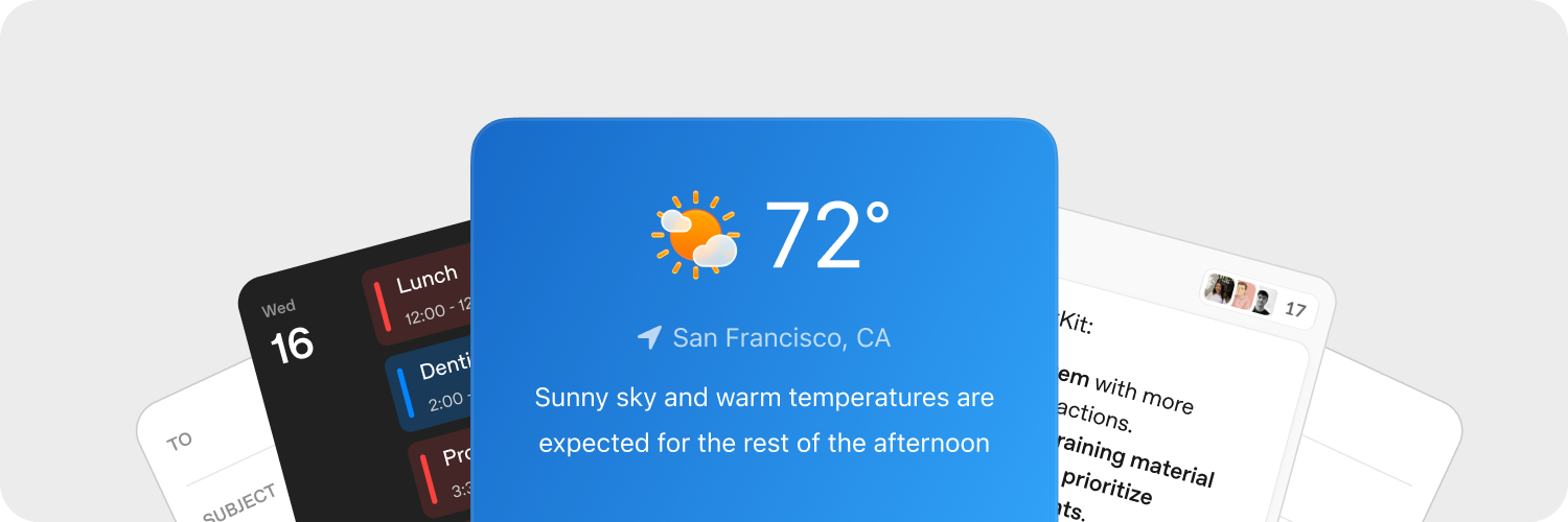
Diseña widgets rápidamente
Usa el Widget Builder de ChatKit Studio para probar distintos diseños de tarjetas y filas de listas y obtener una vista previa de los componentes. Cuando encuentres un diseño que te guste, copia el JSON generado en tu integración y sírvelo desde tu backend.
Sube recursos
Sube recursos para adaptar los widgets de ChatKit al diseño de tu producto. ChatKit requiere que alojes los archivos y las imágenes que subas en tu backend antes de hacer referencia a ellos en un mensaje. Consulta la guía de carga de archivos del SDK de Python para ver una implementación de referencia.
Los widgets de ChatKit pueden mostrar información de contexto, accesos directos y tarjetas interactivas directamente en la conversación. Cuando un usuario hace clic en un botón de un widget, tu aplicación recibe los datos de una acción personalizada para que puedas responder desde tu backend.
Procesa acciones en tu servidor
Con las acciones de los widgets, los usuarios pueden activar la lógica de tu aplicación desde la interfaz. Puedes asociar acciones a distintos eventos de los nodos de un widget (por ejemplo, al hacer clic en un botón) y procesarlas en tu servidor o en la integración del cliente.
Captura los eventos de los widgets con el callback onAction de WidgetsOption o con el hook equivalente de React. Envía los datos de la acción a tu backend para procesarla.
chatkit.setOptions({
widgets: {
async onAction(action, item) {
await fetch("/api/widget-action", {
method: "POST",
headers: { "Content-Type": "application/json" },
body: JSON.stringify({ action, itemId: item.id }),
});
},
},
});¿Buscas un ejemplo completo de servidor? Consulta la documentación del SDK de ChatKit para Python para seguir el proceso paso a paso, de principio a fin.
Encontrarás más información en la documentación sobre acciones.
Referencia
Te recomendamos empezar con los editores visuales y las herramientas anteriores. Consulta el resto de esta documentación para saber cómo funcionan los widgets y ver todas las opciones.
Cada widget se construye con un único contenedor (WidgetRoot) que contiene varios componentes (WidgetNode).
Contenedores (WidgetRoot)
Los contenedores tienen funciones específicas, como mostrar el texto de los indicadores de estado y las acciones principales.
-
Card - Contenedor con límites definidos para los widgets. Admite los campos
status,confirmycancelpara mostrar indicadores de estado y botones de acción debajo del widget.children: list[WidgetNode]size: “sm” | “md” | “lg” | “full” (valor predeterminado: “md”)padding: float | str | dict[str, float | str] | None (claves:top,right,bottom,left,x,y)background: str |{ dark: str, light: str }| Nonestatus:{ text: str, favicon?: str }|{ text: str, icon?: str }| Nonecollapsed: bool | NoneasForm: bool | Noneconfirm:{ label: str, action: ActionConfig }| Nonecancel:{ label: str, action: ActionConfig }| Nonetheme: “light” | “dark” | Nonekey: str | None
-
ListView – Muestra una lista vertical en la que cada elemento es un
ListViewItem.children: list[ListViewItem]limit: int | “auto” | Nonestatus:{ text: str, favicon?: str }|{ text: str, icon?: str }| Nonetheme: “light” | “dark” | Nonekey: str | None
Componentes (WidgetNode)
ChatKit admite los siguientes tipos de widgets. También puedes explorar los componentes y usar un editor interactivo en la sección de componentes del Widget Builder.
-
Badge – Etiqueta pequeña que muestra un estado o metadatos.
label: strcolor: “secondary” | “success” | “danger” | “warning” | “info” | “discovery” | Nonevariant: “solid” | “soft” | “outline” | Nonepill: bool | Nonesize: “sm” | “md” | “lg” | Nonekey: str | None
-
Box – Contenedor flexible que permite definir la dirección, el espaciado y el estilo de los elementos.
children: list[WidgetNode] | Nonedirection: “row” | “column” | Nonealign: “start” | “center” | “end” | “baseline” | “stretch” | Nonejustify: “start” | “center” | “end” | “stretch” | “between” | “around” | “evenly” | Nonewrap: “nowrap” | “wrap” | “wrap-reverse” | Noneflex: int | str | Noneheight: float | str | Nonewidth: float | str | NoneminHeight: int | str | NoneminWidth: int | str | NonemaxHeight: int | str | NonemaxWidth: int | str | Nonesize: float | str | NoneminSize: int | str | NonemaxSize: int | str | Nonegap: int | str | Nonepadding: float | str | dict[str, float | str] | None (claves:top,right,bottom,left,x,y)margin: float | str | dict[str, float | str] | None (claves:top,right,bottom,left,x,y)border: int |dict[str, Any]| None (borde único:{ size: int, color?: str|{ dark: str, light: str }, style?: “solid” | “dashed” | “dotted” | “double” | “groove” | “ridge” | “inset” | “outset” }per-side:{ top?: int|dict, right?: int|dict, bottom?: int|dict, left?: int|dict, x?: int|dict, y?: int|dict })radius: “2xs” | “xs” | “sm” | “md” | “lg” | “xl” | “2xl” | “3xl” | “4xl” | “full” | “100%” | “none” | Nonebackground: str |{ dark: str, light: str }| NoneaspectRatio: float | str | Nonekey: str | None
-
Row – Distribuye los elementos secundarios en sentido horizontal.
children: list[WidgetNode] | Nonegap: int | str | Nonepadding: float | str | dict[str, float | str] | None (claves:top,right,bottom,left,x,y)align: “start” | “center” | “end” | “baseline” | “stretch” | Nonejustify: “start” | “center” | “end” | “stretch” | “between” | “around” | “evenly” | Noneflex: int | str | Noneheight: float | str | Nonewidth: float | str | NoneminHeight: int | str | NoneminWidth: int | str | NonemaxHeight: int | str | NonemaxWidth: int | str | Nonesize: float | str | NoneminSize: int | str | NonemaxSize: int | str | Nonemargin: float | str | dict[str, float | str] | None (claves:top,right,bottom,left,x,y)border: int | dict[str, Any] | None (borde único:{ size: int, color?: str | { dark: str, light: str }, style?: "solid" | "dashed" | "dotted" | "double" | "groove" | "ridge" | "inset" | "outset" }por lado:{ top?: int|dict, right?: int|dict, bottom?: int|dict, left?: int|dict, x?: int|dict, y?: int|dict })radius: “2xs” | “xs” | “sm” | “md” | “lg” | “xl” | “2xl” | “3xl” | “4xl” | “full” | “100%” | “none” | Nonebackground: str |{ dark: str, light: str }| NoneaspectRatio: float | str | Nonekey: str | None
-
Col – Distribuye los elementos secundarios en sentido vertical.
children: list[WidgetNode] | Nonegap: int | str | Nonepadding: float | str | dict[str, float | str] | None (claves:top,right,bottom,left,x,y)align: “start” | “center” | “end” | “baseline” | “stretch” | Nonejustify: “start” | “center” | “end” | “stretch” | “between” | “around” | “evenly” | Nonewrap: “nowrap” | “wrap” | “wrap-reverse” | Noneflex: int | str | Noneheight: float | str | Nonewidth: float | str | NoneminHeight: int | str | NoneminWidth: int | str | NonemaxHeight: int | str | NonemaxWidth: int | str | Nonesize: float | str | NoneminSize: int | str | NonemaxSize: int | str | Nonemargin: float | str | dict[str, float | str] | None (claves:top,right,bottom,left,x,y)border: int | dict[str, Any] | None (borde único:{ size: int, color?: str | { dark: str, light: str }, style?: "solid" | "dashed" | "dotted" | "double" | "groove" | "ridge" | "inset" | "outset" }por lado:{ top?: int|dict, right?: int|dict, bottom?: int|dict, left?: int|dict, x?: int|dict, y?: int|dict })radius: “2xs” | “xs” | “sm” | “md” | “lg” | “xl” | “2xl” | “3xl” | “4xl” | “full” | “100%” | “none” | Nonebackground: str |{ dark: str, light: str }| NoneaspectRatio: float | str | Nonekey: str | None
-
Button – Botón de acción configurable.
submit: bool | Nonestyle: “primary” | “secondary” | Nonelabel: stronClickAction: ActionConfigiconStart: str | NoneiconEnd: str | Nonecolor: “primary” | “secondary” | “info” | “discovery” | “success” | “caution” | “warning” | “danger” | Nonevariant: “solid” | “soft” | “outline” | “ghost” | Nonesize: “3xs” | “2xs” | “xs” | “sm” | “md” | “lg” | “xl” | “2xl” | “3xl” | Nonepill: bool | Noneblock: bool | Noneuniform: bool | NoneiconSize: “sm” | “md” | “lg” | “xl” | “2xl” | Nonekey: str | None
-
Caption – Texto complementario de menor tamaño.
value: strsize: “sm” | “md” | “lg” | Noneweight: “normal” | “medium” | “semibold” | “bold” | NonetextAlign: “start” | “center” | “end” | Nonecolor: str |{ dark: str, light: str }| Nonetruncate: bool | NonemaxLines: int | Nonekey: str | None
-
DatePicker – Campo de fecha con un calendario desplegable.
onChangeAction: ActionConfig | Nonename: strmin: datetime | Nonemax: datetime | Noneside: “top” | “bottom” | “left” | “right” | Nonealign: “start” | “center” | “end” | Noneplaceholder: str | NonedefaultValue: datetime | Nonevariant: “solid” | “soft” | “outline” | “ghost” | Nonesize: “3xs” | “2xs” | “xs” | “sm” | “md” | “lg” | “xl” | “2xl” | “3xl” | Nonepill: bool | Noneblock: bool | Noneclearable: bool | Nonedisabled: bool | Nonekey: str | None
-
Divider – Separador horizontal o vertical.
spacing: int | str | Nonecolor: str |{ dark: str, light: str }| Nonesize: int | str | Noneflush: bool | Nonekey: str | None
-
Icon – Muestra el ícono que indiques por su nombre.
name: strcolor: str |{ dark: str, light: str }| Nonesize: “xs” | “sm” | “md” | “lg” | “xl” | Nonekey: str | None
-
Image – Muestra una imagen con opciones de estilo, ajuste y posición.
size: int | str | Noneheight: int | str | Nonewidth: int | str | NoneminHeight: int | str | NoneminWidth: int | str | NonemaxHeight: int | str | NonemaxWidth: int | str | NoneminSize: int | str | NonemaxSize: int | str | Noneradius: “2xs” | “xs” | “sm” | “md” | “lg” | “xl” | “2xl” | “3xl” | “4xl” | “full” | “100%” | “none” | Nonebackground: str |{ dark: str, light: str }| Nonemargin: int | str | dict[str, int | str] | None (claves:top,right,bottom,left,x,y)aspectRatio: float | str | Noneflex: int | str | Nonesrc: stralt: str | Nonefit: “none” | “cover” | “contain” | “fill” | “scale-down” | Noneposition: “center” | “top” | “bottom” | “left” | “right” | “top left” | “top right” | “bottom left” | “bottom right” | Noneframe: bool | Noneflush: bool | Nonekey: str | None
-
ListView – Muestra una lista vertical de elementos.
children: list[ListViewItem] | Nonelimit: int | “auto” | Nonestatus: dict[str, Any] | None (estructura:{ text: str, favicon?: str })theme: “light” | “dark” | Nonekey: str | None
-
ListViewItem – Elemento de una lista
ListViewcon una acción opcional.children: list[WidgetNode] | NoneonClickAction: ActionConfig | Nonegap: int | str | Nonealign: “start” | “center” | “end” | “baseline” | “stretch” | Nonekey: str | None
-
Markdown – Muestra texto con formato Markdown y admite actualizaciones en streaming.
value: strstreaming: bool | Nonekey: str | None
-
Select – Campo desplegable que permite seleccionar una sola opción.
options: list[dict[str, str]] (cada opción:{ label: str, value: str })onChangeAction: ActionConfig | Nonename: strplaceholder: str | NonedefaultValue: str | Nonevariant: “solid” | “soft” | “outline” | “ghost” | Nonesize: “3xs” | “2xs” | “xs” | “sm” | “md” | “lg” | “xl” | “2xl” | “3xl” | Nonepill: bool | Noneblock: bool | Noneclearable: bool | Nonedisabled: bool | Nonekey: str | None
-
Spacer – Espacio vacío flexible para separar elementos en un diseño.
minSize: int | str | Nonekey: str | None
-
Text – Muestra texto sin formato (usa
Markdownpara mostrar texto con formato Markdown). Admite actualizaciones en streaming.value: strcolor: str |{ dark: str, light: str }| Nonewidth: float | str | Nonesize: “xs” | “sm” | “md” | “lg” | “xl” | Noneweight: “normal” | “medium” | “semibold” | “bold” | NonetextAlign: “start” | “center” | “end” | Noneitalic: bool | NonelineThrough: bool | Nonetruncate: bool | NoneminLines: int | NonemaxLines: int | Nonestreaming: bool | Noneeditable: bool | dict[str, Any] | None (si es un diccionario:{ name: str, autoComplete?: str, autoFocus?: bool, autoSelect?: bool, allowAutofillExtensions?: bool, required?: bool, placeholder?: str, pattern?: str })key: str | None
-
Title – Texto destacado para encabezados.
value: strsize: “xs” | “sm” | “md” | “lg” | “xl” | “2xl” | “3xl” | “4xl” | “5xl” | Noneweight: “normal” | “medium” | “semibold” | “bold” | NonetextAlign: “start” | “center” | “end” | Nonecolor: str |{ dark: str, light: str }| Nonetruncate: bool | NonemaxLines: int | Nonekey: str | None
-
Form – Contenedor que organiza los elementos y puede enviar una acción.
onSubmitAction: ActionConfigchildren: list[WidgetNode] | Nonealign: “start” | “center” | “end” | “baseline” | “stretch” | Nonejustify: “start” | “center” | “end” | “stretch” | “between” | “around” | “evenly” | Noneflex: int | str | Nonegap: int | str | Noneheight: float | str | Nonewidth: float | str | NoneminHeight: int | str | NoneminWidth: int | str | NonemaxHeight: int | str | NonemaxWidth: int | str | Nonesize: float | str | NoneminSize: int | str | NonemaxSize: int | str | Nonepadding: float | str | dict[str, float | str] | None (claves:top,right,bottom,left,x,y)margin: float | str | dict[str, float | str] | None (claves:top,right,bottom,left,x,y)border: int | dict[str, Any] | None (borde único:{ size: int, color?: str | { dark: str, light: str }, style?: "solid" | "dashed" | "dotted" | "double" | "groove" | "ridge" | "inset" | "outset" }por lado:{ top?: int|dict, right?: int|dict, bottom?: int|dict, left?: int|dict, x?: int|dict, y?: int|dict })radius: “2xs” | “xs” | “sm” | “md” | “lg” | “xl” | “2xl” | “3xl” | “4xl” | “full” | “100%” | “none” | Nonebackground: str |{ dark: str, light: str }| Nonekey: str | None
-
Transition – Envuelve contenido que puede animarse.
children: WidgetNode | Nonekey: str | None