
GPT-5.4 desarrolla sitios web mejor que sus predecesores y genera frontends más atractivos y ambiciosos. En particular, entrenamos GPT-5.4 con énfasis en mejorar sus capacidades para crear interfaces de usuario y usar imágenes. Con la orientación adecuada, el modelo puede producir frontends listos para producción que incorporan detalles sutiles, interacciones bien logradas e imágenes hermosas.
El diseño web ofrece una gran variedad de resultados posibles. Un gran diseño equilibra la moderación con la creatividad: se apoya en patrones que han resistido el paso del tiempo e incorpora algo nuevo. GPT-5.4 ha aprendido esta amplia gama de enfoques de diseño y comprende muchas formas distintas de crear un sitio web.
Cuando los prompts no son lo suficientemente específicos, los modelos suelen recurrir a los patrones más frecuentes de los datos de entrenamiento. Algunos son convenciones probadas, pero muchos son simplemente hábitos sobrerrepresentados que queremos evitar. El resultado suele ser razonable y funcional, pero puede tender a una estructura genérica, una jerarquía visual débil y decisiones de diseño que no están a la altura de lo que imaginamos.
Esta guía explica técnicas prácticas para orientar a GPT-5.4 a crear los diseños que tienes en mente.
Mejoras del modelo
Aunque GPT-5.4 mejora en varios aspectos, para el trabajo de front-end nos enfocamos en tres mejoras prácticas:
- una mejor comprensión de imágenes durante todo el proceso de diseño
- aplicaciones y sitios web con funcionalidades más completas
- un mejor uso de herramientas para inspeccionar, probar y verificar su propio trabajo
Comprensión de imágenes y uso de herramientas
GPT-5.4 se entrenó para usar herramientas de búsqueda y generación de imágenes de forma nativa, lo que le permite incorporar el razonamiento visual directamente en su proceso de diseño. Para obtener los mejores resultados, indica al modelo que primero genere un tablero de inspiración o varias opciones visuales antes de seleccionar los recursos finales.
Puedes orientar al modelo hacia buenas referencias visuales describiendo explícitamente los atributos que deben reflejar las imágenes, como el estilo, la paleta de colores, la composición o la atmósfera. También debes incluir instrucciones en el prompt que guíen al modelo para reutilizar imágenes generadas previamente, llamar a la herramienta de generación de imágenes para crear nuevos recursos visuales o usar imágenes externas específicas como referencia cuando sea necesario.
Default to using any uploaded/pre-generated images. Otherwise use the image generation tool to create visually stunning image artifacts. Do not reference or link to web images unless the user explicitly asks for them.Mejoras de funcionalidad
El modelo se entrenó para desarrollar aplicaciones más completas y con un funcionamiento sólido. Puedes esperar una mayor confiabilidad en tareas de larga duración. Los juegos y las experiencias de usuario complejas que antes creías imposibles se hacen realidad en uno o dos turnos.
Uso de la computadora y verificación
GPT-5.4 es nuestro primer modelo de la línea principal entrenado para el uso de la computadora. Puede navegar por interfaces de forma nativa y, en combinación con herramientas como Playwright, inspeccionar su trabajo de manera iterativa, validar el comportamiento y perfeccionar las implementaciones. Esto permite flujos de trabajo de desarrollo más largos y autónomos.
Mira nuestro video de lanzamiento para ver estas capacidades en acción.
Playwright es especialmente útil para el desarrollo de front-end. Permite al modelo inspeccionar las páginas renderizadas, probar distintos tamaños del área de visualización, recorrer los flujos de la aplicación y detectar problemas de estado o navegación. Proporcionar una herramienta o habilidad de Playwright aumenta significativamente la probabilidad de que GPT-5.4 produzca interfaces pulidas y con funcionalidades completas. Gracias a la mejor comprensión de imágenes, también permite al modelo verificar visualmente su trabajo y comprobar que coincida con la interfaz de referencia, si se proporciona una.
Consejos prácticos para un inicio rápido
Si solo vas a adoptar algunas prácticas de este documento, empieza por estas:
- Selecciona un nivel de razonamiento bajo para empezar.
- Define desde el principio tu sistema de diseño y sus restricciones: tipografía, paleta de colores y distribución.
- Proporciona referencias visuales o un tablero de inspiración (por ejemplo, adjunta una captura de pantalla) para establecer límites visuales que orienten al modelo.
- Define desde el principio una narrativa o una estrategia de contenido para orientar la creación de contenido del modelo.
Aquí tienes un prompt para empezar.
## Frontend tasks

When doing frontend design tasks, avoid generic, overbuilt layouts.

**Use these hard rules:**
- One composition: The first viewport must read as one composition, not a dashboard (unless it's a dashboard).
- Brand first: On branded pages, the brand or product name must be a hero-level signal, not just nav text or an eyebrow. No headline should overpower the brand.
- Brand test: If the first viewport could belong to another brand after removing the nav, the branding is too weak.
- Typography: Use expressive, purposeful fonts and avoid default stacks (Inter, Roboto, Arial, system).
- Background: Don't rely on flat, single-color backgrounds; use gradients, images, or subtle patterns to build atmosphere.
- Full-bleed hero only: On landing pages and promotional surfaces, the hero image should be a dominant edge-to-edge visual plane or background by default. Do not use inset hero images, side-panel hero images, rounded media cards, tiled collages, or floating image blocks unless the existing design system clearly requires it.
- Hero budget: The first viewport should usually contain only the brand, one headline, one short supporting sentence, one CTA group, and one dominant image. Do not place stats, schedules, event listings, address blocks, promos, "this week" callouts, metadata rows, or secondary marketing content in the first viewport.
- No hero overlays: Do not place detached labels, floating badges, promo stickers, info chips, or callout boxes on top of hero media.
- Cards: Default: no cards. Never use cards in the hero. Cards are allowed only when they are the container for a user interaction. If removing a border, shadow, background, or radius does not hurt interaction or understanding, it should not be a card.
- One job per section: Each section should have one purpose, one headline, and usually one short supporting sentence.
- Real visual anchor: Imagery should show the product, place, atmosphere, or context. Decorative gradients and abstract backgrounds do not count as the main visual idea.
- Reduce clutter: Avoid pill clusters, stat strips, icon rows, boxed promos, schedule snippets, and multiple competing text blocks.
- Use motion to create presence and hierarchy, not noise. Ship at least 2-3 intentional motions for visually led work.
- Color & Look: Choose a clear visual direction; define CSS variables; avoid purple-on-white defaults. No purple bias or dark mode bias.
- Ensure the page loads properly on both desktop and mobile.
- For React code, prefer modern patterns including useEffectEvent, startTransition, and useDeferredValue when appropriate if used by the team. Do not add useMemo/useCallback by default unless already used; follow the repo's React Compiler guidance.

Exception: If working within an existing website or design system, preserve the established patterns, structure, and visual language.
Técnicas para mejorar los diseños
Empieza por los principios de diseño
Define restricciones como un solo encabezado H1, no más de seis secciones, un máximo de dos tipografías, un color de acento y un llamado a la acción principal visible sin desplazarse.
Proporciona referencias visuales
Las capturas de pantalla de referencia o los tableros de inspiración ayudan al modelo a inferir el ritmo de la composición, la escala tipográfica, los sistemas de espaciado y el tratamiento de las imágenes. A continuación, se muestra un ejemplo de cómo GPT-5.4 genera su propio tablero de inspiración para que el usuario lo revise.
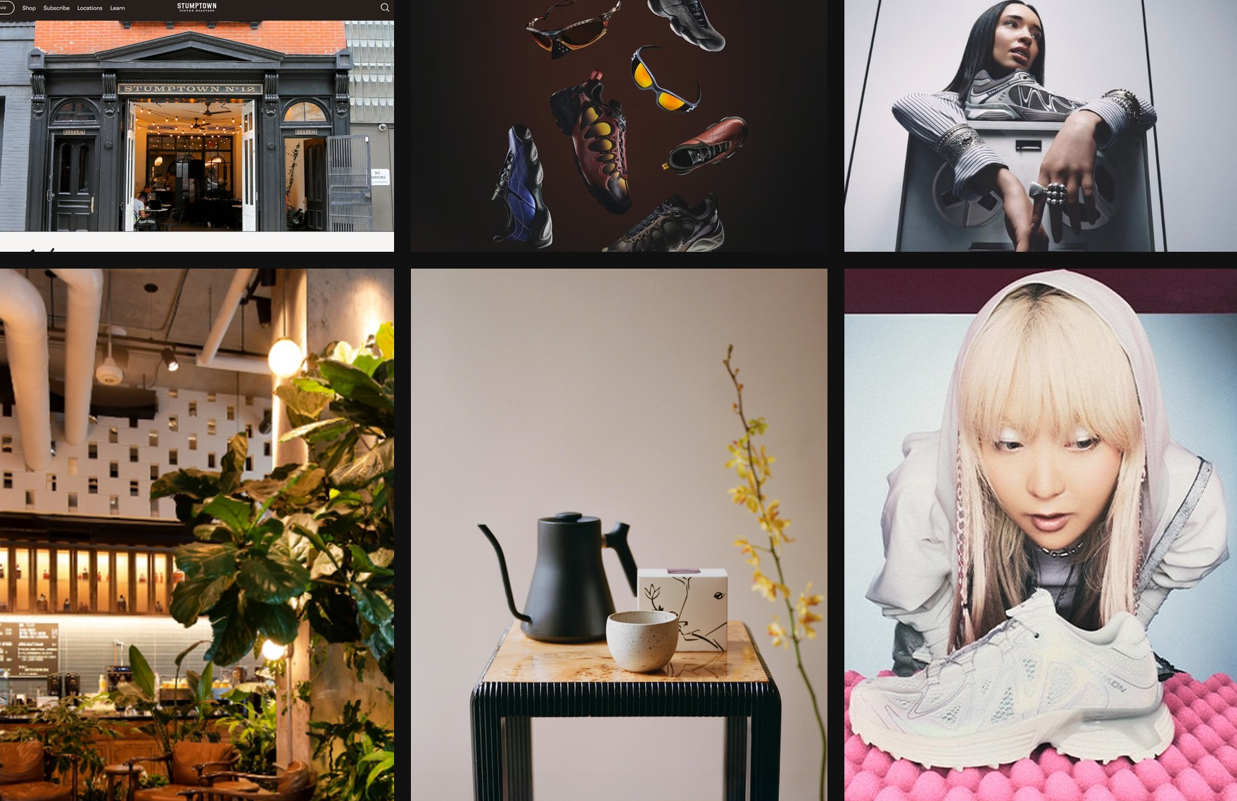
Tablero de inspiración creado con GPT-5.4 en Codex, inspirado en la cultura del café de Nueva York
y la estética Y2K
Estructura la página como una narrativa
Estructura típica de una página de marketing:
- Sección principal: establece la identidad y la promesa
- Imágenes de apoyo: muestran el contexto o el entorno
- Detalles del producto: explican lo que se ofrece
- Prueba social: aporta credibilidad
- Llamado a la acción final: convierte el interés en acción
Indica que se respete el sistema de diseño
Anima al modelo a establecer un sistema de diseño claro al inicio del desarrollo. Define tokens de diseño básicos como background, surface, primary text, muted text y accent, junto con funciones tipográficas como display, headline, body y caption. Esta estructura ayuda al modelo a producir patrones de interfaz coherentes y escalables en toda la aplicación.
Para la mayoría de los proyectos web, funciona bien empezar con un conjunto de tecnologías conocido, como React y Tailwind . GPT-5.4 ofrece un rendimiento especialmente sólido con estas herramientas, lo que facilita iterar con rapidez y lograr resultados pulidos.
El movimiento y los elementos de interfaz organizados en capas pueden añadir complejidad, especialmente cuando los componentes fijos o flotantes interactúan con el contenido principal. Al trabajar con animaciones, superposiciones o capas decorativas, conviene incluir indicaciones para evitar problemas en la distribución de los elementos. Por ejemplo:
Keep fixed or floating UI elements from overlapping text, buttons, or other key content across screen sizes. Place them in safe areas, behind primary content where appropriate, and maintain sufficient spacing.Reduce el nivel de razonamiento
Para los sitios web más sencillos, más razonamiento no siempre es mejor. En la práctica, los niveles de razonamiento bajo y medio suelen dar mejores resultados de front-end: ayudan al modelo a mantener la rapidez y el enfoque, y a evitar analizar en exceso, sin dejar de ofrecer margen para aumentar el razonamiento en diseños más ambiciosos.
Basa el diseño en contenido real
Proporcionar al modelo textos reales, contexto del producto o un objetivo claro para el proyecto es una de las formas más sencillas de mejorar los resultados de front-end. Ese contexto lo ayuda a elegir la estructura adecuada para el sitio, desarrollar narrativas más claras en cada sección y redactar mensajes más creíbles, en lugar de recurrir a patrones genéricos de contenido de relleno.
Integrar todo con la habilidad de front-end
Para ayudar a aprovechar al máximo GPT-5.4 en tareas generales de front-end, también preparamos una habilidad específica, frontend-skill, que encontrarás a continuación. Le ofrece al modelo una orientación más clara sobre estructura, criterio estético y patrones de interacción, lo que lo ayuda a producir diseños más pulidos, con una intención clara y más atractivos desde el primer momento.
Habilidad de front-end
---
name: frontend-skill
description: Use when the task asks for a visually strong landing page, website, app, prototype, demo, or game UI. This skill enforces restrained composition, image-led hierarchy, cohesive content structure, and tasteful motion while avoiding generic cards, weak branding, and UI clutter.
---

# Frontend skill

Use this skill when the quality of the work depends on art direction, hierarchy, restraint, imagery, and motion rather than component count.

Goal: ship interfaces that feel deliberate, premium, and current. Default toward award-level composition: one big idea, strong imagery, sparse copy, rigorous spacing, and a small number of memorable motions.

## Working Model

Before building, write three things:

- visual thesis: one sentence describing mood, material, and energy
- content plan: hero, support, detail, final CTA
- interaction thesis: 2-3 motion ideas that change the feel of the page

Each section gets one job, one dominant visual idea, and one primary takeaway or action.

## Beautiful Defaults

- Start with composition, not components.
- Prefer a full-bleed hero or full-canvas visual anchor.
- Make the brand or product name the loudest text.
- Keep copy short enough to scan in seconds.
- Use whitespace, alignment, scale, cropping, and contrast before adding chrome.
- Limit the system: two typefaces max, one accent color by default.
- Default to cardless layouts. Use sections, columns, dividers, lists, and media blocks instead.
- Treat the first viewport as a poster, not a document.

## Landing Pages

Default sequence:

1. Hero: brand or product, promise, CTA, and one dominant visual
2. Support: one concrete feature, offer, or proof point
3. Detail: atmosphere, workflow, product depth, or story
4. Final CTA: convert, start, visit, or contact

Hero rules:

- One composition only.
- Full-bleed image or dominant visual plane.
- Canonical full-bleed rule: on branded landing pages, the hero itself must run edge-to-edge with no inherited page gutters, framed container, or shared max-width; constrain only the inner text/action column.
- Brand first, headline second, body third, CTA fourth.
- No hero cards, stat strips, logo clouds, pill soup, or floating dashboards by default.
- Keep headlines to roughly 2-3 lines on desktop and readable in one glance on mobile.
- Keep the text column narrow and anchored to a calm area of the image.
- All text over imagery must maintain strong contrast and clear tap targets.

If the first viewport still works after removing the image, the image is too weak. If the brand disappears after hiding the nav, the hierarchy is too weak.

Viewport budget:

- If the first screen includes a sticky/fixed header, that header counts against the hero. The combined header + hero content must fit within the initial viewport at common desktop and mobile sizes.
- When using `100vh`/`100svh` heroes, subtract persistent UI chrome (`calc(100svh - header-height)`) or overlay the header instead of stacking it in normal flow.

## Apps

Default to Linear-style restraint:

- calm surface hierarchy
- strong typography and spacing
- few colors
- dense but readable information
- minimal chrome
- cards only when the card is the interaction

For app UI, organize around:

- primary workspace
- navigation
- secondary context or inspector
- one clear accent for action or state

Avoid:

- dashboard-card mosaics
- thick borders on every region
- decorative gradients behind routine product UI
- multiple competing accent colors
- ornamental icons that do not improve scanning

If a panel can become plain layout without losing meaning, remove the card treatment.

## Imagery

Imagery must do narrative work.

- Use at least one strong, real-looking image for brands, venues, editorial pages, and lifestyle products.
- Prefer in-situ photography over abstract gradients or fake 3D objects.
- Choose or crop images with a stable tonal area for text.
- Do not use images with embedded signage, logos, or typographic clutter fighting the UI.
- Do not generate images with built-in UI frames, splits, cards, or panels.
- If multiple moments are needed, use multiple images, not one collage.

The first viewport needs a real visual anchor. Decorative texture is not enough.

## Copy

- Write in product language, not design commentary.
- Let the headline carry the meaning.
- Supporting copy should usually be one short sentence.
- Cut repetition between sections.
- do not include prompt language or design commentary into the UI
- Give every section one responsibility: explain, prove, deepen, or convert.

If deleting 30 percent of the copy improves the page, keep deleting.

## Utility Copy For Product UI

When the work is a dashboard, app surface, admin tool, or operational workspace, default to utility copy over marketing copy.

- Prioritize orientation, status, and action over promise, mood, or brand voice.
- Start with the working surface itself: KPIs, charts, filters, tables, status, or task context. Do not introduce a hero section unless the user explicitly asks for one.
- Section headings should say what the area is or what the user can do there.
- Good: "Selected KPIs", "Plan status", "Search metrics", "Top segments", "Last sync".
- Avoid aspirational hero lines, metaphors, campaign-style language, and executive-summary banners on product surfaces unless specifically requested.
- Supporting text should explain scope, behavior, freshness, or decision value in one sentence.
- If a sentence could appear in a homepage hero or ad, rewrite it until it sounds like product UI.
- If a section does not help someone operate, monitor, or decide, remove it.
- Litmus check: if an operator scans only headings, labels, and numbers, can they understand the page immediately?

## Motion

Use motion to create presence and hierarchy, not noise.

Ship at least 2-3 intentional motions for visually led work:

- one entrance sequence in the hero
- one scroll-linked, sticky, or depth effect
- one hover, reveal, or layout transition that sharpens affordance

Prefer Framer Motion when available for:

- section reveals
- shared layout transitions
- scroll-linked opacity, translate, or scale shifts
- sticky storytelling
- carousels that advance narrative, not just fill space
- menus, drawers, and modal presence effects

Motion rules:

- noticeable in a quick recording
- smooth on mobile
- fast and restrained
- consistent across the page
- removed if ornamental only

## Hard Rules

- No cards by default.
- No hero cards by default.
- No boxed or center-column hero when the brief calls for full bleed.
- No more than one dominant idea per section.
- No section should need many tiny UI devices to explain itself.
- No headline should overpower the brand on branded pages.
- No filler copy.
- No split-screen hero unless text sits on a calm, unified side.
- No more than two typefaces without a clear reason.
- No more than one accent color unless the product already has a strong system.

## Reject These Failures

- Generic SaaS card grid as the first impression
- Beautiful image with weak brand presence
- Strong headline with no clear action
- Busy imagery behind text
- Sections that repeat the same mood statement
- Carousel with no narrative purpose
- App UI made of stacked cards instead of layout

## Litmus Checks

- Is the brand or product unmistakable in the first screen?
- Is there one strong visual anchor?
- Can the page be understood by scanning headlines only?
- Does each section have one job?
- Are cards actually necessary?
- Does motion improve hierarchy or atmosphere?
- Would the design still feel premium if all decorative shadows were removed?
Instala frontend-skill ejecutando el siguiente comando en Codex App:
$skill-installer frontend-skillAquí tienes algunos ejemplos de sitios web generados con la ayuda de la habilidad Frontend Design.
Páginas de destino
Juegos
Paneles
Conclusión principal
GPT-5.4 puede generar interfaces front-end de alta calidad cuando los prompts incluyen restricciones de diseño claras, referencias visuales, narrativas estructuradas y sistemas de diseño definidos.
Esperamos que estas técnicas te ayuden a crear aplicaciones con más personalidad y un buen diseño.
Si quieres compartir un proyecto que hayas generado por completo con GPT-5.4 y un agente de programación como Codex, envía tu aplicación para que se muestre en nuestra galería.