
GPT-5.4 is a better web developer than its predecessors—generating more visually appealing and ambitious frontends. Notably, we trained GPT-5.4 with a focus on improved UI capabilities and use of images. With the right guidance, the model can produce production-ready frontends incorporating subtle touches, well-crafted interactions, and beautiful imagery.
Web design can produce a large surface area of outcomes. Great design balances restraint with invention—drawing from patterns that have stood the test of time while introducing something new. GPT-5.4 has learned this wide spectrum of design approaches and understands many different ways a website can be built.
When prompts are underspecified, models often fall back to high-frequency patterns from the training data. Some of these are proven conventions, but many are simply overrepresented habits we want to avoid. The result is usually plausible and functional, but it can drift toward generic structure, weak visual hierarchy, and design choices that fall short of what we visualize in our heads.
This guide explains practical techniques for steering GPT-5.4 toward crafting the designs you envision.
Model Improvements
While GPT-5.4 improves across a range of axes, for front-end work we focused on three practical gains:
- stronger image understanding throughout the design process
- more functionally complete apps and websites
- better use of tools to inspect, test, and verify its own work
Image understanding and tool use
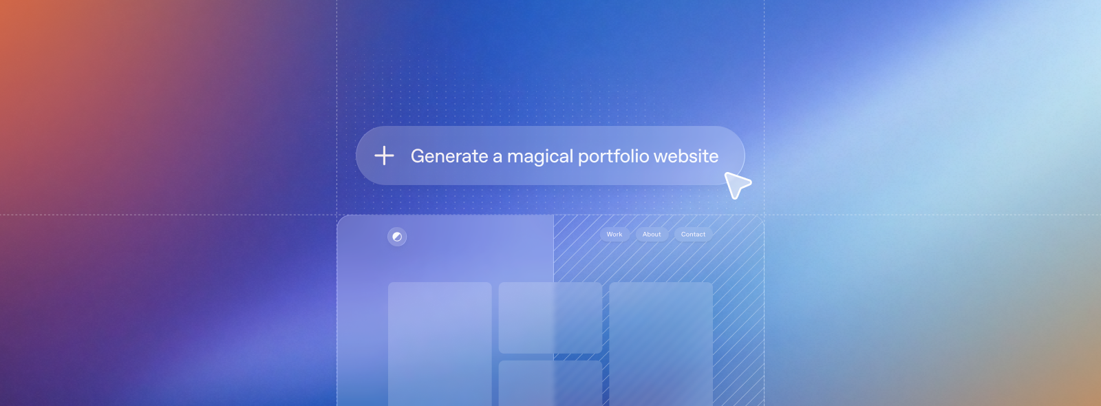
GPT-5.4 was trained to use image search and image generation tools natively, allowing it to incorporate visual reasoning directly into its design process. For best results, instruct the model to first generate a mood board or several visual options before selecting the final assets.
You can guide the model toward strong visual references by explicitly describing the attributes the images should capture (e.g., style, color palette, composition, or mood). You should also include prompt instructions that guide the model to reuse previously generated images, call the image generation tool to create new visuals, or reference specific external images when required.
Default to using any uploaded/pre-generated images. Otherwise use the image generation tool to create visually stunning image artifacts. Do not reference or link to web images unless the user explicitly asks for them.Functionality improvements
The model was trained to develop more complete and functionally sound apps. Expect the model to be more reliable over long-horizon tasks. Games and complex user experiences you previously thought were impossible are a reality in one or two turns.
Computer Use and Verification
GPT-5.4 is our first mainline model trained for computer use. It can natively navigate interfaces, and combined with tools such as Playwright, it can iteratively inspect its work, validate behavior, and refine implementations—enabling longer, more autonomous development workflows.
Watch our launch video to see these capabilities in action.
Playwright is particularly valuable for front-end development. It allows the model to inspect rendered pages, test multiple viewports, navigate application flows, and detect issues with state or navigation. Providing a Playwright tool or skill significantly improves the likelihood that GPT-5.4 produces polished, functionally complete interfaces. With improved image understanding, it also provides a way for the model to verify its work visually and check that it matches the reference UI if provided.
Practical tips quickstart
If you adopt only a few practices from this document, start with these:
- Select low reasoning level to begin with.
- Define your design system and constraints upfront (i.e., typography, color palette, layout).
- Provide visual references or a mood board (i.e., attach a screenshot) to provide visual guardrails for the model.
- Define a narrative or content strategy upfront to guide the model’s content creation.
Here’s a prompt to get started.
## Frontend tasks

When doing frontend design tasks, avoid generic, overbuilt layouts.

**Use these hard rules:**
- One composition: The first viewport must read as one composition, not a dashboard (unless it's a dashboard).
- Brand first: On branded pages, the brand or product name must be a hero-level signal, not just nav text or an eyebrow. No headline should overpower the brand.
- Brand test: If the first viewport could belong to another brand after removing the nav, the branding is too weak.
- Typography: Use expressive, purposeful fonts and avoid default stacks (Inter, Roboto, Arial, system).
- Background: Don't rely on flat, single-color backgrounds; use gradients, images, or subtle patterns to build atmosphere.
- Full-bleed hero only: On landing pages and promotional surfaces, the hero image should be a dominant edge-to-edge visual plane or background by default. Do not use inset hero images, side-panel hero images, rounded media cards, tiled collages, or floating image blocks unless the existing design system clearly requires it.
- Hero budget: The first viewport should usually contain only the brand, one headline, one short supporting sentence, one CTA group, and one dominant image. Do not place stats, schedules, event listings, address blocks, promos, "this week" callouts, metadata rows, or secondary marketing content in the first viewport.
- No hero overlays: Do not place detached labels, floating badges, promo stickers, info chips, or callout boxes on top of hero media.
- Cards: Default: no cards. Never use cards in the hero. Cards are allowed only when they are the container for a user interaction. If removing a border, shadow, background, or radius does not hurt interaction or understanding, it should not be a card.
- One job per section: Each section should have one purpose, one headline, and usually one short supporting sentence.
- Real visual anchor: Imagery should show the product, place, atmosphere, or context. Decorative gradients and abstract backgrounds do not count as the main visual idea.
- Reduce clutter: Avoid pill clusters, stat strips, icon rows, boxed promos, schedule snippets, and multiple competing text blocks.
- Use motion to create presence and hierarchy, not noise. Ship at least 2-3 intentional motions for visually led work.
- Color & Look: Choose a clear visual direction; define CSS variables; avoid purple-on-white defaults. No purple bias or dark mode bias.
- Ensure the page loads properly on both desktop and mobile.
- For React code, prefer modern patterns including useEffectEvent, startTransition, and useDeferredValue when appropriate if used by the team. Do not add useMemo/useCallback by default unless already used; follow the repo's React Compiler guidance.

Exception: If working within an existing website or design system, preserve the established patterns, structure, and visual language.
Techniques for better designs
Start with design principles
Define constraints such as one H1 headline, no more than six sections, two typefaces maximum, one accent color, and one primary CTA above the fold.
Provide visual references
Reference screenshots or mood boards help the model infer layout rhythm, typography scale, spacing systems, and imagery treatment. Below is an example of GPT-5.4 generating its own mood board for the user to review.
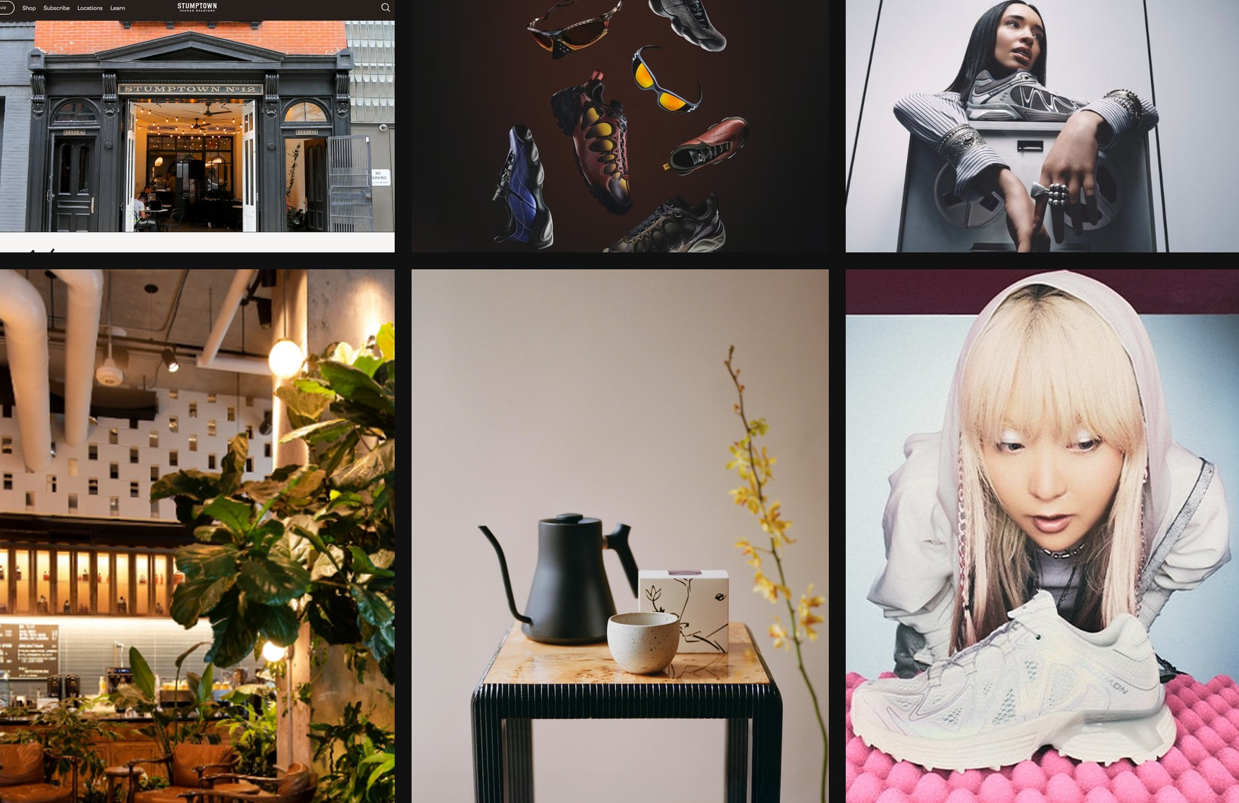
Mood board created with GPT-5.4 in Codex inspired by NYC coffee culture
and Y2K aesthetics
Structure the page as a narrative
Typical marketing page structure:
- Hero — establish identity and promise
- Supporting imagery — show context or environment
- Product detail — explain the offering
- Social proof — establish credibility
- Final CTA — convert interest into action
Instruct design system adherence
Encourage the model to establish a clear design system early in the build. Define core design tokens such as background, surface, primary text, muted text, and accent, along with typography roles like display, headline, body, and caption. This structure helps the model produce consistent, scalable UI patterns across the application.
For most web projects, starting with a familiar stack such as React and Tailwind works well. GPT-5.4 performs particularly strongly with these tools, making it easier to iterate quickly and reach polished results.
Motion and layered UI elements can introduce complexity, especially when fixed or floating components interact with primary content. When working with animations, overlays, or decorative layers, it helps to include guidance that encourages safe layout behavior. For example:
Keep fixed or floating UI elements from overlapping text, buttons, or other key content across screen sizes. Place them in safe areas, behind primary content where appropriate, and maintain sufficient spacing.Dial back the reasoning
For simpler websites, more reasoning is not always better. In practice, low and medium reasoning levels often lead to stronger front-end results, helping the model stay fast, focused, and less prone to overthinking, while still leaving headroom to turn reasoning up for more ambitious designs.
Ground the design in real content
Providing the model with real copy, product context, or a clear project goal is one of the simplest ways to improve front-end results. That context helps it choose the right site structure, shape clearer section-level narratives, and write more believable messaging instead of falling back to generic placeholder patterns.
Bringing it all together with the Frontend Skill
To help people get the most out of GPT-5.4 on general front-end tasks, we’ve also prepared a dedicated frontend-skill you can find below. It gives the model stronger guidance on structure, taste, and interaction patterns, helping it produce more polished, intentional, and delightful designs out of the box.
Frontend Skill
---
name: frontend-skill
description: Use when the task asks for a visually strong landing page, website, app, prototype, demo, or game UI. This skill enforces restrained composition, image-led hierarchy, cohesive content structure, and tasteful motion while avoiding generic cards, weak branding, and UI clutter.
---

# Frontend skill

Use this skill when the quality of the work depends on art direction, hierarchy, restraint, imagery, and motion rather than component count.

Goal: ship interfaces that feel deliberate, premium, and current. Default toward award-level composition: one big idea, strong imagery, sparse copy, rigorous spacing, and a small number of memorable motions.

## Working Model

Before building, write three things:

- visual thesis: one sentence describing mood, material, and energy
- content plan: hero, support, detail, final CTA
- interaction thesis: 2-3 motion ideas that change the feel of the page

Each section gets one job, one dominant visual idea, and one primary takeaway or action.

## Beautiful Defaults

- Start with composition, not components.
- Prefer a full-bleed hero or full-canvas visual anchor.
- Make the brand or product name the loudest text.
- Keep copy short enough to scan in seconds.
- Use whitespace, alignment, scale, cropping, and contrast before adding chrome.
- Limit the system: two typefaces max, one accent color by default.
- Default to cardless layouts. Use sections, columns, dividers, lists, and media blocks instead.
- Treat the first viewport as a poster, not a document.

## Landing Pages

Default sequence:

1. Hero: brand or product, promise, CTA, and one dominant visual
2. Support: one concrete feature, offer, or proof point
3. Detail: atmosphere, workflow, product depth, or story
4. Final CTA: convert, start, visit, or contact

Hero rules:

- One composition only.
- Full-bleed image or dominant visual plane.
- Canonical full-bleed rule: on branded landing pages, the hero itself must run edge-to-edge with no inherited page gutters, framed container, or shared max-width; constrain only the inner text/action column.
- Brand first, headline second, body third, CTA fourth.
- No hero cards, stat strips, logo clouds, pill soup, or floating dashboards by default.
- Keep headlines to roughly 2-3 lines on desktop and readable in one glance on mobile.
- Keep the text column narrow and anchored to a calm area of the image.
- All text over imagery must maintain strong contrast and clear tap targets.

If the first viewport still works after removing the image, the image is too weak. If the brand disappears after hiding the nav, the hierarchy is too weak.

Viewport budget:

- If the first screen includes a sticky/fixed header, that header counts against the hero. The combined header + hero content must fit within the initial viewport at common desktop and mobile sizes.
- When using `100vh`/`100svh` heroes, subtract persistent UI chrome (`calc(100svh - header-height)`) or overlay the header instead of stacking it in normal flow.

## Apps

Default to Linear-style restraint:

- calm surface hierarchy
- strong typography and spacing
- few colors
- dense but readable information
- minimal chrome
- cards only when the card is the interaction

For app UI, organize around:

- primary workspace
- navigation
- secondary context or inspector
- one clear accent for action or state

Avoid:

- dashboard-card mosaics
- thick borders on every region
- decorative gradients behind routine product UI
- multiple competing accent colors
- ornamental icons that do not improve scanning

If a panel can become plain layout without losing meaning, remove the card treatment.

## Imagery

Imagery must do narrative work.

- Use at least one strong, real-looking image for brands, venues, editorial pages, and lifestyle products.
- Prefer in-situ photography over abstract gradients or fake 3D objects.
- Choose or crop images with a stable tonal area for text.
- Do not use images with embedded signage, logos, or typographic clutter fighting the UI.
- Do not generate images with built-in UI frames, splits, cards, or panels.
- If multiple moments are needed, use multiple images, not one collage.

The first viewport needs a real visual anchor. Decorative texture is not enough.

## Copy

- Write in product language, not design commentary.
- Let the headline carry the meaning.
- Supporting copy should usually be one short sentence.
- Cut repetition between sections.
- do not include prompt language or design commentary into the UI
- Give every section one responsibility: explain, prove, deepen, or convert.

If deleting 30 percent of the copy improves the page, keep deleting.

## Utility Copy For Product UI

When the work is a dashboard, app surface, admin tool, or operational workspace, default to utility copy over marketing copy.

- Prioritize orientation, status, and action over promise, mood, or brand voice.
- Start with the working surface itself: KPIs, charts, filters, tables, status, or task context. Do not introduce a hero section unless the user explicitly asks for one.
- Section headings should say what the area is or what the user can do there.
- Good: "Selected KPIs", "Plan status", "Search metrics", "Top segments", "Last sync".
- Avoid aspirational hero lines, metaphors, campaign-style language, and executive-summary banners on product surfaces unless specifically requested.
- Supporting text should explain scope, behavior, freshness, or decision value in one sentence.
- If a sentence could appear in a homepage hero or ad, rewrite it until it sounds like product UI.
- If a section does not help someone operate, monitor, or decide, remove it.
- Litmus check: if an operator scans only headings, labels, and numbers, can they understand the page immediately?

## Motion

Use motion to create presence and hierarchy, not noise.

Ship at least 2-3 intentional motions for visually led work:

- one entrance sequence in the hero
- one scroll-linked, sticky, or depth effect
- one hover, reveal, or layout transition that sharpens affordance

Prefer Framer Motion when available for:

- section reveals
- shared layout transitions
- scroll-linked opacity, translate, or scale shifts
- sticky storytelling
- carousels that advance narrative, not just fill space
- menus, drawers, and modal presence effects

Motion rules:

- noticeable in a quick recording
- smooth on mobile
- fast and restrained
- consistent across the page
- removed if ornamental only

## Hard Rules

- No cards by default.
- No hero cards by default.
- No boxed or center-column hero when the brief calls for full bleed.
- No more than one dominant idea per section.
- No section should need many tiny UI devices to explain itself.
- No headline should overpower the brand on branded pages.
- No filler copy.
- No split-screen hero unless text sits on a calm, unified side.
- No more than two typefaces without a clear reason.
- No more than one accent color unless the product already has a strong system.

## Reject These Failures

- Generic SaaS card grid as the first impression
- Beautiful image with weak brand presence
- Strong headline with no clear action
- Busy imagery behind text
- Sections that repeat the same mood statement
- Carousel with no narrative purpose
- App UI made of stacked cards instead of layout

## Litmus Checks

- Is the brand or product unmistakable in the first screen?
- Is there one strong visual anchor?
- Can the page be understood by scanning headlines only?
- Does each section have one job?
- Are cards actually necessary?
- Does motion improve hierarchy or atmosphere?
- Would the design still feel premium if all decorative shadows were removed?
Install the frontend-skill by running the following command inside the Codex app:
$skill-installer frontend-skillHere are a few example websites generated with the help of the Frontend Design skill.
Landing Pages
Games
Dashboards
Key Takeaway
GPT-5.4 can generate high-quality front-end interfaces when prompts provide clear design constraints, visual references, structured narratives, and defined design systems.
We hope these techniques help you build more distinctive, well-designed apps.
If you want to share a project you’ve entirely generated with GPT-5.4 and a coding agent such as Codex, submit your app to be showcased in our gallery.