
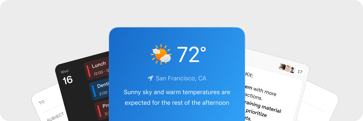
Widgets são os contêineres e componentes que o ChatKit oferece. Você pode usar widgets prontos, adaptar modelos ou criar seus próprios widgets para personalizar por completo o ChatKit no seu produto.
Crie widgets rapidamente
Use o Widget Builder do ChatKit Studio para experimentar layouts de cartões e linhas de lista e visualizar os componentes. Quando estiver satisfeito com o resultado, copie o JSON gerado para a sua integração e disponibilize-o pelo backend.
Faça upload de recursos
Faça upload de recursos para adaptar os widgets do ChatKit ao visual do seu produto. Hospede os arquivos e as imagens enviados no seu backend antes de fazer referência a eles em uma mensagem do ChatKit. Consulte o guia de upload do SDK para Python para ver uma implementação de referência.
Os widgets do ChatKit podem exibir informações de contexto, atalhos e cartões interativos diretamente na conversa. Quando o usuário clica em um botão do widget, seu aplicativo recebe um payload de ação personalizada. Com esses dados, você pode responder pelo backend.
Processe ações no servidor
As ações dos widgets permitem que os usuários acionem a lógica do aplicativo pela interface. Você pode associar ações a diferentes eventos nos nodes do widget, como cliques em botões, e processá-las no servidor ou na integração do cliente.
Capture os eventos do widget com o callback onAction de WidgetsOption ou com o hook equivalente do React. Encaminhe o payload da ação ao backend para que ele a processe.
chatkit.setOptions({
widgets: {
async onAction(action, item) {
await fetch("/api/widget-action", {
method: "POST",
headers: { "Content-Type": "application/json" },
body: JSON.stringify({ action, itemId: item.id }),
});
},
},
});Quer ver um exemplo completo de servidor? Consulte a documentação do SDK do ChatKit para Python para acompanhar a implementação passo a passo, do início ao fim.
Saiba mais na documentação sobre ações.
Referência
Recomendamos começar pelos editores visuais e pelas ferramentas apresentados acima. Consulte o restante desta documentação para entender como os widgets funcionam e conhecer todas as opções.
Cada widget tem um único contêiner (WidgetRoot), que reúne vários componentes (WidgetNode).
Contêineres (WidgetRoot)
Os contêineres oferecem recursos específicos, como exibir o texto de um indicador de status e apresentar ações principais.
-
Card – Um contêiner que delimita a área dos widgets. Os campos
status,confirmecancelpermitem exibir indicadores de status e botões de ação abaixo do widget.children: list[WidgetNode]size: “sm” | “md” | “lg” | “full” (padrão: “md”)padding: float | str | dict[str, float | str] | None (chaves:top,right,bottom,left,x,y)background: str |{ dark: str, light: str }| Nonestatus:{ text: str, favicon?: str }|{ text: str, icon?: str }| Nonecollapsed: bool | NoneasForm: bool | Noneconfirm:{ label: str, action: ActionConfig }| Nonecancel:{ label: str, action: ActionConfig }| Nonetheme: “light” | “dark” | Nonekey: str | None
-
ListView – Exibe uma lista vertical em que cada item é um
ListViewItem.children: list[ListViewItem]limit: int | “auto” | Nonestatus:{ text: str, favicon?: str }|{ text: str, icon?: str }| Nonetheme: “light” | “dark” | Nonekey: str | None
Componentes (WidgetNode)
O ChatKit oferece suporte aos tipos de widget a seguir. Você também pode explorar os componentes e usar um editor interativo na seção de componentes do Widget Builder.
-
Badge – Um pequeno rótulo para indicar status ou exibir metadados.
label: strcolor: “secondary” | “success” | “danger” | “warning” | “info” | “discovery” | Nonevariant: “solid” | “soft” | “outline” | Nonepill: bool | Nonesize: “sm” | “md” | “lg” | Nonekey: str | None
-
Box – Um contêiner flexível que permite configurar a direção, o espaçamento e o estilo do layout.
children: list[WidgetNode] | Nonedirection: “row” | “column” | Nonealign: “start” | “center” | “end” | “baseline” | “stretch” | Nonejustify: “start” | “center” | “end” | “stretch” | “between” | “around” | “evenly” | Nonewrap: “nowrap” | “wrap” | “wrap-reverse” | Noneflex: int | str | Noneheight: float | str | Nonewidth: float | str | NoneminHeight: int | str | NoneminWidth: int | str | NonemaxHeight: int | str | NonemaxWidth: int | str | Nonesize: float | str | NoneminSize: int | str | NonemaxSize: int | str | Nonegap: int | str | Nonepadding: float | str | dict[str, float | str] | None (chaves:top,right,bottom,left,x,y)margin: float | str | dict[str, float | str] | None (chaves:top,right,bottom,left,x,y)border: int |dict[str, Any]| None (borda única:{ size: int, color?: str|{ dark: str, light: str }, style?: “solid” | “dashed” | “dotted” | “double” | “groove” | “ridge” | “inset” | “outset” }per-side:{ top?: int|dict, right?: int|dict, bottom?: int|dict, left?: int|dict, x?: int|dict, y?: int|dict })radius: “2xs” | “xs” | “sm” | “md” | “lg” | “xl” | “2xl” | “3xl” | “4xl” | “full” | “100%” | “none” | Nonebackground: str |{ dark: str, light: str }| NoneaspectRatio: float | str | Nonekey: str | None
-
Row – Organiza os elementos filhos na horizontal.
children: list[WidgetNode] | Nonegap: int | str | Nonepadding: float | str | dict[str, float | str] | None (chaves:top,right,bottom,left,x,y)align: “start” | “center” | “end” | “baseline” | “stretch” | Nonejustify: “start” | “center” | “end” | “stretch” | “between” | “around” | “evenly” | Noneflex: int | str | Noneheight: float | str | Nonewidth: float | str | NoneminHeight: int | str | NoneminWidth: int | str | NonemaxHeight: int | str | NonemaxWidth: int | str | Nonesize: float | str | NoneminSize: int | str | NonemaxSize: int | str | Nonemargin: float | str | dict[str, float | str] | None (chaves:top,right,bottom,left,x,y)border: int | dict[str, Any] | None (borda única:{ size: int, color?: str | { dark: str, light: str }, style?: "solid" | "dashed" | "dotted" | "double" | "groove" | "ridge" | "inset" | "outset" }por lado:{ top?: int|dict, right?: int|dict, bottom?: int|dict, left?: int|dict, x?: int|dict, y?: int|dict })radius: “2xs” | “xs” | “sm” | “md” | “lg” | “xl” | “2xl” | “3xl” | “4xl” | “full” | “100%” | “none” | Nonebackground: str |{ dark: str, light: str }| NoneaspectRatio: float | str | Nonekey: str | None
-
Col – Organiza os elementos filhos na vertical.
children: list[WidgetNode] | Nonegap: int | str | Nonepadding: float | str | dict[str, float | str] | None (chaves:top,right,bottom,left,x,y)align: “start” | “center” | “end” | “baseline” | “stretch” | Nonejustify: “start” | “center” | “end” | “stretch” | “between” | “around” | “evenly” | Nonewrap: “nowrap” | “wrap” | “wrap-reverse” | Noneflex: int | str | Noneheight: float | str | Nonewidth: float | str | NoneminHeight: int | str | NoneminWidth: int | str | NonemaxHeight: int | str | NonemaxWidth: int | str | Nonesize: float | str | NoneminSize: int | str | NonemaxSize: int | str | Nonemargin: float | str | dict[str, float | str] | None (chaves:top,right,bottom,left,x,y)border: int | dict[str, Any] | None (borda única:{ size: int, color?: str | { dark: str, light: str }, style?: "solid" | "dashed" | "dotted" | "double" | "groove" | "ridge" | "inset" | "outset" }por lado:{ top?: int|dict, right?: int|dict, bottom?: int|dict, left?: int|dict, x?: int|dict, y?: int|dict })radius: “2xs” | “xs” | “sm” | “md” | “lg” | “xl” | “2xl” | “3xl” | “4xl” | “full” | “100%” | “none” | Nonebackground: str |{ dark: str, light: str }| NoneaspectRatio: float | str | Nonekey: str | None
-
Button – Um botão de ação flexível.
submit: bool | Nonestyle: “primary” | “secondary” | Nonelabel: stronClickAction: ActionConfigiconStart: str | NoneiconEnd: str | Nonecolor: “primary” | “secondary” | “info” | “discovery” | “success” | “caution” | “warning” | “danger” | Nonevariant: “solid” | “soft” | “outline” | “ghost” | Nonesize: “3xs” | “2xs” | “xs” | “sm” | “md” | “lg” | “xl” | “2xl” | “3xl” | Nonepill: bool | Noneblock: bool | Noneuniform: bool | NoneiconSize: “sm” | “md” | “lg” | “xl” | “2xl” | Nonekey: str | None
-
Caption – Texto de apoio em tamanho menor.
value: strsize: “sm” | “md” | “lg” | Noneweight: “normal” | “medium” | “semibold” | “bold” | NonetextAlign: “start” | “center” | “end” | Nonecolor: str |{ dark: str, light: str }| Nonetruncate: bool | NonemaxLines: int | Nonekey: str | None
-
DatePicker – Um campo de data com calendário suspenso.
onChangeAction: ActionConfig | Nonename: strmin: datetime | Nonemax: datetime | Noneside: “top” | “bottom” | “left” | “right” | Nonealign: “start” | “center” | “end” | Noneplaceholder: str | NonedefaultValue: datetime | Nonevariant: “solid” | “soft” | “outline” | “ghost” | Nonesize: “3xs” | “2xs” | “xs” | “sm” | “md” | “lg” | “xl” | “2xl” | “3xl” | Nonepill: bool | Noneblock: bool | Noneclearable: bool | Nonedisabled: bool | Nonekey: str | None
-
Divider – Um separador horizontal ou vertical.
spacing: int | str | Nonecolor: str |{ dark: str, light: str }| Nonesize: int | str | Noneflush: bool | Nonekey: str | None
-
Icon – Exibe o ícone correspondente ao nome informado.
name: strcolor: str |{ dark: str, light: str }| Nonesize: “xs” | “sm” | “md” | “lg” | “xl” | Nonekey: str | None
-
Image – Exibe uma imagem com opções de estilo, ajuste e posicionamento.
size: int | str | Noneheight: int | str | Nonewidth: int | str | NoneminHeight: int | str | NoneminWidth: int | str | NonemaxHeight: int | str | NonemaxWidth: int | str | NoneminSize: int | str | NonemaxSize: int | str | Noneradius: “2xs” | “xs” | “sm” | “md” | “lg” | “xl” | “2xl” | “3xl” | “4xl” | “full” | “100%” | “none” | Nonebackground: str |{ dark: str, light: str }| Nonemargin: int | str | dict[str, int | str] | None (chaves:top,right,bottom,left,x,y)aspectRatio: float | str | Noneflex: int | str | Nonesrc: stralt: str | Nonefit: “none” | “cover” | “contain” | “fill” | “scale-down” | Noneposition: “center” | “top” | “bottom” | “left” | “right” | “top left” | “top right” | “bottom left” | “bottom right” | Noneframe: bool | Noneflush: bool | Nonekey: str | None
-
ListView – Exibe uma lista vertical de itens.
children: list[ListViewItem] | Nonelimit: int | “auto” | Nonestatus: dict[str, Any] | None (estrutura:{ text: str, favicon?: str })theme: “light” | “dark” | Nonekey: str | None
-
ListViewItem – Um item de uma
ListViewque pode ter uma ação associada.children: list[WidgetNode] | NoneonClickAction: ActionConfig | Nonegap: int | str | Nonealign: “start” | “center” | “end” | “baseline” | “stretch” | Nonekey: str | None
-
Markdown – Renderiza texto formatado em Markdown e aceita atualizações por streaming.
value: strstreaming: bool | Nonekey: str | None
-
Select – Uma lista suspensa que permite selecionar uma única opção.
options: list[dict[str, str]] (cada opção:{ label: str, value: str })onChangeAction: ActionConfig | Nonename: strplaceholder: str | NonedefaultValue: str | Nonevariant: “solid” | “soft” | “outline” | “ghost” | Nonesize: “3xs” | “2xs” | “xs” | “sm” | “md” | “lg” | “xl” | “2xl” | “3xl” | Nonepill: bool | Noneblock: bool | Noneclearable: bool | Nonedisabled: bool | Nonekey: str | None
-
Spacer – Insere um espaço vazio de tamanho flexível no layout.
minSize: int | str | Nonekey: str | None
-
Text – Exibe texto simples (use
Markdownpara renderizar texto em Markdown). Aceita atualizações por streaming.value: strcolor: str |{ dark: str, light: str }| Nonewidth: float | str | Nonesize: “xs” | “sm” | “md” | “lg” | “xl” | Noneweight: “normal” | “medium” | “semibold” | “bold” | NonetextAlign: “start” | “center” | “end” | Noneitalic: bool | NonelineThrough: bool | Nonetruncate: bool | NoneminLines: int | NonemaxLines: int | Nonestreaming: bool | Noneeditable: bool | dict[str, Any] | None (quando o valor é um dicionário:{ name: str, autoComplete?: str, autoFocus?: bool, autoSelect?: bool, allowAutofillExtensions?: bool, required?: bool, placeholder?: str, pattern?: str })key: str | None
-
Title – Exibe um título em destaque.
value: strsize: “xs” | “sm” | “md” | “lg” | “xl” | “2xl” | “3xl” | “4xl” | “5xl” | Noneweight: “normal” | “medium” | “semibold” | “bold” | NonetextAlign: “start” | “center” | “end” | Nonecolor: str |{ dark: str, light: str }| Nonetruncate: bool | NonemaxLines: int | Nonekey: str | None
-
Form – Um contêiner de layout que pode enviar uma ação.
onSubmitAction: ActionConfigchildren: list[WidgetNode] | Nonealign: “start” | “center” | “end” | “baseline” | “stretch” | Nonejustify: “start” | “center” | “end” | “stretch” | “between” | “around” | “evenly” | Noneflex: int | str | Nonegap: int | str | Noneheight: float | str | Nonewidth: float | str | NoneminHeight: int | str | NoneminWidth: int | str | NonemaxHeight: int | str | NonemaxWidth: int | str | Nonesize: float | str | NoneminSize: int | str | NonemaxSize: int | str | Nonepadding: float | str | dict[str, float | str] | None (chaves:top,right,bottom,left,x,y)margin: float | str | dict[str, float | str] | None (chaves:top,right,bottom,left,x,y)border: int | dict[str, Any] | None (borda única:{ size: int, color?: str | { dark: str, light: str }, style?: "solid" | "dashed" | "dotted" | "double" | "groove" | "ridge" | "inset" | "outset" }por lado:{ top?: int|dict, right?: int|dict, bottom?: int|dict, left?: int|dict, x?: int|dict, y?: int|dict })radius: “2xs” | “xs” | “sm” | “md” | “lg” | “xl” | “2xl” | “3xl” | “4xl” | “full” | “100%” | “none” | Nonebackground: str |{ dark: str, light: str }| Nonekey: str | None
-
Transition – Envolve conteúdo que pode ser animado.
children: WidgetNode | Nonekey: str | None