
ウィジェットは、ChatKit が提供するコンテナとコンポーネントです。既製のウィジェットを使うことも、テンプレートを変更することも、独自のウィジェットを設計することもできます。製品に合わせて ChatKit を自由にカスタマイズできます。
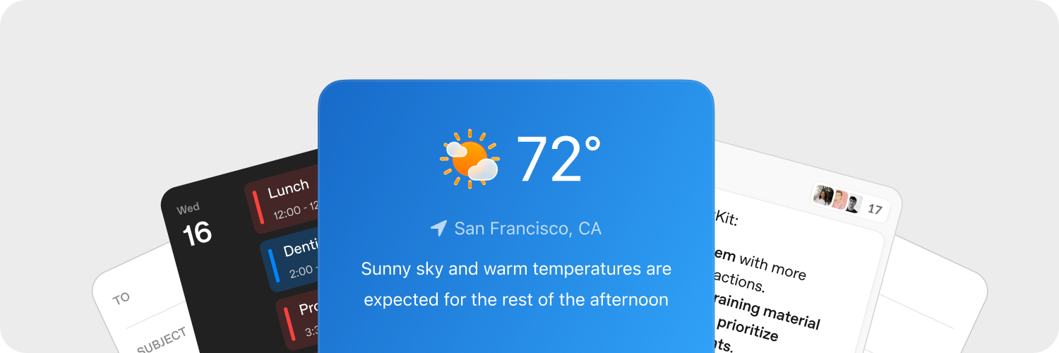
ウィジェットの手軽な設計
ChatKit Studio の Widget Builder を使うと、カードのレイアウトやリストの各行の構成を試し、コンポーネントをプレビューできます。デザインが決まったら、生成された JSON をアプリケーションにコピーし、バックエンドから配信します。
アセットのアップロード
アセットをアップロードすると、製品に合わせて ChatKit ウィジェットをカスタマイズできます。ChatKit では、アップロードしたファイルや画像をメッセージ内で参照する前に、バックエンドでホストしておく必要があります。実装例は Python SDK のアップロードガイドを参照してください。
ChatKit ウィジェットを使うと、コンテキストやショートカット、操作可能なカードを会話内に直接表示できます。ユーザーがウィジェットのボタンをクリックすると、アプリケーションがカスタムアクションのペイロードを受け取り、バックエンドから応答できます。
サーバーでのアクション処理
ウィジェットのアクションを使うと、ユーザーは UI から処理を実行できます。各ウィジェットノードのイベント(ボタンのクリックなど)にアクションを割り当て、そのアクションをサーバー側またはクライアント側で処理できます。
onAction コールバックは WidgetsOption または同等の React フックから利用できます。このコールバックでウィジェットのイベントを受け取り、アクションのペイロードをバックエンドに転送して処理します。
chatkit.setOptions({
widgets: {
async onAction(action, item) {
await fetch("/api/widget-action", {
method: "POST",
headers: { "Content-Type": "application/json" },
body: JSON.stringify({ action, itemId: item.id }),
});
},
},
});サーバー側の実装例を一通り確認したい場合は、ChatKit Python SDK のドキュメントを参照してください。実装の手順を最初から最後まで説明しています。
詳しくは、アクションのドキュメントを参照してください。
リファレンス
まずは、上で紹介したビジュアルビルダーやツールを使ってみてください。以降では、ウィジェットの仕組みと、指定できるすべてのオプションを説明します。
ウィジェットは、1 つのコンテナ(WidgetRoot)に複数のコンポーネント(WidgetNode)を配置して構成します。
コンテナ(WidgetRoot)
コンテナには、ステータスを示すテキストの表示や主要なアクションの設定など、種類に応じた機能があります。
-
Card – ウィジェットを枠内に配置するコンテナです。
status、confirm、cancelの各フィールドを使って、ウィジェットの下にステータス表示やアクションボタンを配置できます。children: list[WidgetNode]size: “sm” | “md” | “lg” | “full”(デフォルト: “md”)padding: float | str | dict[str, float | str] | None (キー:top、right、bottom、left、x、y)background: str |{ dark: str, light: str }| Nonestatus:{ text: str, favicon?: str }|{ text: str, icon?: str }| Nonecollapsed: bool | NoneasForm: bool | Noneconfirm:{ label: str, action: ActionConfig }| Nonecancel:{ label: str, action: ActionConfig }| Nonetheme: “light” | “dark” | Nonekey: str | None
-
ListView – 項目を縦に並べ、各項目を
ListViewItemとして表示します。children: list[ListViewItem]limit: int | “auto” | Nonestatus:{ text: str, favicon?: str }|{ text: str, icon?: str }| Nonetheme: “light” | “dark” | Nonekey: str | None
コンポーネント(WidgetNode)
以下の種類のウィジェットを利用できます。Widget Builder のコンポーネント一覧では、各コンポーネントを確認し、対話型エディターで試すこともできます。
-
Badge – ステータスやメタデータを示す小さなラベル
label: strcolor: “secondary” | “success” | “danger” | “warning” | “info” | “discovery” | Nonevariant: “solid” | “soft” | “outline” | Nonepill: bool | Nonesize: “sm” | “md” | “lg” | Nonekey: str | None
-
Box – 配置方向、間隔、スタイルを設定できるレイアウト用コンテナ
children: list[WidgetNode] | Nonedirection: “row” | “column” | Nonealign: “start” | “center” | “end” | “baseline” | “stretch” | Nonejustify: “start” | “center” | “end” | “stretch” | “between” | “around” | “evenly” | Nonewrap: “nowrap” | “wrap” | “wrap-reverse” | Noneflex: int | str | Noneheight: float | str | Nonewidth: float | str | NoneminHeight: int | str | NoneminWidth: int | str | NonemaxHeight: int | str | NonemaxWidth: int | str | Nonesize: float | str | NoneminSize: int | str | NonemaxSize: int | str | Nonegap: int | str | Nonepadding: float | str | dict[str, float | str] | None (キー:top、right、bottom、left、x、y)margin: float | str | dict[str, float | str] | None (キー:top、right、bottom、left、x、y)border: int |dict[str, Any]| None (全辺共通:{ size: int, color?: str|{ dark: str, light: str }, style?: “solid” | “dashed” | “dotted” | “double” | “groove” | “ridge” | “inset” | “outset” }per-side:{ top?: int|dict, right?: int|dict, bottom?: int|dict, left?: int|dict, x?: int|dict, y?: int|dict })radius: “2xs” | “xs” | “sm” | “md” | “lg” | “xl” | “2xl” | “3xl” | “4xl” | “full” | “100%” | “none” | Nonebackground: str |{ dark: str, light: str }| NoneaspectRatio: float | str | Nonekey: str | None
-
Row – 子要素を横方向に並べます。
children: list[WidgetNode] | Nonegap: int | str | Nonepadding: float | str | dict[str, float | str] | None (キー:top、right、bottom、left、x、y)align: “start” | “center” | “end” | “baseline” | “stretch” | Nonejustify: “start” | “center” | “end” | “stretch” | “between” | “around” | “evenly” | Noneflex: int | str | Noneheight: float | str | Nonewidth: float | str | NoneminHeight: int | str | NoneminWidth: int | str | NonemaxHeight: int | str | NonemaxWidth: int | str | Nonesize: float | str | NoneminSize: int | str | NonemaxSize: int | str | Nonemargin: float | str | dict[str, float | str] | None (キー:top、right、bottom、left、x、y)border: int | dict[str, Any] | None (全辺共通:{ size: int, color?: str | { dark: str, light: str }, style?: "solid" | "dashed" | "dotted" | "double" | "groove" | "ridge" | "inset" | "outset" }辺ごと:{ top?: int|dict, right?: int|dict, bottom?: int|dict, left?: int|dict, x?: int|dict, y?: int|dict })radius: “2xs” | “xs” | “sm” | “md” | “lg” | “xl” | “2xl” | “3xl” | “4xl” | “full” | “100%” | “none” | Nonebackground: str |{ dark: str, light: str }| NoneaspectRatio: float | str | Nonekey: str | None
-
Col – 子要素を縦方向に並べます。
children: list[WidgetNode] | Nonegap: int | str | Nonepadding: float | str | dict[str, float | str] | None (キー:top、right、bottom、left、x、y)align: “start” | “center” | “end” | “baseline” | “stretch” | Nonejustify: “start” | “center” | “end” | “stretch” | “between” | “around” | “evenly” | Nonewrap: “nowrap” | “wrap” | “wrap-reverse” | Noneflex: int | str | Noneheight: float | str | Nonewidth: float | str | NoneminHeight: int | str | NoneminWidth: int | str | NonemaxHeight: int | str | NonemaxWidth: int | str | Nonesize: float | str | NoneminSize: int | str | NonemaxSize: int | str | Nonemargin: float | str | dict[str, float | str] | None (キー:top、right、bottom、left、x、y)border: int | dict[str, Any] | None (全辺共通:{ size: int, color?: str | { dark: str, light: str }, style?: "solid" | "dashed" | "dotted" | "double" | "groove" | "ridge" | "inset" | "outset" }辺ごと:{ top?: int|dict, right?: int|dict, bottom?: int|dict, left?: int|dict, x?: int|dict, y?: int|dict })radius: “2xs” | “xs” | “sm” | “md” | “lg” | “xl” | “2xl” | “3xl” | “4xl” | “full” | “100%” | “none” | Nonebackground: str |{ dark: str, light: str }| NoneaspectRatio: float | str | Nonekey: str | None
-
Button – 用途に合わせて設定できるアクションボタン
submit: bool | Nonestyle: “primary” | “secondary” | Nonelabel: stronClickAction: ActionConfigiconStart: str | NoneiconEnd: str | Nonecolor: “primary” | “secondary” | “info” | “discovery” | “success” | “caution” | “warning” | “danger” | Nonevariant: “solid” | “soft” | “outline” | “ghost” | Nonesize: “3xs” | “2xs” | “xs” | “sm” | “md” | “lg” | “xl” | “2xl” | “3xl” | Nonepill: bool | Noneblock: bool | Noneuniform: bool | NoneiconSize: “sm” | “md” | “lg” | “xl” | “2xl” | Nonekey: str | None
-
Caption – 補足情報を示す小さめのテキスト
value: strsize: “sm” | “md” | “lg” | Noneweight: “normal” | “medium” | “semibold” | “bold” | NonetextAlign: “start” | “center” | “end” | Nonecolor: str |{ dark: str, light: str }| Nonetruncate: bool | NonemaxLines: int | Nonekey: str | None
-
DatePicker – ドロップダウンカレンダー付きの日付入力欄
onChangeAction: ActionConfig | Nonename: strmin: datetime | Nonemax: datetime | Noneside: “top” | “bottom” | “left” | “right” | Nonealign: “start” | “center” | “end” | Noneplaceholder: str | NonedefaultValue: datetime | Nonevariant: “solid” | “soft” | “outline” | “ghost” | Nonesize: “3xs” | “2xs” | “xs” | “sm” | “md” | “lg” | “xl” | “2xl” | “3xl” | Nonepill: bool | Noneblock: bool | Noneclearable: bool | Nonedisabled: bool | Nonekey: str | None
-
Divider – 横方向または縦方向の区切り線
spacing: int | str | Nonecolor: str |{ dark: str, light: str }| Nonesize: int | str | Noneflush: bool | Nonekey: str | None
-
Icon – 名前で指定したアイコンを表示します。
name: strcolor: str |{ dark: str, light: str }| Nonesize: “xs” | “sm” | “md” | “lg” | “xl” | Nonekey: str | None
-
Image – 画像を表示します。必要に応じてスタイル、表示領域への収め方、位置を指定できます。
size: int | str | Noneheight: int | str | Nonewidth: int | str | NoneminHeight: int | str | NoneminWidth: int | str | NonemaxHeight: int | str | NonemaxWidth: int | str | NoneminSize: int | str | NonemaxSize: int | str | Noneradius: “2xs” | “xs” | “sm” | “md” | “lg” | “xl” | “2xl” | “3xl” | “4xl” | “full” | “100%” | “none” | Nonebackground: str |{ dark: str, light: str }| Nonemargin: int | str | dict[str, int | str] | None (キー:top、right、bottom、left、x、y)aspectRatio: float | str | Noneflex: int | str | Nonesrc: stralt: str | Nonefit: “none” | “cover” | “contain” | “fill” | “scale-down” | Noneposition: “center” | “top” | “bottom” | “left” | “right” | “top left” | “top right” | “bottom left” | “bottom right” | Noneframe: bool | Noneflush: bool | Nonekey: str | None
-
ListView – 項目を縦に並べたリストを表示します。
children: list[ListViewItem] | Nonelimit: int | “auto” | Nonestatus: dict[str, Any] | None (形式:{ text: str, favicon?: str })theme: “light” | “dark” | Nonekey: str | None
-
ListViewItem –
ListView内の項目です。必要に応じてアクションを設定できます。children: list[WidgetNode] | NoneonClickAction: ActionConfig | Nonegap: int | str | Nonealign: “start” | “center” | “end” | “baseline” | “stretch” | Nonekey: str | None
-
Markdown – Markdown 形式のテキストをレンダリングします。ストリーミングによる更新に対応しています。
value: strstreaming: bool | Nonekey: str | None
-
Select – 項目を 1 つ選択できるドロップダウン入力欄
options: list[dict[str, str]] (各選択肢の形式:{ label: str, value: str })onChangeAction: ActionConfig | Nonename: strplaceholder: str | NonedefaultValue: str | Nonevariant: “solid” | “soft” | “outline” | “ghost” | Nonesize: “3xs” | “2xs” | “xs” | “sm” | “md” | “lg” | “xl” | “2xl” | “3xl” | Nonepill: bool | Noneblock: bool | Noneclearable: bool | Nonedisabled: bool | Nonekey: str | None
-
Spacer – レイアウト内に配置する伸縮可能な空白
minSize: int | str | Nonekey: str | None
-
Text – プレーンテキストを表示します(Markdown のレンダリングには
Markdownを使います)。ストリーミングによる更新に対応しています。value: strcolor: str |{ dark: str, light: str }| Nonewidth: float | str | Nonesize: “xs” | “sm” | “md” | “lg” | “xl” | Noneweight: “normal” | “medium” | “semibold” | “bold” | NonetextAlign: “start” | “center” | “end” | Noneitalic: bool | NonelineThrough: bool | Nonetruncate: bool | NoneminLines: int | NonemaxLines: int | Nonestreaming: bool | Noneeditable: bool | dict[str, Any] | None (辞書の場合:{ name: str, autoComplete?: str, autoFocus?: bool, autoSelect?: bool, allowAutofillExtensions?: bool, required?: bool, placeholder?: str, pattern?: str })key: str | None
-
Title – 目立つように表示する見出しテキスト
value: strsize: “xs” | “sm” | “md” | “lg” | “xl” | “2xl” | “3xl” | “4xl” | “5xl” | Noneweight: “normal” | “medium” | “semibold” | “bold” | NonetextAlign: “start” | “center” | “end” | Nonecolor: str |{ dark: str, light: str }| Nonetruncate: bool | NonemaxLines: int | Nonekey: str | None
-
Form – アクションを送信できるレイアウト用コンテナ
onSubmitAction: ActionConfigchildren: list[WidgetNode] | Nonealign: “start” | “center” | “end” | “baseline” | “stretch” | Nonejustify: “start” | “center” | “end” | “stretch” | “between” | “around” | “evenly” | Noneflex: int | str | Nonegap: int | str | Noneheight: float | str | Nonewidth: float | str | NoneminHeight: int | str | NoneminWidth: int | str | NonemaxHeight: int | str | NonemaxWidth: int | str | Nonesize: float | str | NoneminSize: int | str | NonemaxSize: int | str | Nonepadding: float | str | dict[str, float | str] | None (キー:top、right、bottom、left、x、y)margin: float | str | dict[str, float | str] | None (キー:top、right、bottom、left、x、y)border: int | dict[str, Any] | None (全辺共通:{ size: int, color?: str | { dark: str, light: str }, style?: "solid" | "dashed" | "dotted" | "double" | "groove" | "ridge" | "inset" | "outset" }辺ごと:{ top?: int|dict, right?: int|dict, bottom?: int|dict, left?: int|dict, x?: int|dict, y?: int|dict })radius: “2xs” | “xs” | “sm” | “md” | “lg” | “xl” | “2xl” | “3xl” | “4xl” | “full” | “100%” | “none” | Nonebackground: str |{ dark: str, light: str }| Nonekey: str | None
-
Transition – アニメーションを適用する可能性のあるコンテンツを囲みます。
children: WidgetNode | Nonekey: str | None