
GPT-5.4 は従来のモデルよりウェブ開発能力が高く、見た目が魅力的で、より大胆なフロントエンドを生成します。特に、UI の構築能力と画像の活用能力の向上に重点を置いてトレーニングしました。適切な指示があれば、細やかな工夫、練り上げられたインタラクション、美しい画像を取り入れた、本番環境で使えるフロントエンドを作成できます。
ウェブデザインには、多種多様な表現の可能性があります。優れたデザインは、長年にわたり支持されてきたパターンを生かしながら新しさを取り入れ、控えめな表現と創意のバランスを保っています。GPT-5.4 はこうした幅広いデザイン手法を学習しており、ウェブサイトを構築するさまざまな方法を理解しています。
プロンプトの指定が曖昧だと、モデルはトレーニングデータに頻出するパターンに頼りがちです。その中には実績のある定石もありますが、単にデータ中に多く含まれているだけで、避けたい慣習も少なくありません。結果はたいてい、それらしく見えて機能もしますが、ありきたりな構成や視覚的な優先順位が伝わりにくい見せ方に偏り、頭に思い描いたデザインに届かないことがあります。
このガイドでは、思い描いたデザインを GPT-5.4 で形にするための実践的なテクニックを紹介します。
モデルの改善点
GPT-5.4 はさまざまな面で改善されていますが、フロントエンド開発では、次の 3 つの実用的な改善に注力しました。
- デザイン工程全体での画像理解能力の向上
- アプリやウェブサイトの機能面での完成度の向上
- 自らの成果物を確認、テスト、検証するためのツール活用能力の向上
画像理解とツールの使用
GPT-5.4 は、画像検索や画像生成のツールを直接使えるようにトレーニングされており、視覚的な推論をデザイン工程に組み込めます。より良い結果を得るには、最終的な素材を選ぶ前に、まずムードボードや複数のビジュアル案を生成するよう指示してください。
画像に求める特徴(スタイル、カラーパレット、構図、雰囲気など)を明確に伝えると、モデルが有用なビジュアル資料を選びやすくなります。また、必要に応じて、以前に生成した画像の再利用、画像生成ツールによる新しいビジュアルの作成、特定の外部画像の参照を行うよう、プロンプトに指示を含めてください。
Default to using any uploaded/pre-generated images. Otherwise use the image generation tool to create visually stunning image artifacts. Do not reference or link to web images unless the user explicitly asks for them.機能面の改善
このモデルは、完成度が高く、機能的にも確かなアプリを開発できるようにトレーニングされています。長時間にわたるタスクでも、より安定した働きが期待できます。これまで不可能だと思っていたゲームや複雑なユーザー体験も、1〜2 回のやり取りで実現できます。
コンピューターの使用と検証
GPT-5.4 は、コンピューターの使用を学習した OpenAI 初の主力モデルです。インターフェースを直接操作でき、Playwright などのツールと組み合わせると、成果物の確認、動作の検証、実装の改善を繰り返せます。これにより、より長時間にわたり、より自律的に開発を進めるワークフローが可能になります。
これらの機能が実際に動く様子は、発表動画をご覧ください。
Playwright は、フロントエンド開発で特に役立ちます。モデルはこれを使って、レンダリングされたページの確認、複数のビューポートでのテスト、アプリ内の操作フローの実行、状態やナビゲーションの問題の検出ができます。Playwright のツールやスキルを提供すると、GPT-5.4 が洗練された、機能面でも完成度の高いインターフェースを作れる可能性が大きく高まります。また、向上した画像理解能力と組み合わせることで、成果物を視覚的に検証し、参考の UI が提供されていれば、それに合っているか確認することもできます。
実践のためのクイックスタート
このドキュメントからいくつかだけ取り入れるなら、まずは次の方法を試してください。
- まずは推論強度を低く設定します。
- デザインシステムと制約(タイポグラフィ、カラーパレット、レイアウトなど)をあらかじめ定義します。
- スクリーンショットを添付するなどしてビジュアル資料やムードボードを提供し、モデルの視覚表現にガードレールを設けます。
- ストーリーの流れやコンテンツ戦略をあらかじめ定め、モデルによるコンテンツ作成の方向性を示します。
まずは、次のプロンプトから始めてみてください。
## Frontend tasks

When doing frontend design tasks, avoid generic, overbuilt layouts.

**Use these hard rules:**
- One composition: The first viewport must read as one composition, not a dashboard (unless it's a dashboard).
- Brand first: On branded pages, the brand or product name must be a hero-level signal, not just nav text or an eyebrow. No headline should overpower the brand.
- Brand test: If the first viewport could belong to another brand after removing the nav, the branding is too weak.
- Typography: Use expressive, purposeful fonts and avoid default stacks (Inter, Roboto, Arial, system).
- Background: Don't rely on flat, single-color backgrounds; use gradients, images, or subtle patterns to build atmosphere.
- Full-bleed hero only: On landing pages and promotional surfaces, the hero image should be a dominant edge-to-edge visual plane or background by default. Do not use inset hero images, side-panel hero images, rounded media cards, tiled collages, or floating image blocks unless the existing design system clearly requires it.
- Hero budget: The first viewport should usually contain only the brand, one headline, one short supporting sentence, one CTA group, and one dominant image. Do not place stats, schedules, event listings, address blocks, promos, "this week" callouts, metadata rows, or secondary marketing content in the first viewport.
- No hero overlays: Do not place detached labels, floating badges, promo stickers, info chips, or callout boxes on top of hero media.
- Cards: Default: no cards. Never use cards in the hero. Cards are allowed only when they are the container for a user interaction. If removing a border, shadow, background, or radius does not hurt interaction or understanding, it should not be a card.
- One job per section: Each section should have one purpose, one headline, and usually one short supporting sentence.
- Real visual anchor: Imagery should show the product, place, atmosphere, or context. Decorative gradients and abstract backgrounds do not count as the main visual idea.
- Reduce clutter: Avoid pill clusters, stat strips, icon rows, boxed promos, schedule snippets, and multiple competing text blocks.
- Use motion to create presence and hierarchy, not noise. Ship at least 2-3 intentional motions for visually led work.
- Color & Look: Choose a clear visual direction; define CSS variables; avoid purple-on-white defaults. No purple bias or dark mode bias.
- Ensure the page loads properly on both desktop and mobile.
- For React code, prefer modern patterns including useEffectEvent, startTransition, and useDeferredValue when appropriate if used by the team. Do not add useMemo/useCallback by default unless already used; follow the repo's React Compiler guidance.

Exception: If working within an existing website or design system, preserve the established patterns, structure, and visual language.
より良いデザインのためのテクニック
最初に決めるデザイン原則
H1 見出しは 1 つ、セクションは 6 つ以内、書体は最大 2 種類、アクセントカラーは 1 色、ファーストビューには主要な CTA を 1 つ置く、といった制約を定義します。
ビジュアル資料の提供
参考のスクリーンショットやムードボードがあると、モデルはレイアウトのリズム、文字サイズの段階、余白のルール、画像の扱い方を読み取りやすくなります。以下は、ユーザーがレビューできるように GPT-5.4 自身が生成したムードボードの例です。
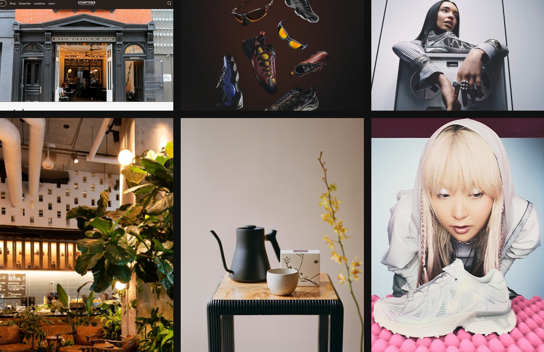
ニューヨークのコーヒーカルチャーと Y2K の美学に着想を得て、Codex の GPT-5.4 で作成したムードボード
ストーリーに沿ったページ構成
一般的なマーケティングページの構成は次のとおりです。
- ヒーロー:ブランドの個性と提供価値を提示
- 補足画像:利用シーンや環境を紹介
- プロダクトの詳細:提供内容を説明
- 社会的証明:信頼性を確立
- 最後の CTA:関心を行動につなげる
デザインシステムに従うための指示
構築の早い段階で明確なデザインシステムを確立するよう、モデルに促してください。background、surface、primary text、muted text、accent などの基本的なデザイントークンと、display、headline、body、caption などのタイポグラフィの役割を定義します。このように体系化すると、モデルはアプリ全体で一貫性があり、拡張しやすい UI パターンを作成しやすくなります。
多くのウェブプロジェクトでは、 React と Tailwind など、使い慣れた技術スタックから始めると効果的です。GPT-5.4 はこれらのツールで特に高い能力を発揮するため、改善を素早く繰り返し、洗練された仕上がりに近づけやすくなります。
動きや重なりのある UI 要素は、特に固定表示やフローティング表示のコンポーネントが主要なコンテンツと干渉する場合、複雑さの原因になります。アニメーション、オーバーレイ、装飾用のレイヤーを扱う際は、レイアウトが崩れないようにする指針を含めると役立ちます。たとえば、次のように指示します。
Keep fixed or floating UI elements from overlapping text, buttons, or other key content across screen sizes. Place them in safe areas, behind primary content where appropriate, and maintain sufficient spacing.推論強度の引き下げ
シンプルなウェブサイトでは、推論を増やせば必ず良くなるわけではありません。実際には、 推論強度を低または中にすると、フロントエンドの仕上がりが良くなることがよくあります。モデルが速度と集中力を保ち、考えすぎに陥りにくくなるためです。より大胆なデザインに取り組む際には、推論強度を上げる余地も残せます。
実際のコンテンツに基づくデザイン
実際に使う文章、プロダクトの背景情報、明確なプロジェクトの目標をモデルに与えることは、フロントエンドの仕上がりを改善する最も手軽な方法の 1 つです。こうした情報があると、モデルは適切なサイト構成を選び、セクションごとのストーリーを明確にし、ありきたりな仮の文章に頼らず、説得力のあるメッセージを書きやすくなります。
フロントエンドスキルで各手法をまとめて活用
一般的なフロントエンドのタスクで GPT-5.4 の能力を最大限に引き出せるよう、専用の frontend-skill も用意しました。以下から確認できます。このスキルは、構成、美的な判断、インタラクションのパターンについて、モデルにより明確な指針を与えます。そのため、使い始めから、より洗練され、意図が伝わる、魅力的なデザインを生み出しやすくなります。
フロントエンドスキル
---
name: frontend-skill
description: Use when the task asks for a visually strong landing page, website, app, prototype, demo, or game UI. This skill enforces restrained composition, image-led hierarchy, cohesive content structure, and tasteful motion while avoiding generic cards, weak branding, and UI clutter.
---

# Frontend skill

Use this skill when the quality of the work depends on art direction, hierarchy, restraint, imagery, and motion rather than component count.

Goal: ship interfaces that feel deliberate, premium, and current. Default toward award-level composition: one big idea, strong imagery, sparse copy, rigorous spacing, and a small number of memorable motions.

## Working Model

Before building, write three things:

- visual thesis: one sentence describing mood, material, and energy
- content plan: hero, support, detail, final CTA
- interaction thesis: 2-3 motion ideas that change the feel of the page

Each section gets one job, one dominant visual idea, and one primary takeaway or action.

## Beautiful Defaults

- Start with composition, not components.
- Prefer a full-bleed hero or full-canvas visual anchor.
- Make the brand or product name the loudest text.
- Keep copy short enough to scan in seconds.
- Use whitespace, alignment, scale, cropping, and contrast before adding chrome.
- Limit the system: two typefaces max, one accent color by default.
- Default to cardless layouts. Use sections, columns, dividers, lists, and media blocks instead.
- Treat the first viewport as a poster, not a document.

## Landing Pages

Default sequence:

1. Hero: brand or product, promise, CTA, and one dominant visual
2. Support: one concrete feature, offer, or proof point
3. Detail: atmosphere, workflow, product depth, or story
4. Final CTA: convert, start, visit, or contact

Hero rules:

- One composition only.
- Full-bleed image or dominant visual plane.
- Canonical full-bleed rule: on branded landing pages, the hero itself must run edge-to-edge with no inherited page gutters, framed container, or shared max-width; constrain only the inner text/action column.
- Brand first, headline second, body third, CTA fourth.
- No hero cards, stat strips, logo clouds, pill soup, or floating dashboards by default.
- Keep headlines to roughly 2-3 lines on desktop and readable in one glance on mobile.
- Keep the text column narrow and anchored to a calm area of the image.
- All text over imagery must maintain strong contrast and clear tap targets.

If the first viewport still works after removing the image, the image is too weak. If the brand disappears after hiding the nav, the hierarchy is too weak.

Viewport budget:

- If the first screen includes a sticky/fixed header, that header counts against the hero. The combined header + hero content must fit within the initial viewport at common desktop and mobile sizes.
- When using `100vh`/`100svh` heroes, subtract persistent UI chrome (`calc(100svh - header-height)`) or overlay the header instead of stacking it in normal flow.

## Apps

Default to Linear-style restraint:

- calm surface hierarchy
- strong typography and spacing
- few colors
- dense but readable information
- minimal chrome
- cards only when the card is the interaction

For app UI, organize around:

- primary workspace
- navigation
- secondary context or inspector
- one clear accent for action or state

Avoid:

- dashboard-card mosaics
- thick borders on every region
- decorative gradients behind routine product UI
- multiple competing accent colors
- ornamental icons that do not improve scanning

If a panel can become plain layout without losing meaning, remove the card treatment.

## Imagery

Imagery must do narrative work.

- Use at least one strong, real-looking image for brands, venues, editorial pages, and lifestyle products.
- Prefer in-situ photography over abstract gradients or fake 3D objects.
- Choose or crop images with a stable tonal area for text.
- Do not use images with embedded signage, logos, or typographic clutter fighting the UI.
- Do not generate images with built-in UI frames, splits, cards, or panels.
- If multiple moments are needed, use multiple images, not one collage.

The first viewport needs a real visual anchor. Decorative texture is not enough.

## Copy

- Write in product language, not design commentary.
- Let the headline carry the meaning.
- Supporting copy should usually be one short sentence.
- Cut repetition between sections.
- do not include prompt language or design commentary into the UI
- Give every section one responsibility: explain, prove, deepen, or convert.

If deleting 30 percent of the copy improves the page, keep deleting.

## Utility Copy For Product UI

When the work is a dashboard, app surface, admin tool, or operational workspace, default to utility copy over marketing copy.

- Prioritize orientation, status, and action over promise, mood, or brand voice.
- Start with the working surface itself: KPIs, charts, filters, tables, status, or task context. Do not introduce a hero section unless the user explicitly asks for one.
- Section headings should say what the area is or what the user can do there.
- Good: "Selected KPIs", "Plan status", "Search metrics", "Top segments", "Last sync".
- Avoid aspirational hero lines, metaphors, campaign-style language, and executive-summary banners on product surfaces unless specifically requested.
- Supporting text should explain scope, behavior, freshness, or decision value in one sentence.
- If a sentence could appear in a homepage hero or ad, rewrite it until it sounds like product UI.
- If a section does not help someone operate, monitor, or decide, remove it.
- Litmus check: if an operator scans only headings, labels, and numbers, can they understand the page immediately?

## Motion

Use motion to create presence and hierarchy, not noise.

Ship at least 2-3 intentional motions for visually led work:

- one entrance sequence in the hero
- one scroll-linked, sticky, or depth effect
- one hover, reveal, or layout transition that sharpens affordance

Prefer Framer Motion when available for:

- section reveals
- shared layout transitions
- scroll-linked opacity, translate, or scale shifts
- sticky storytelling
- carousels that advance narrative, not just fill space
- menus, drawers, and modal presence effects

Motion rules:

- noticeable in a quick recording
- smooth on mobile
- fast and restrained
- consistent across the page
- removed if ornamental only

## Hard Rules

- No cards by default.
- No hero cards by default.
- No boxed or center-column hero when the brief calls for full bleed.
- No more than one dominant idea per section.
- No section should need many tiny UI devices to explain itself.
- No headline should overpower the brand on branded pages.
- No filler copy.
- No split-screen hero unless text sits on a calm, unified side.
- No more than two typefaces without a clear reason.
- No more than one accent color unless the product already has a strong system.

## Reject These Failures

- Generic SaaS card grid as the first impression
- Beautiful image with weak brand presence
- Strong headline with no clear action
- Busy imagery behind text
- Sections that repeat the same mood statement
- Carousel with no narrative purpose
- App UI made of stacked cards instead of layout

## Litmus Checks

- Is the brand or product unmistakable in the first screen?
- Is there one strong visual anchor?
- Can the page be understood by scanning headlines only?
- Does each section have one job?
- Are cards actually necessary?
- Does motion improve hierarchy or atmosphere?
- Would the design still feel premium if all decorative shadows were removed?
Codex App 内で次のコマンドを実行して、frontend-skill をインストールします。
$skill-installer frontend-skillフロントエンドデザインスキルを活用して生成したウェブサイトの例をいくつか紹介します。
ランディングページ
ゲーム
ダッシュボード
まとめ
プロンプトでデザイン上の制約、視覚的な参考資料、構成を練ったストーリー、定義済みのデザインシステムを明確に示すことで、GPT-5.4 は高品質なフロントエンドのインターフェースを生成できます。
これらの手法が、より個性的でデザインの優れたアプリづくりに役立てば幸いです。
GPT-5.4 と Codex などのコーディングエージェントで全体を生成したプロジェクトを共有したい方は、ギャラリーへの掲載に向けてアプリをご応募ください。