
Overview
Custom UI is optional. Add it when a plugin use case requires people to inspect, compare, edit, confirm, or navigate structured information. Keep the MCP tools useful without a component so ChatGPT and Codex can complete the workflow without UI.
The MCP server returns UI resources for selected tools. Components run inside
an iframe in ChatGPT, communicate with the host through the MCP Apps bridge
(JSON-RPC over postMessage), and render alongside the conversation. The open
MCP Apps standard lets the UI run across compatible hosts.
Start with MCP Apps
ChatGPT implements the open MCP Apps standard for UI returned by an MCP server. MCP Apps defines how your server associates tools with UI resources and how the iframe communicates with its host.
For new UI:
- Declare the UI resource with
_meta.ui.resourceUri. - Use the
ui/*JSON-RPC bridge overpostMessagefor initialization, notifications, tool calls, messages, and model-visible context. - Keep tools useful without UI so the model can complete the workflow in clients that do not render components.
This standards-first foundation lets the same UI run in ChatGPT and other compatible MCP Apps hosts.
When you’re ready to implement the standard, use the MCP Apps specification.
Layer on ChatGPT extensions
After the MCP Apps flow works, use window.openai only for capabilities that
the shared specification does not cover. These optional extensions can improve
the experience in ChatGPT without making them part of the portable UI
foundation.
Prefer shared fields and methods
Use the MCP Apps field or method whenever the shared specification covers the capability:
| Goal | MCP Apps standard | ChatGPT compatibility alias |
|---|---|---|
| Link a tool to a UI resource | _meta.ui.resourceUri | _meta["openai/outputTemplate"] |
| Receive tool input | ui/initialize + ui/notifications/tool-input | window.openai.toolInput |
| Receive tool results | ui/notifications/tool-result | window.openai.toolOutput |
| Call a tool from the UI | tools/call | window.openai.callTool |
| Send a follow-up message | ui/message | window.openai.sendFollowUpMessage |
The compatibility aliases remain available for existing integrations. New UI should use the shared fields and bridge methods in the middle column.
Examples include:
- Instant Checkout with
window.openai.requestCheckout. - ChatGPT file handling with
window.openai.uploadFile,window.openai.selectFiles, andwindow.openai.getFileDownloadUrl. - Host-controlled modals with
window.openai.requestModal. - Widget-state persistence with
window.openai.widgetStateandwindow.openai.setWidgetState.
Feature-detect each extension and provide a fallback when practical:
const openai = typeof window !== "undefined" ? window.openai : undefined;

if (openai?.requestModal) {
  await openai.requestModal({
    /* ... */
  });
} else {
  // Fallback behavior for hosts without this extension.
}
Avoid branching on a host or product name. Test for the capability your UI needs.
For extension signatures and examples, see the window.openai component
bridge reference.
Optional OpenAI component library
The
@openai/apps-sdk-ui component
library provides ready-made buttons, cards, input controls, and layout
primitives that match ChatGPT’s container. Use it when you want consistent
styling without rebuilding base components.
You can also explore the UI examples repository on GitHub.
Choose a presentation
Start with inline UI and request more space only when the workflow needs it. Choose the smallest presentation that lets people understand the result or complete the task.
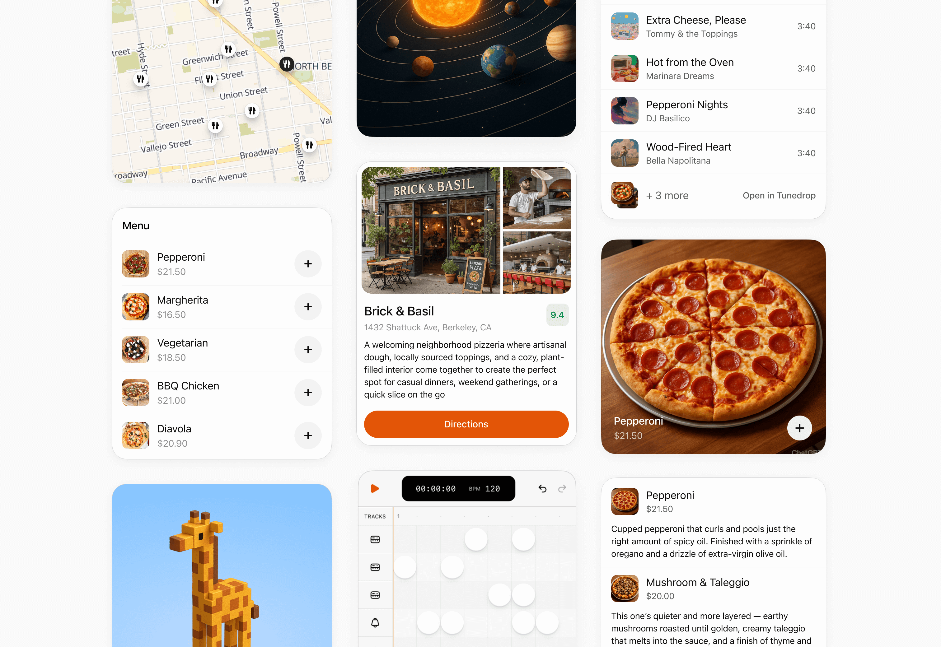
Inline card
Use an inline card for a focused result, confirmation, or small set of actions. Keep it self-contained and avoid deep navigation.
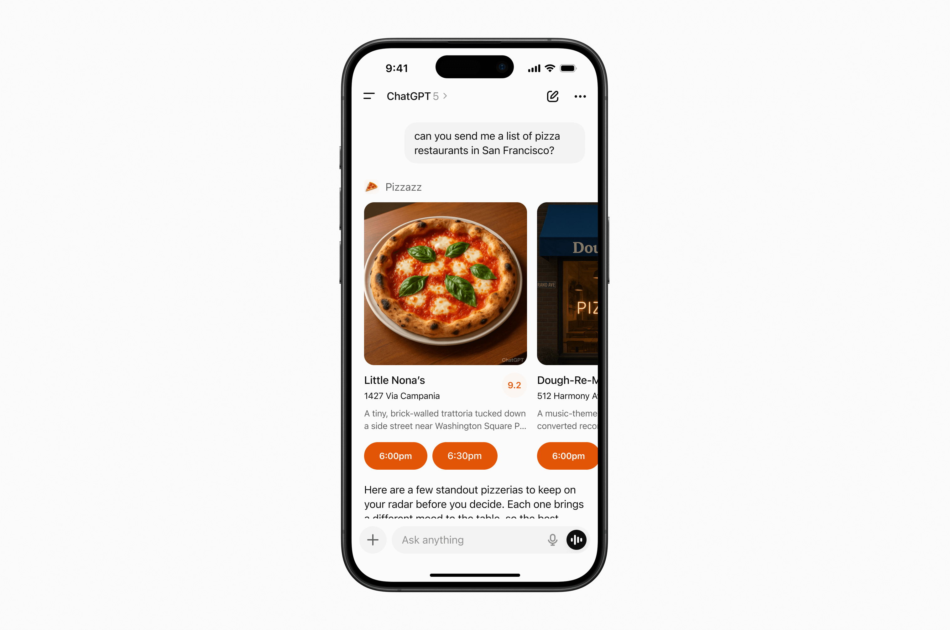
Inline carousel
Use an inline carousel when people need to scan and choose from a small set of similar, visually rich options.
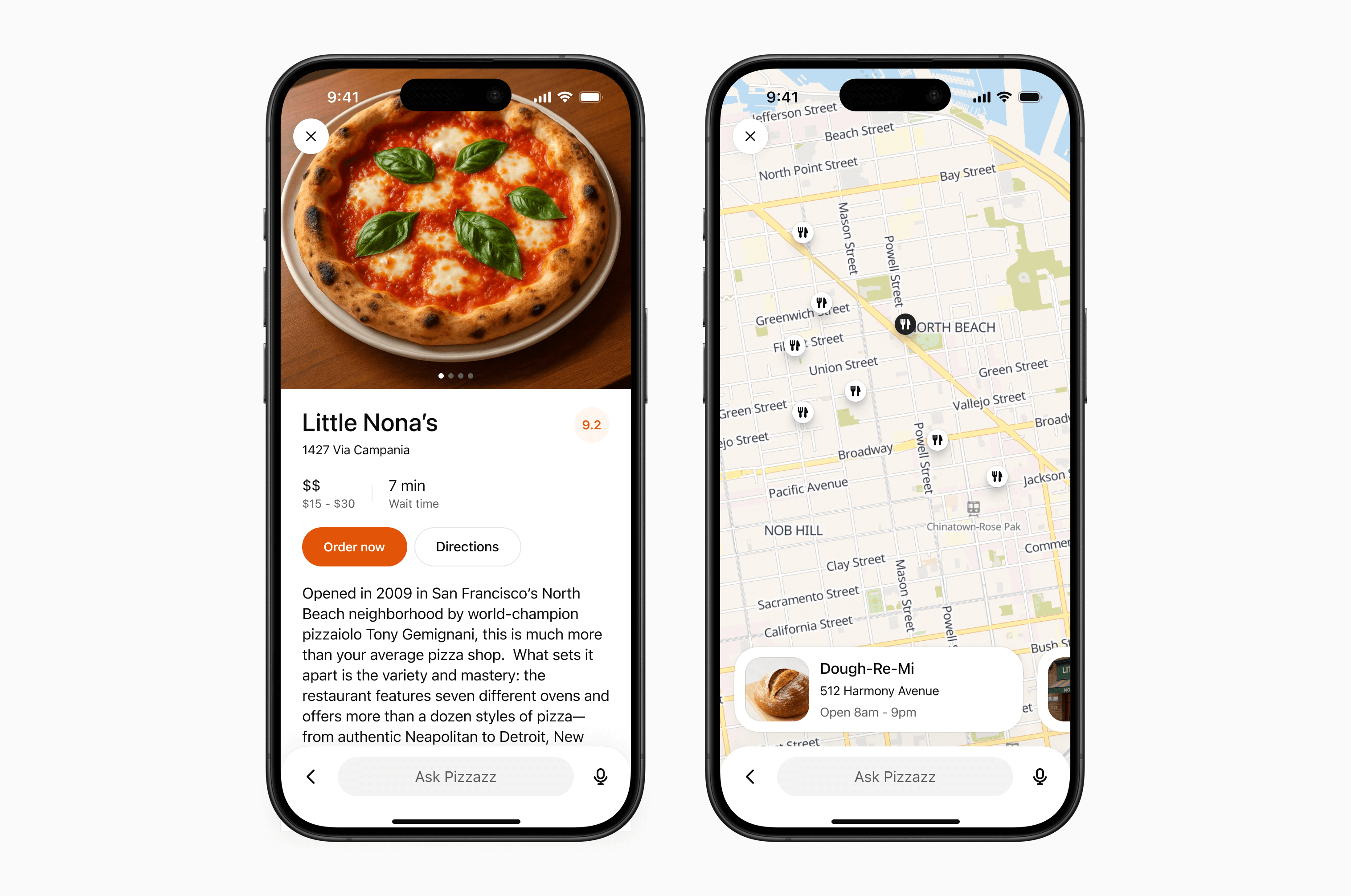
fullscreen
Use fullscreen for rich tasks that need more room, such as maps, editing canvases, or detailed browsing. Design the experience to work with ChatGPT’s composer, which remains available in fullscreen.
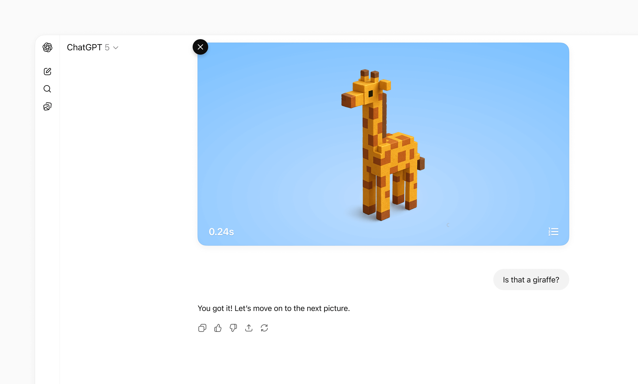
Picture-in-picture
Use picture-in-picture for an ongoing activity that should remain visible while the conversation continues, such as a live session, game, or video.
For detailed layout, interaction, visual design, and accessibility guidance, see UI guidelines.
Separate data processing from UI rendering
Decoupled pattern
If you attach a widget template to every tool call, ChatGPT can re-render your iframe too often. A better pattern is to separate data-processing tools from render tools:
- Data tools fetch, compute, or mutate data and return only tool results.
- Render tools take final data and return the widget template.
This allows the model to apply its intelligence to data it fetched before choosing to render UI to the user, making it much more likely that it will accomplish the user’s specific expressed goal.
This pattern is part of the MCP Apps architecture.
In practice, many UI integrations use this split:
- Search/fetch tools (data-first): Return IDs plus metadata with no widget template attached.
- Render tools (for example,
render_listings_widget): Take a prepared list of IDs and render the widget.
Only the render tool should include _meta.ui.resourceUri.
Decoupled call flow
Recommended call flow:
- The model calls the data tool (for example,
roll_dice). - The model receives
structuredContentfrom the data tool. - The model calls the render tool with that data.
- The widget renders once with final, model-checked context.
Example: Real estate follow-up queries
Suppose your plugin shows listing cards and a map, but your server-side search tool
only supports broad filters (city, price, beds, baths) and cannot filter by
school zone.
If a user asks, “Which of these are in the Richmond Primary School zone?” decoupling helps:
searchruns broadly and returns candidate listing IDs plus metadata.- The model refines that candidate set for the follow-up question.
- The model calls
render_listings_widgetwith only the filtered IDs. - The widget renders the final filtered set.
Best practices:
- Keep data tools reusable. Return complete
structuredContentfor chaining. - Keep render tools focused on presentation. Don’t mix business logic into the render handler.
- State the dependency in the render tool description (for example, “Always
call
roll_dicefirst”). - Keep reruns intentional. Let the UI call data tools directly for local interactions like “Re-roll,” without remounting the widget.
Decoupled example
Example (decoupled dice tools):
import { McpServer } from "@modelcontextprotocol/sdk/server/mcp.js";
import { z } from "zod/v3";

const TEMPLATE_URI = "ui://widget/dice.html";

const server = new McpServer(
  { name: "Decoupled dice", version: "1.0.0" },
  { capabilities: { tools: {} } }
);

// The widget only renders the latest tool result.
// Re-roll calls the data tool directly to avoid remounting the widget.
const widgetHtml = `
  <div style="font-family: system-ui; padding: 8px;">
    <div style="font-size: 20px; margin-bottom: 6px;">
      Result: <span id="out">—</span>
    </div>
    <button id="reroll">Re-roll</button>
  </div>

  <script>
    const outputEl = document.getElementById("out");
    const rerollButton = document.getElementById("reroll");
    const pendingRequests = new Map();
    let nextRequestId = 1;
    let latestToolInput;
    let latestToolOutput;

    function render(result) {
      outputEl.textContent = String(result?.value ?? "—");
    }

    function request(method, params) {
      const id = nextRequestId++;
      window.parent.postMessage({ jsonrpc: "2.0", id, method, params }, "*");
      return new Promise((resolve, reject) => {
        pendingRequests.set(id, { resolve, reject });
      });
    }

    window.addEventListener(
      "message",
      (event) => {
        if (event.source !== window.parent) return;
        const message = event.data;
        if (!message || message.jsonrpc !== "2.0") return;

        if (message.id !== undefined && pendingRequests.has(message.id)) {
          const pending = pendingRequests.get(message.id);
          pendingRequests.delete(message.id);
          if (message.error) pending.reject(message.error);
          else pending.resolve(message.result);
          return;
        }

        if (message.method === "ui/notifications/tool-input") {
          latestToolInput = message.params;
        }

        if (message.method === "ui/notifications/tool-result") {
          latestToolOutput = message.params?.structuredContent;
          render(latestToolOutput);
        }
      },
      { passive: true }
    );

    rerollButton.onclick = async () => {
      const sides = latestToolOutput?.sides ?? latestToolInput?.sides ?? 6;
      const next = await request("tools/call", {
        name: "roll_dice",
        arguments: { sides },
      });
      if (next?.structuredContent) {
        render(next.structuredContent);
      }
    };
  </script>
`.trim();

server.registerResource("dice-widget", TEMPLATE_URI, {}, async () => ({
  contents: [
    {
      uri: TEMPLATE_URI,
      mimeType: "text/html;profile=mcp-app",
      text: widgetHtml,
      _meta: { ui: { prefersBorder: true } },
    },
  ],
}));

// 1) Data tool: no output template, returns chainable structuredContent.
server.registerTool(
  "roll_dice",
  {
    title: "Roll dice",
    description: "Roll an N-sided die and return { sides, value }.",
    inputSchema: { sides: z.number().int().min(2) },
    outputSchema: {
      sides: z.number().int().min(2),
      value: z.number().int().min(1),
    },
    _meta: {
      "openai/toolInvocation/invoking": "Rolling…",
      "openai/toolInvocation/invoked": "Rolled.",
    },
  },
  async ({ sides }) => {
    const value = 1 + Math.floor(Math.random() * sides);
    return {
      structuredContent: { sides, value },
      content: [{ type: "text", text: `Rolled ${value} on ${sides} sides.` }],
    };
  }
);

// 2) Render tool: owns the template and requires data from roll_dice.
server.registerTool(
  "render_dice_widget",
  {
    title: "Render dice widget",
    description:
      "Render the dice widget from roll data. First call roll_dice, then pass its sides and value to this tool.",
    inputSchema: {
      sides: z.number().int().min(2),
      value: z.number().int().min(1),
    },
    outputSchema: {
      sides: z.number().int().min(2),
      value: z.number().int().min(1),
    },
    _meta: {
      ui: { resourceUri: TEMPLATE_URI },
      "openai/toolInvocation/invoking": "Rendering…",
      "openai/toolInvocation/invoked": "Rendered.",
    },
  },
  async ({ sides, value }) => ({
    structuredContent: { sides, value },
    content: [
      {
        type: "text",
        text: `Showing a ${sides}-sided roll: ${value}.`,
      },
    ],
  })
);

export default server;
Manage state
UI from an MCP server works with three kinds of state:
| State type | Owner | Lifetime | Examples |
|---|---|---|---|
| Business data (authoritative) | MCP server or external service | Long-lived | Tasks, tickets, documents |
| UI state (ephemeral) | UI instance | Active UI instance | Selected row, expanded panel, sort order |
| Cross-session state (durable) | Storage you control | Cross-session and cross-conversation | Saved filters, view mode, workspace |
Keep each value with the system that owns it. The UI should render authoritative data from tool results and layer temporary presentation state on top.
MCP server or external service
│
├── Authoritative business data
│
▼
UI
│
├── Ephemeral presentation state
│
└── Rendered view = business data + UI state
Keep business data on the server
Business data is the source of truth. Do not store it only in the UI. When a user takes an action:
- The UI calls an MCP tool.
- The server validates the request and updates the data.
- The server returns the updated authoritative snapshot.
- The UI renders the snapshot while preserving compatible presentation state.
Return enough structured content for both the model and UI to understand the new state. This also lets the conversation remain useful if the UI cannot load.
Keep temporary UI state in the UI
Use framework state for values that only affect presentation, such as a selected item, open panel, or draft filter. Each rendered UI instance has its own state.
When the model needs to know about a selection or staged edit, send that
information through ui/update-model-context. This is the portable MCP Apps
mechanism for updating model-visible context.
ChatGPT also provides optional widget-scoped persistence:
- Read the current snapshot from
window.openai.widgetState. - Write a new snapshot with
window.openai.setWidgetState(state).
setWidgetState is synchronous. Call it after each meaningful UI-state change;
there is nothing to await.
import { useState } from "react";

export function TaskList({ tasks }) {
  const [state, setState] = useState(
    window.openai?.widgetState ?? { selectedId: null }
  );

  function selectTask(selectedId) {
    const nextState = { ...state, selectedId };
    setState(nextState);
    window.openai?.setWidgetState?.(nextState);
  }

  return (
    <ul>
      {tasks.map((task) => (
        <li key={task.id}>
          <button
            type="button"
            aria-pressed={state.selectedId === task.id}
            onClick={() => selectTask(task.id)}
          >
            {task.title}
          </button>
        </li>
      ))}
    </ul>
  );
}
Widget state belongs to one rendered UI instance. Do not use it as the source of truth for business data or as durable storage.
Make images visible to the model
For UI that works with images, use the structured widget-state shape:
modelContent: Text or JSON the model should see.privateContent: UI-only state the model should not see.imageIds: File IDs the model should receive on later turns.
window.openai.setWidgetState({
  modelContent: "Review the currently selected images.",
  privateContent: {
    currentView: "image-viewer",
    filters: ["crop", "sharpen"],
  },
  imageIds: ["file_123", "file_456"],
});
Only include file IDs uploaded with window.openai.uploadFile, selected with
window.openai.selectFiles, received through tool input file parameters, or
returned through tool result file references.
Store cross-session state on your server
Store preferences and data that must survive across conversations, devices, or sessions in storage you control. Authenticate the user so the MCP server can map each request to the correct account.
When you add durable storage:
- Keep latency low enough for interactive UI.
- Protect private data with server-side authorization.
- Plan for data residency and compliance requirements.
- Apply rate limits to traffic from retries or concurrent UI instances.
- Version stored objects so you can migrate them without breaking existing conversations.
Avoid localStorage for core state. UI runs in an isolated iframe, and browser
storage does not provide a reliable cross-device or cross-session data layer.
Scaffold the component project
Now that you understand the MCP Apps bridge (and optional ChatGPT extensions), it’s time to scaffold your component project.
As best practice, keep the component code separate from your server logic. A common layout is:
plugin-ui/
  server/            # MCP server (Python or Node)
  web/               # Component bundle source
    package.json
    tsconfig.json
    src/component.tsx
    dist/component.js   # Build output
Create the project and install dependencies (Node 18+ recommended):
cd plugin-ui/web
npm init -y
npm install react@^18 react-dom@^18
npm install -D typescript esbuild
If your component requires drag-and-drop, charts, or other libraries, add them now. Keep the dependency set lean to reduce bundle size.
Author the React component
Your entry file should mount a component into a root element and render from
the latest tool result delivered over the MCP Apps bridge (for example,
ui/notifications/tool-result).
The examples page includes sample UI, such as the Pizzaz list of pizza restaurants.
Explore the Pizzaz component gallery
The UI examples include example components. Treat them as blueprints when shaping your own UI:
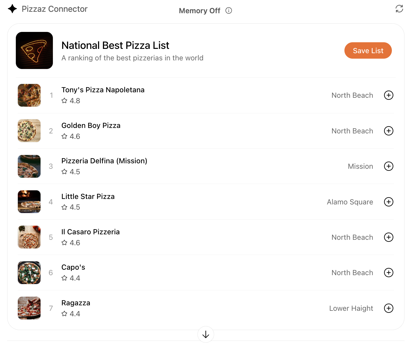
- Pizzaz List: Ranked card list with favorites and call-to-action buttons.
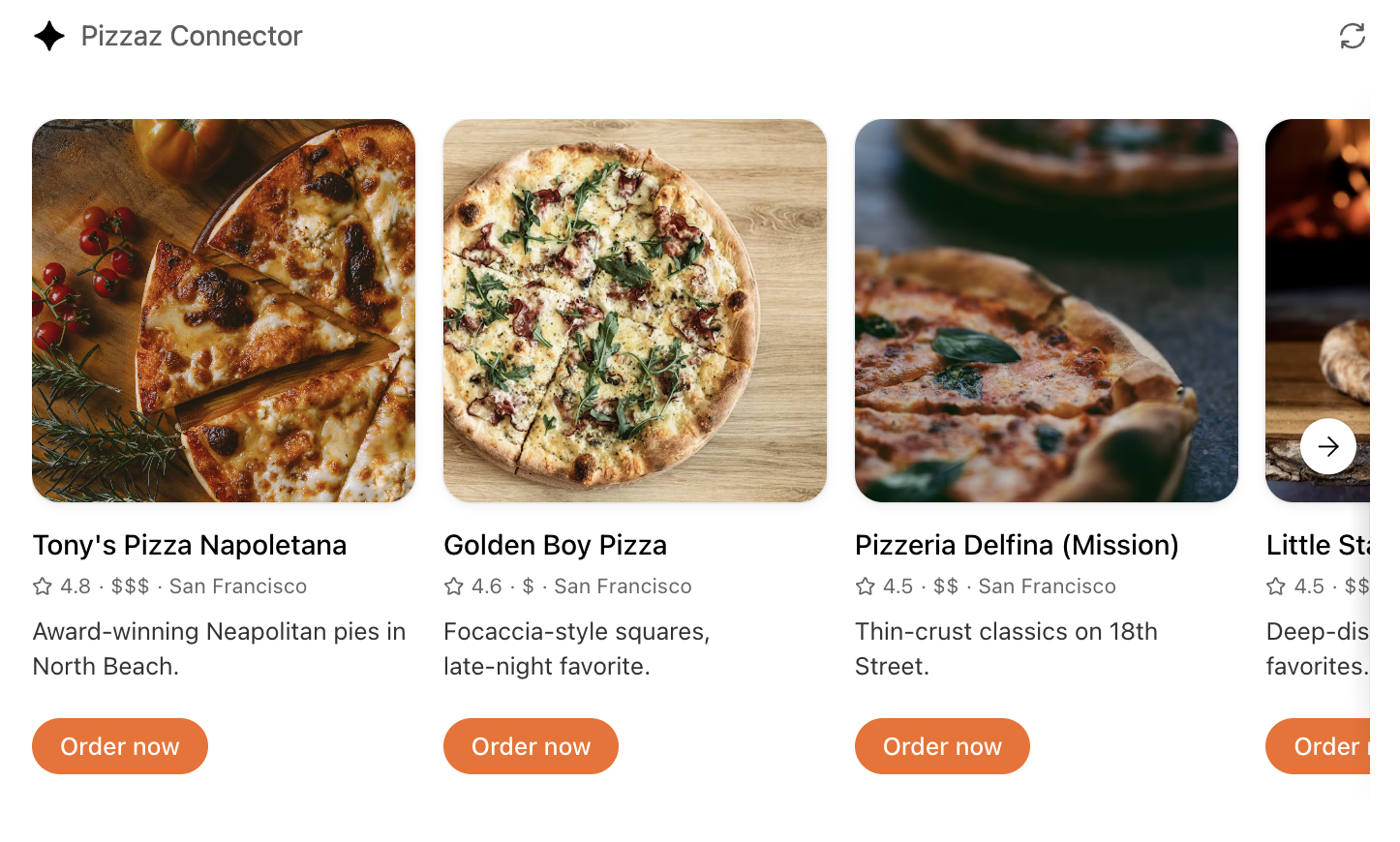
- Pizzaz Carousel: Embla-powered horizontal scroller that demonstrates media-heavy layouts.
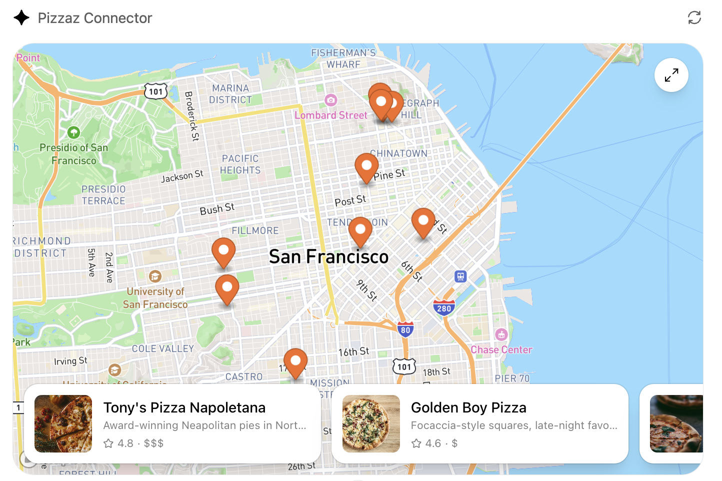
- Pizzaz Map: Mapbox integration with fullscreen inspector and host state sync.
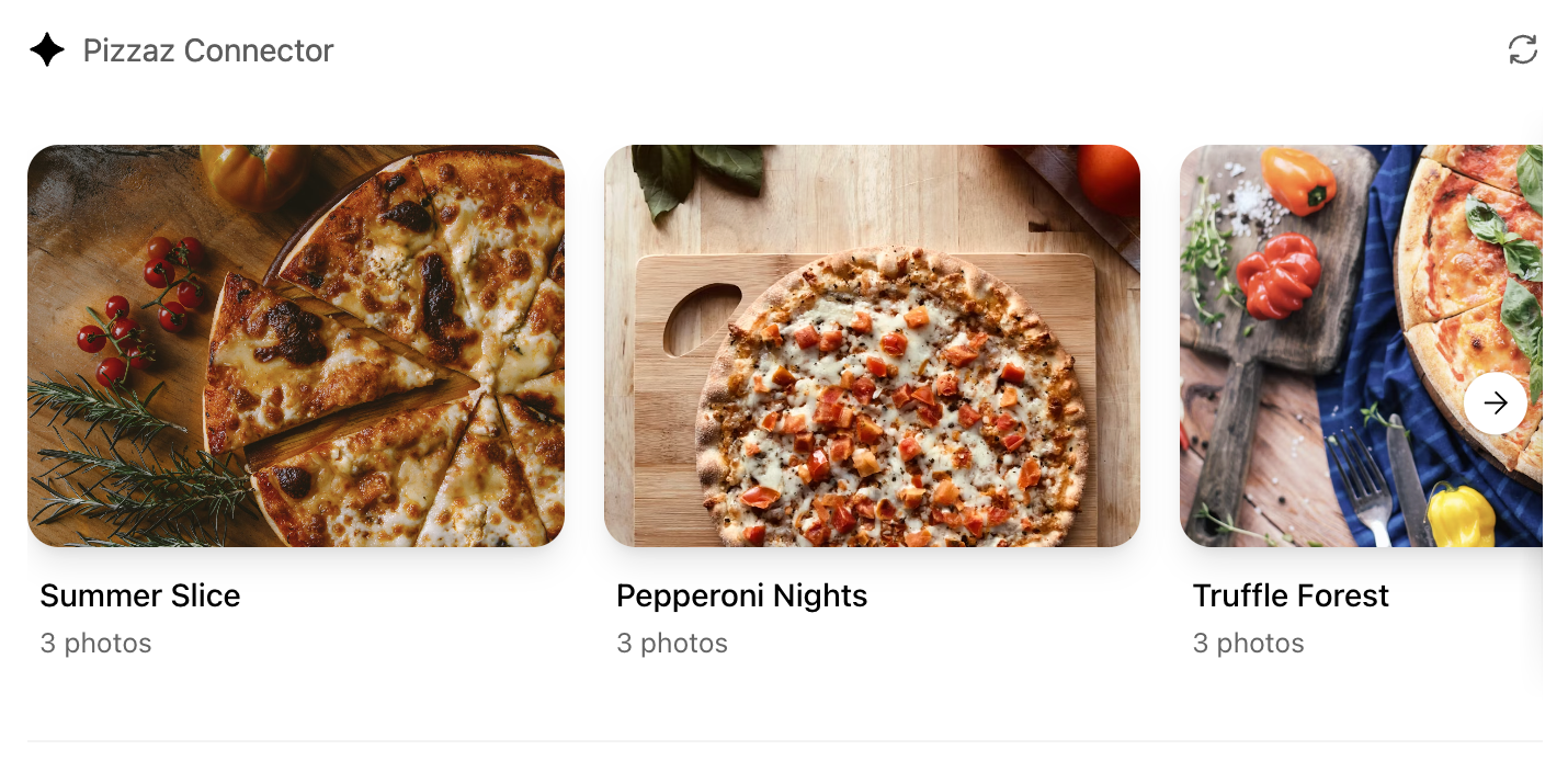
- Pizzaz Album: Stacked gallery view built for deep dives on a single place.
- Pizzaz Video: Scripted player with overlays and fullscreen controls.
Each example shows how to bundle assets, wire host APIs, and structure state for real conversations. Copy the one closest to your use case and adapt the data layer for your tool responses.
React helper hooks
A small helper to subscribe to ui/notifications/tool-result:
type ToolResult = { structuredContent?: unknown } | null;

export function useToolResult() {
  const [toolResult, setToolResult] = useState<ToolResult>(null);

  useEffect(() => {
    const onMessage = (event: MessageEvent) => {
      if (event.source !== window.parent) return;
      const message = event.data;
      if (!message || message.jsonrpc !== "2.0") return;
      if (message.method !== "ui/notifications/tool-result") return;
      setToolResult(message.params ?? null);
    };

    window.addEventListener("message", onMessage, { passive: true });
    return () => window.removeEventListener("message", onMessage);
  }, []);

  return toolResult;
}
Render from toolResult?.structuredContent, and treat it as untrusted input.
Widget localization
The host mirrors the locale to document.documentElement.lang. Use that locale
to load translations and format dates/numbers. A common pattern with
react-intl:
import { IntlProvider } from "react-intl";
import en from "./locales/en-US.json";
import es from "./locales/es-ES.json";

const messages: Record<string, Record<string, string>> = {
  "en-US": en,
  "es-ES": es,
};

export function PluginUI() {
  const locale = document.documentElement.lang || "en-US";
  return (
    <IntlProvider
      locale={locale}
      messages={messages[locale] ?? messages["en-US"]}
    >
      {/* Render UI with <FormattedMessage> or useIntl() */}
    </IntlProvider>
  );
}
Bundle for the iframe
Once you finish writing your React component, you can build it into a single JavaScript module that the server can inline:
// package.json
{
  "scripts": {
    "build": "esbuild src/component.tsx --bundle --format=esm --outfile=dist/component.js"
  }
}
Run npm run build to produce dist/component.js. If esbuild complains about missing dependencies, confirm you ran npm install in the web/ directory and that your imports match installed package names (for example, @react-dnd/html5-server-side vs react-dnd-html5-server-side).
Embed the component in the server response
Expose the component as an MCP resource with the MCP Apps UI MIME type
(text/html;profile=mcp-app). If you use
@modelcontextprotocol/ext-apps/server, prefer RESOURCE_MIME_TYPE instead of
embedding the string:
import {
  registerAppResource,
  RESOURCE_MIME_TYPE,
} from "@modelcontextprotocol/ext-apps/server";
import { readFileSync } from "node:fs";

const component = readFileSync("web/dist/component.js", "utf8");

registerAppResource(
  server,
  "project-board",
  "ui://project-board/v1.html",
  {},
  async () => ({
    contents: [
      {
        uri: "ui://project-board/v1.html",
        mimeType: RESOURCE_MIME_TYPE,
        text: `<div id="root"></div><script type="module">${component}</script>`,
        _meta: {
          ui: {
            prefersBorder: true,
            domain: "https://example.com",
            csp: {
              connectDomains: ["https://api.example.com"],
              resourceDomains: ["https://static.example.com"],
            },
          },
        },
      },
    ],
  })
);
Associate the resource URI with only the tools that should render the
component. For broader MCP Apps compatibility, use _meta.ui.resourceUri.
ChatGPT also honors _meta["openai/outputTemplate"] as a compatibility alias.
Treat the resource URI as a cache key. When you make a breaking change to the HTML, JavaScript, or CSS, publish a new URI and update every tool that references it.
Content security policy (CSP)
Declare the exact domains the component connects to or loads resources from:
connectDomainsfor API requests.resourceDomainsfor scripts, styles, images, and other assets.frameDomainsonly when the component must embed specific iframe origins.
Nested frames are blocked by default. Keep each allowlist as narrow as possible. The plugin review process checks the declared policy against the UI behavior.
Component UI templates are the recommended path for production.
During development you can rebuild the component bundle whenever your React code changes and hot-reload the server.
Offer checkout in your UI
If you want to offer users the ability to check out through your plugin’s UI flows, use the component to present products, prices, terms, and payment choices before confirmation. Keep the underlying catalog and order tools useful without UI, then choose an external checkout flow or, when available, an embedded payment option.
Use external checkout by default
External checkout is the recommended and generally available approach. Link from the component to a merchant-hosted checkout flow on your own domain, where you handle:
- Pricing and payment collection.
- Taxes, discounts, and fees.
- Shipping and fulfillment.
- Refunds, support, and compliance.
Current approval is limited to plugins for physical-goods purchases. Do not offer other commerce categories unless OpenAI has explicitly enabled them for your plugin.
Use saved payment methods
For eligible physical-goods purchases, optional UI can let customers select a payment method they previously saved with your service. This flow can display eligible saved methods but cannot collect new payment credentials. Your MCP server processes the purchase and returns the authoritative order result.
Use the ChatGPT payment sheet
Embedded checkout with the ChatGPT payment sheet is in private beta for select marketplaces and is not available to all developers or users.
For enabled integrations, window.openai.requestCheckout opens the ChatGPT
payment sheet:
const order = await window.openai.requestCheckout(checkoutSession);The checkout flow has four parts:
- An MCP tool returns a checkout session in
structuredContent. - The component displays the line items, totals, terms, and fulfillment choices.
- The component calls
requestCheckout(checkoutSession)after the user chooses to pay. - ChatGPT sends the selected payment token to the MCP server’s
complete_checkouttool, which charges the payment method and returns the completed order.
The checkout session must include:
- A unique session ID.
- Line items and quantities.
- Totals in integer minor currency units.
- Payment-provider and merchant metadata.
- Required legal, privacy, refund, and support links.
Treat the server as the source of truth for prices and order status. Verify the payment token, make the operation idempotent, persist the order, and return an authoritative receipt. Never trust totals calculated only in the component.
Use payment_mode: "test" to exercise the end-to-end flow without moving real
funds. Handle cancellation, declined payments, and payment-provider errors in
the component.
For complete checkout-session fields, payment-provider behavior, the
complete_checkout result shape, and delegated-payment requirements, see the
checkout API reference.